
Spotify Green: The Exact Hex Code and How to Use It
7 min read
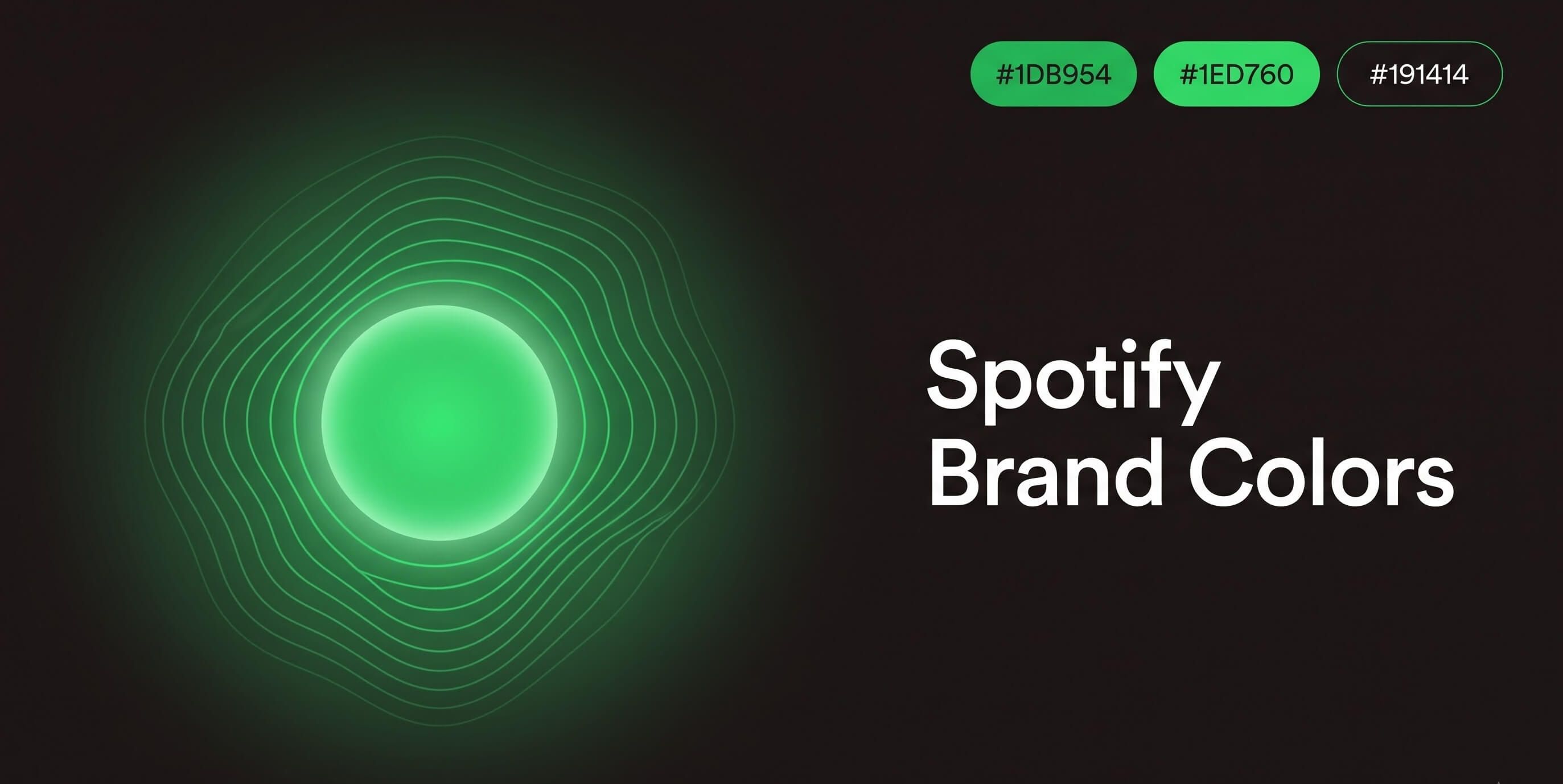
Scroll through your phone in a dark room and there's one color that cuts through instantly — that electric, almost glowing green sitting on a play button. It's the opposite of subtle, and that's entirely the point. Where Starbucks built a brand around a quiet, forest-deep green, Spotify went the other way: loud, energetic, and impossible to miss against a near-black interface.
Here's the exact hex code behind it, a genuinely interesting wrinkle most brand-color pages skip entirely, and how to use it properly in your own work.
The Official Spotify Color Palette
Spotify's brand is built on three colors, and the contrast between them does a lot of heavy lifting:
- Spotify Green —
#1DB954· RGB (29, 185, 84) · HSL (141°, 73%, 42%) - Spotify Black —
#191414· RGB (25, 20, 20) - White —
#FFFFFF· RGB (255, 255, 255)
#1DB954 is the green you'll see used across the app interface, play buttons, and most marketing material — it's the one worth grabbing if you're building something Spotify-adjacent.
Wait — There Are Actually Two Official Greens
This is the part most brand-color roundups get wrong by flattening it into one number. Spotify's own brand guidelines specify a second, lighter green reserved specifically for the logo mark: #1ED760, RGB (30, 215, 96), corresponding to Pantone PMS 7479 C.
So to be precise:
- `#1DB954` — the general-purpose Spotify Green, used in UI, buttons, and marketing
- `#1ED760` — a brighter tint used specifically in the logo itself
The guidelines don't spell out exactly why the two are split, but it's a common practice in brand systems: a logo mark often needs a slightly different calibration than everyday interface elements to look right at small sizes or on a lit-up app icon, even when both are "the same" brand green to everyone outside the design team. If you're recreating the logo specifically, use #1ED760. For everything else — buttons, backgrounds, accents — #1DB954 is the one you want.
Why Spotify Picked an Electric Green
Color choices like this are rarely accidental. Spotify's green was chosen to signal energy, freshness, and growth — qualities the brand wants tied to music discovery and staying constantly, restlessly current. It's a deliberately youthful, kinetic choice, which is a big part of why it reads so differently from a legacy brand's muted, decades-old palette.
The practical reasoning is just as important as the emotional one: #1DB954 is bright and saturated enough to stay legible and attention-grabbing against Spotify's dark, near-black interface — every play button, follow toggle, and notification badge needs to be found instantly, even in a glance. If you want to dig deeper into what different colors tend to communicate and why brands lean on them, our color meanings guide is a solid next read.
How Spotify's Green Compares to Other Greens
Saying a color is "vivid" is easy — showing why is more useful. Here's how #1DB954 actually stacks up against a few reference greens:
- Pure green (`#00FF00`) — maximum saturation, no red or blue at all. Spotify's green pulls back from this extreme, adding a touch of red (29) to warm it up slightly and keep it from looking radioactive.
- Standard web "green" (`#008000`) — much darker and duller by comparison (RGB 0, 128, 0). Spotify's green is nearly 45% brighter in the green channel alone (185 vs. 128), which is most of why it feels so alive next to a muted, textbook green.
- Android Green (`#3DDC84`) — another well-known tech-brand green, and actually fairly close in feel, though slightly lighter and cooler than Spotify's shade.
The short version: Spotify didn't pick "a green," it picked a specific, high-brightness, slightly warm point in the green spectrum that reads as energetic rather than natural or corporate — which lines up exactly with the brand personality it's going for.
The Contrast Detail Most Guides Miss
Here's something worth knowing if you're actually going to use this green in a design: white text on `#1DB954` doesn't pass WCAG accessibility standards. Running the numbers gives a contrast ratio of roughly 2.6:1 — well under the 4.5:1 required for normal text, and just short of the 3:1 minimum even for large text.
That's very likely why Spotify's own play-button icon usually appears in black or near-black rather than white when it sits directly on the green circle. Swap in Spotify's own near-black (#191414) as the foreground color instead, and the ratio jumps to roughly 7.1:1 — comfortably clearing WCAG AA and landing right at AAA, the strictest standard that exists.
The takeaway: bright, saturated colors like this one often look high-contrast because they're vivid, but vividness and contrast ratio aren't the same thing. Before you ship a design using this green as a background, run your actual text color through our contrast checker rather than assuming — it takes ten seconds and it's the difference between an accessible design and one that quietly fails for a chunk of your audience.
How to Use These Codes in Your Own Work
If you're building something with a similar palette, set both greens up as CSS variables from the start so you're never guessing which one belongs where:
:root {
  --spotify-green: #1DB954;
  --spotify-green-logo: #1ED760;
  --spotify-black: #191414;
}

.play-button {
  background-color: var(--spotify-green);
  color: var(--spotify-black);
}
Need to move between formats for a specific tool or platform — say you've got the RGB values from a design file but need hex for your stylesheet? Our RGB to Hex and Hex to RGB converters handle the conversion instantly, with no manual rounding errors creeping in.
Colors That Pair Well With Spotify Green
Vivid, high-saturation greens like this one work best against very dark or very light neutrals — which is exactly why Spotify's entire interface is built on near-black rather than white or gray. Bold secondary colors tend to fight with a green this loud rather than complement it.
A few pairings that tend to work well in practice:
- Charcoal or near-black (like Spotify's own
#191414) for a moody, app-like feel - Off-white or warm cream instead of pure white, for a softer contrast that's easier on the eyes in large blocks
- Deep navy as a secondary accent, if you want something cooler to balance the green's warmth without competing with it
If you want to explore combinations, this shade sits close to the neon green family — check out colors that go with neon green for pairing ideas, or drop #1DB954 directly into our color palette generator to see auto-generated combinations built around it. Want to soften it into a gradient for a banner or header instead of using it flat? Our color mixer can blend it with a neutral to create a subtler duotone effect.
Quick Answers
What is the exact hex code for Spotify green? #1DB954 is the primary brand green used across the app and most marketing. The logo itself uses a lighter tint, #1ED760.
Is Spotify's logo a different green from the rest of the app? Yes — per Spotify's own brand guidelines, the logo uses #1ED760 while interface elements typically use the slightly darker #1DB954.
Does white text work on Spotify green? No — the contrast ratio is only around 2.6:1, which fails WCAG AA. Near-black text or icons (like Spotify's own #191414) pass comfortably at roughly 7.1:1.
Can I use Spotify's exact colors in my own project? For personal projects, mockups, or educational content, sure — that's standard practice in design. Just be careful about implying any official affiliation or endorsement if you're using it commercially; brand colors like this one are tied closely to trademark protections, even when the hex code itself is just a number anyone can technically use.
More Brand Colors Worth Exploring
Spotify and Starbucks both prove the same point in opposite directions — a single, deliberately chosen color can carry an entire brand's personality, whether that's calm and grounded or loud and energetic. We're cataloguing more of these exact breakdowns on our brand colors hub, including the codes behind Coca-Cola, McDonald's, and Nike.
---
Next time you glance at that glowing green circle in a dark room, you'll know there's actually two hex codes hiding behind it — and now you know exactly which one to reach for.