Tailwind Color Generator
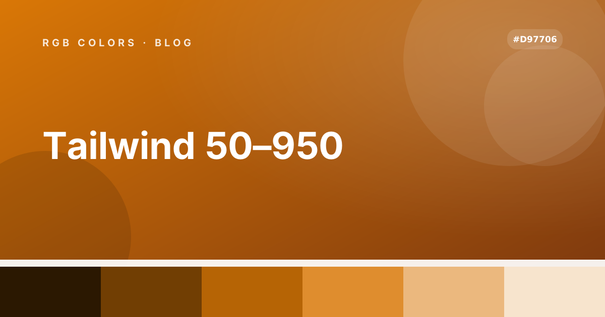
Turn one base color into an eleven-step Tailwind scale — 50 through 950 — then judge it in use: the strip under the preview lists every step, one click copies its hex, and the same scale draws a full interface in light and dark mode. Export it as CSS variables or a tailwind.config colors block.
Steps follow Tailwind’s own lightness ladder for your hue, with the ends eased so they never turn neon. Fine-tune individual steps if a brand needs exact values. Tailwind color docs
Palette 1 (MediumSlateBlue)
Click any step to copy its hex value. The marked dot shows the step your base color landed on (step 400).
Examples
Increase your revenue by 3x
Our platform helps you close more deals and scale faster than ever.
Categories
Audience
- NewsletterLast message sent an hour ago
- Existing customersLast message sent 2 weeks ago
- Trial usersLast message sent 4 days ago
Spending
- Home Renovation$10,000$8,250$1,750
- Education & Courses$40,000$19,500$20,500
- Health & Wellness$5,500$3,000$2,500
Schedule
- 9:15AMWeekly Team Sync
Quick check-in to align priorities and share updates for the week.
- 4:00PMClient Pitch Rehearsal
Run through tomorrow's presentation and refine messaging with the team.
- 7:30PMProduct Design Review
Collaborative session to go over the latest UI/UX proposals and feedback.
Uploads
Clear- brand-scale.svgDone24 KB
- contrast-sheet.png68%1.2 MB
- poster-draft.pdf22%840 KB
Command palette
K- Go to dashboardG D
- Open color reportR
- Invite a teammateI
- Workspace settings,
Notifications
3 new- Scale savedbrand-50 to brand-950 written to your tokens.
- Contrast checkedEvery step clears AA against white.
- Step 500 is close1.4% away from the base hex.
Revenue
IncomeExpensesSavingsPricing plans
Perfect for freelancers or hobbyists starting out.
Ideal for growing teams that need collaboration tools.
Designed for large organizations with custom needs.
Tickets
- Amy P.Open1 hrs
- Sarah A.Open20 mins
- Jessica P.Processing45 mins
- James A.Closed2 days
Continue Watching
3 in progress UI / UX
Design principles and tools for creating intuitive user interfaces.
 Front End Dev
Build responsive web pages using HTML, CSS and JavaScript.
Create and mix custom audio for games and film projects.
Design board
MineActivity
Today- Amy P. updated step 600 tonow#4f46e5
- James A. exported the scale as12mtailwind.config.js
- Sara L. checked contrast and passed1hAA · 4.9:1
- Orlando S. renamed the scale to3hbrand
Brand marks
Design Principles Handbook
Continue reading
Manage team access
Control who can view, edit and approve content across your organization. Great for admins.
Notifications settings
Customize when and how you receive alerts for important updates and requests.
Download reports
Export activity summaries and detailed reports in multiple file formats, anytime.
Stats
This year- Views
- Clicks
- Sales
Buttons
Workspace settings
Saved 2 min agoCopy the scale
#6366f1 is step 400 of this scale. Take all eleven values as CSS custom properties, or paste the same scale into a tailwind.config.js colors block — both use the step names shown above, so the strip, the preview and the code can never disagree.
:root {
  --color-brand-50: #f3f3fc;
  --color-brand-100: #d6d7f5;
  --color-brand-200: #abacf8;
  --color-brand-300: #8a8bf5;
  --color-brand-400: #6366f1;
  --color-brand-500: #3f42ee;
  --color-brand-600: #1418eb;
  --color-brand-700: #1114c5;
  --color-brand-800: #0e10a0;
  --color-brand-900: #12136e;
  --color-brand-950: #0c0d4b;
}module.exports = {
theme: {
extend: {
colors: {
brand: {
50: '#f3f3fc',
100: '#d6d7f5',
200: '#abacf8',
300: '#8a8bf5',
400: '#6366f1',
500: '#3f42ee',
600: '#1418eb',
700: '#1114c5',
800: '#0e10a0',
900: '#12136e',
950: '#0c0d4b',
},
},
},
},
};Tailwind ships every color as an 11-step scale (50–950) so your buttons, text, borders and hover states always have a matching shade. This generator rebuilds that structure around any base color, then draws a working interface with it — tinted panels, buttons in every state, progress bars and charts, a calendar, a command palette, a notification stack, an upload queue, a design board with avatars, an activity feed and a settings form with toggles — so the ramp can be judged in use before it reaches a design system.
Frequently asked questions
The full scale is 50, 100, 200, 300, 400, 500, 600, 700, 800, 900 and 950 — 11 shades from very light to very dark.
Good to know
- Every surface in the preview is inline-styled from the generated scale, so the mock interface is a real color test rather than a screenshot.
- Text on each swatch and button is picked automatically from the background luminance, so labels stay legible.
- The settings card uses real inputs and toggles, so borders, carets and switch fills can be judged by typing in them rather than beside them.
- The 500 step sits at the middle of every Tailwind scale; this generator pins your color to its closest step instead.
- Contrast against white or black is worth checking next — the contrast checker takes any two colors.
Tools that pair with Tailwind Color Generator
Tailwind Color Generator is one of 33 single-page tools in this workspace. These are the ones that carry the job on — the color value moves between them, so nothing gets retyped or re-uploaded.
Guides for Tailwind Color Generator
Longer reads for the questions that come up around tailwind color generator.