
Color Wheel
Choose a base color, pick a harmony rule, and get a ready-to-use scheme. Click any swatch to make it the new base.
A color wheel shows how hues relate to one another. Color harmony is the art of combining colors that look balanced together, derived using simple geometric rules on the wheel.
Frequently asked questions
A harmony is a set of colors generated from a base hue using a fixed rule on the color wheel, such as complementary or analogous.
Good to know facts
- Complementary colors sit 180° apart on the wheel and create strong contrast.
- Analogous colors sit close together (within about 30°) and feel calm and cohesive.
Related tools
These color tools pair naturally with the one you just used — keep exploring.
From the blog
Guides that go deeper into what this tool does.
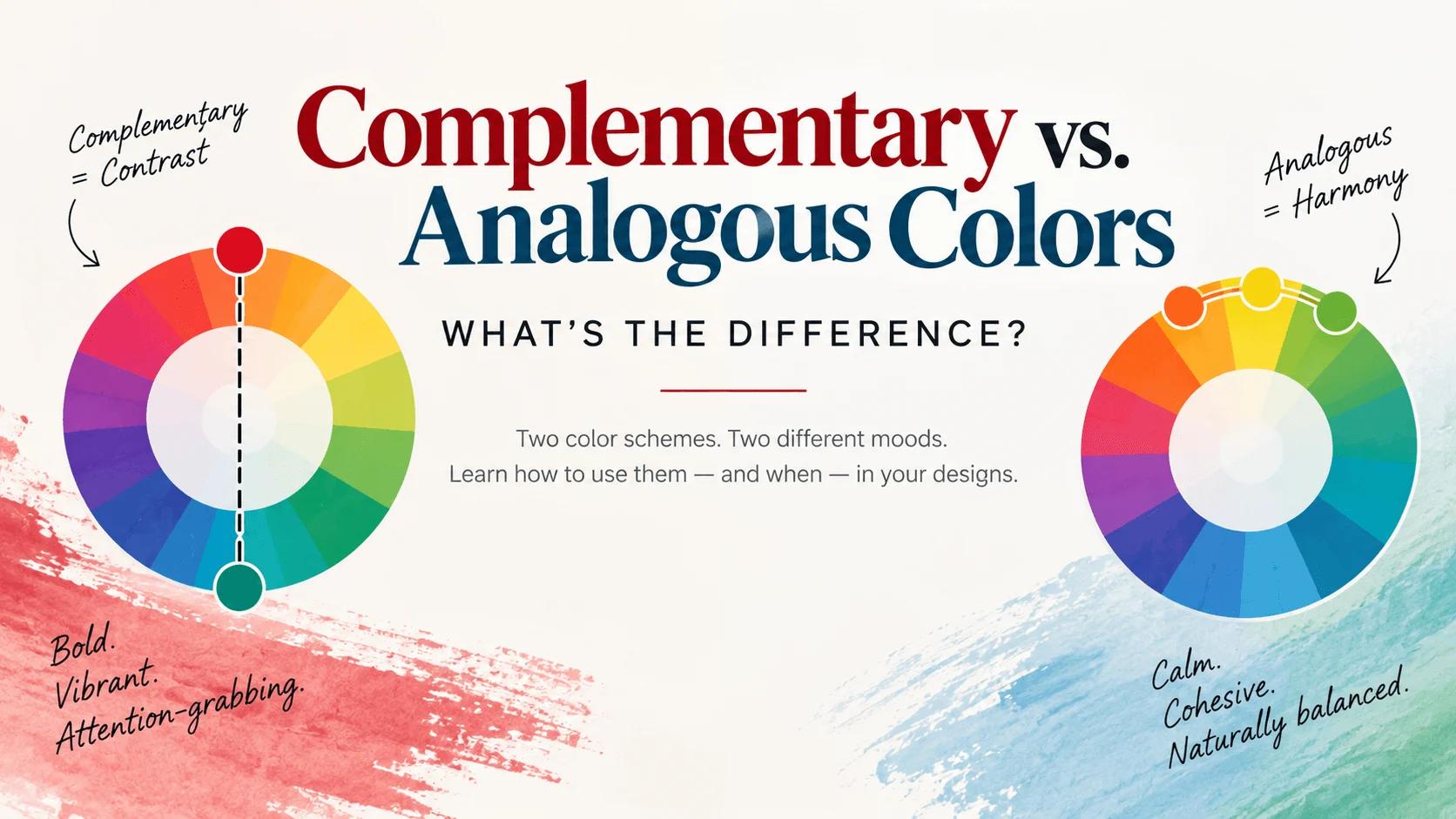
Complementary vs. Analogous Colors: What's the Difference?
Complementary colors sit opposite each other on the wheel for bold contrast; analogous colors sit next to each other for harmony. Real examples and when to use each.
Color Wheel 101: How to Use It to Pick a Color Scheme
The color wheel organizes every hue by how it relates to the others. Learn the five classic color schemes you can read straight off the wheel — with a tool to generate them.
What Colors Go Together? 12 Color Combinations That Always Work
Not sure which colors go together? Start with these 12 foolproof combinations — complementary pairs, seasonal palettes and neutral-anchored schemes with hex codes.