
Complementary vs. Analogous Colors: What's the Difference?
Color Theory9 min read
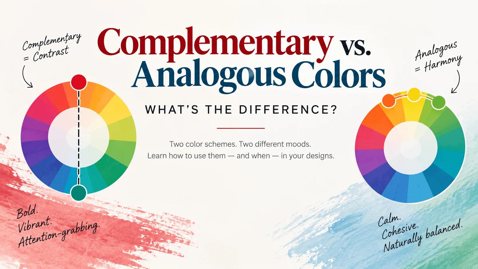
Pick two colors for a project and you'll usually end up in one of two moods without quite knowing why. Sometimes the combination feels loud, electric, almost impossible to look away from. Other times it feels calm, cohesive, like the colors were always meant to sit together. That's not a coincidence, and it's not just taste — it comes down to exactly where those colors sit on the color wheel.
Complementary and analogous colors are the two most common color schemes in design, and they sit at opposite ends of that spectrum on purpose. One is built for contrast. The other is built for harmony. Once you understand the difference, you'll start noticing it in logos, websites, paintings, and even outfits everywhere you look.
Key Takeaways
- Complementary colors sit directly opposite each other on the color wheel (like red and green, or blue and orange). They create strong contrast and grab attention fast.
- Analogous colors sit next to each other on the color wheel (like blue, blue-green, and green). They create a smooth, harmonious look with much lower contrast.
- Use complementary colors when you want something to stand out — buttons, logos, anything that needs to be noticed immediately.
- Use analogous colors when you want a calm, cohesive feel — backgrounds, editorial layouts, anything meant to be looked at for a while.
- The two aren't mutually exclusive. A lot of strong designs use an analogous color family as the base, with a single complementary color dropped in as an accent.
What Do These Terms Actually Mean?
Both terms describe a color's position on the color wheel, the circular chart that arranges hues in the order they naturally blend into each other. Where a color sits on that wheel determines which scheme it belongs to.
Complementary means directly across from each other, on opposite sides of the wheel. Analogous means right next to each other, sharing a close family relationship. That's really the whole foundation — everything else about how each scheme looks and feels flows from that one positional difference.
Complementary Colors: The Attention-Grabbers
Complementary colors are pairs that sit exactly opposite one another on the wheel. The classic combinations are red and green, blue and orange, and yellow and purple.
- Red (
#E63946) and Green (#2A9D8F) - Blue (
#457B9D) and Orange (#F4A261) - Yellow (
#FFD60A) and Purple (#6A4C93)
Here's what makes these pairings feel so intense: when two opposite colors sit next to each other, each one actually makes the other look more vivid than it would on its own. Color theorists call this "simultaneous contrast," and it's a genuinely real perceptual effect, not just a design trend. Your eyes and brain amplify the difference automatically.
That's exactly why so many logos, sports uniforms, and warning signs use complementary pairs — they're easy to spot from far away and hard to ignore up close. If you want something in your design to jump off the page, a complementary pair is usually the fastest way to get there.
One fun bit of color trivia: this only works when the colors sit side by side. If you actually mix two complementary paints together, they cancel each other out instead of amplifying, usually turning into a dull gray or brown. Painters use that trick deliberately to mix realistic shadows, but it's the opposite of the vibrant effect you get by keeping the colors separate.
Best for: call-to-action buttons, logos, sports branding, anything that needs to be noticed immediately.
Analogous Colors: The Harmony Builders
Analogous colors are groups that sit right next to each other on the wheel, usually three to five hues in a row. Because they're neighbors, they share a common base and blend into each other naturally.
- Warm family: Red (
#E63946), Orange (#F4A261), Yellow (#FFD60A) - Cool family: Blue (
#457B9D), Teal (#2A9D8F), Green (#52B788)
This is the color relationship you see constantly in nature, which is a big part of why it feels so effortless and calming. Think of a sunset sliding from red into orange into yellow, or a forest moving from deep green into blue-green into blue at dusk. Nothing about that transition feels jarring, because each color is only a small step away from the one next to it.
There's one rule worth keeping in mind: stick to a fairly narrow range. Three to four neighboring hues usually works best. Stretch an analogous scheme too far around the wheel, and you start losing the "shared family" feeling that makes it work in the first place.
Best for: backgrounds, editorial and blog layouts, wellness and lifestyle brands, anything meant to feel calm and put-together rather than urgent.
Complementary vs. Analogous, at a Glance
- Position on the wheel: Complementary = opposite. Analogous = neighboring.
- Contrast level: Complementary = high. Analogous = low.
- Overall feeling: Complementary = energetic, bold, attention-grabbing. Analogous = calm, cohesive, easy to sit with.
- Common use case: Complementary = accents, buttons, logos. Analogous = backgrounds, full palettes, long-form content.
- Risk if overused: Complementary can feel jarring or overwhelming in large amounts. Analogous can feel flat or monotonous if it stretches too far around the wheel.
Which One Should You Actually Use?
It depends entirely on what you want people to feel. A brand chasing energy and excitement tends to lean toward bold, high-contrast combinations, while a brand aiming for trust, calm, or reliability tends to lean toward closely related, analogous hues. Neither approach is "correct" — they're just aimed at different emotional outcomes.
The honest answer for most real projects is that you don't have to pick just one. A common, highly effective pattern is to build your main palette out of analogous colors for a cohesive base, then drop in a single complementary color as your accent — for your buttons, links, or anything else that needs to catch the eye. This is the same underlying logic we covered in our post on the best color combinations for a website: a calm foundation with one deliberate pop of contrast tends to outperform an entire palette built on either extreme.
What About Split-Complementary, Triadic, and Other Schemes?
Complementary and analogous are the two most common schemes, but they're not the only ones. A split-complementary scheme takes a base color and pairs it with the two colors sitting next to its complement, rather than the complement itself — it keeps a lot of the contrast while softening the intensity slightly. A triadic scheme uses three colors spaced evenly around the wheel for a bold but balanced look, and a tetradic scheme uses two complementary pairs together for a richer, more complex palette.
If you want the full breakdown of how all of these color harmonies work together, our complete guide to complementary colors goes deeper into the theory behind each one.
How to Build Either Scheme Yourself
The easiest way to actually see these relationships is to stop imagining them and start looking at them directly. Our color wheel tool shows complementary and analogous relationships in real time as you pick a base color — spin through a few hues and watch how the "opposite" and "neighboring" colors shift along with it. If you want a full walkthrough of how to use it, check out our guide on how to use a color wheel.
Once you've found a direction you like, our color palette generator can build out a full palette from a single starting color, and our color mixer lets you see exactly what happens when two colors blend together, including that classic muddy-gray effect that happens when true complements are mixed as pigment.
Common Mistakes to Avoid
A few things trip people up with both schemes:
- Using complementary colors at full saturation everywhere. Two intensely bright opposite colors covering equal amounts of space can create an uncomfortable "vibrating" effect. Let one color dominate and use the other sparingly as an accent instead.
- Stretching an analogous palette too far. Once you go much past four or five neighboring hues, the sense of harmony starts to break down and the palette can feel unfocused.
- Forgetting about lightness and saturation. Two colors can be technically complementary or analogous and still clash badly if one is much darker, brighter, or more saturated than the other. Adjusting brightness and intensity matters just as much as picking the right hue.
FAQs
Can I combine complementary and analogous colors in the same design? Yes, and it's actually one of the most common approaches in real design work. Build your base palette from analogous colors, then add a single complementary color as an accent for anything that needs extra attention.
Why do complementary colors look muddy when I mix them as paint, but fine as separate colors on a screen? Mixing pigments works differently from placing colors side by side. When you physically combine two complementary paints, they cancel each other's color out and shift toward gray or brown. Placed next to each other instead of mixed, they do the opposite — each one makes the other look more vivid.
How many colors should an analogous scheme include? Three to four neighboring hues is the sweet spot. Going much wider than that starts to dilute the sense of harmony that makes analogous schemes work.
Which is better for a website: complementary or analogous? Neither is universally better — it depends on the feeling you're going for. Analogous schemes tend to work well as an overall base, while a single complementary color often works best as an accent for buttons and calls to action.
What is a split-complementary color scheme? It's a softer variation of a complementary scheme. Instead of pairing a color with its direct opposite, you pair it with the two colors sitting next to that opposite, which keeps strong contrast while feeling slightly less intense.
Wrap-Up
Complementary and analogous colors aren't competing techniques — they're two different tools built for two different jobs. One exists to grab attention, the other exists to create calm, and the best designs usually know exactly when to reach for each one. Once you start seeing the color wheel this way, picking a palette stops feeling like guesswork and starts feeling like a decision you can actually explain.
Tools for this guide
Related posts
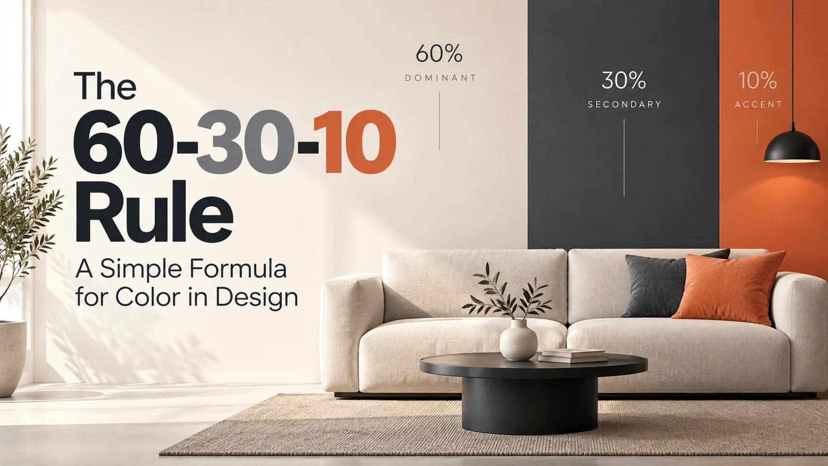
The 60-30-10 Rule: A Simple Formula for Color in Design
The 60-30-10 color rule explained — how to split any palette into a dominant, secondary, and accent color, with real hex codes and CSS for web design.
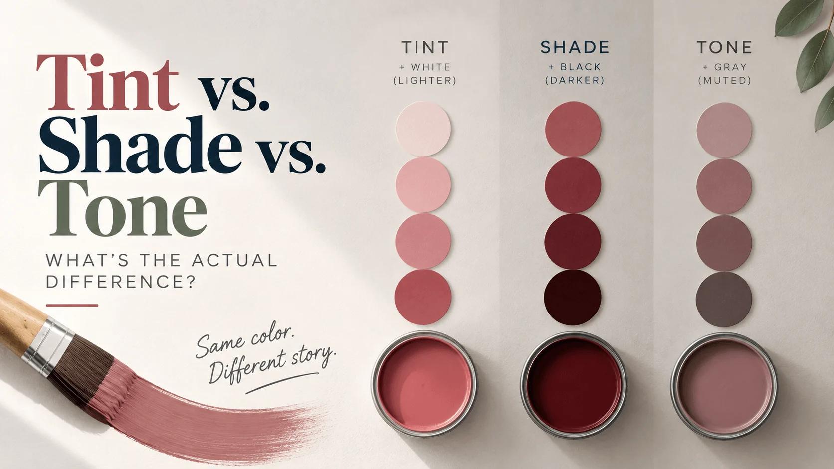
Tint vs. Shade vs. Tone: What's the Actual Difference?
Tint (+white), shade (+black), and tone (+gray) explained clearly — with a real hex example, CSS code, and where each one actually belongs in design.