Accessible Color Palettes
Every palette here names the text color and the surface it sits on, and the ratio is measured live with the same maths the contrast checker uses — so you can copy a pair knowing the type is readable before you start designing.
Ink on Paper
16.98:1Long-form reading, documentation, editorial layout
#111827 · #4B5563 · #9CA3AF · #E5E7EB · #F9FAFB
The safest possible pairing: near-black type on a near-white page. Nothing competes with the text.
Readable by default
The quick brown fox jumps over the lazy dog.
#111827 on #F9FAFB
Midnight UI
14.42:1Dark-mode interfaces, dashboards, developer tools
#0F172A · #1E293B · #334155 · #94A3B8 · #E5E7EB
Light grey on deep navy rather than pure white on pure black, which cuts the glare that makes long dark sessions tiring.
Readable by default
The quick brown fox jumps over the lazy dog.
#E5E7EB on #0F172A
Ocean Depth
8.87:1Fintech, data dashboards, trust-led brands
#0C4A6E · #0369A1 · #0EA5E9 · #7DD3FC · #F0F9FF
A single blue family stepped from dark surface to light text, so hierarchy comes from lightness alone.
Readable by default
The quick brown fox jumps over the lazy dog.
#F0F9FF on #0C4A6E
Forest Calm
8.80:1Sustainability, wellness, outdoor brands
#14532D · #166534 · #22C55E · #BBF7D0 · #F7FEE7
Deep green surface with a near-white tint for text — an earthy palette that still clears AAA.
Readable by default
The quick brown fox jumps over the lazy dog.
#F7FEE7 on #14532D
Plum Light
13.97:1Beauty, wellness, subscription products
#3B0764 · #7E22CE · #A855F7 · #E9D5FF · #FAF5FF
Dark plum type on a violet-tinted white, which keeps the palette soft without sacrificing contrast.
Readable by default
The quick brown fox jumps over the lazy dog.
#3B0764 on #FAF5FF
Terracotta Warm
14.74:1Hospitality, food, artisan brands
#431407 · #9A3412 · #EA580C · #FED7AA · #FFF7ED
Warm brown type on cream: the highest-contrast earthy palette here, and the friendliest to read.
Readable by default
The quick brown fox jumps over the lazy dog.
#431407 on #FFF7ED
Slate and Sky
16.30:1SaaS interfaces, docs, product marketing
#0F172A · #334155 · #0284C7 · #BAE6FD · #F1F5F9
A neutral slate stack with one sky-blue accent that is dark enough to carry white text on buttons.
Readable by default
The quick brown fox jumps over the lazy dog.
#0F172A on #F1F5F9
Sand and Espresso
16.37:1Leather goods, coffee, menswear
#1C1917 · #57534E · #78350F · #D6D3D1 · #FAF7F2
Espresso text on sand, with a mid-brown accent for links and borders.
Readable by default
The quick brown fox jumps over the lazy dog.
#1C1917 on #FAF7F2
Teal and Cream
13.87:1Healthcare, spa, wellness clinics
#042F2E · #115E59 · #14B8A6 · #99F6E4 · #F0FDFA
A cool, clinical palette that stays readable because the text color sits at the darkest end of the same hue.
Readable by default
The quick brown fox jumps over the lazy dog.
#042F2E on #F0FDFA
Burgundy and Blush
14.23:1Editorial fashion, wine, beauty packaging
#4C0519 · #9F1239 · #E11D48 · #FECDD3 · #FFF1F2
Deep burgundy type on a blush surface — a romantic palette built on a single red family.
Readable by default
The quick brown fox jumps over the lazy dog.
#4C0519 on #FFF1F2
Indigo and Mint
10.91:1Education, kids products, playful interfaces
#312E81 · #4F46E5 · #34D399 · #A7F3D0 · #F0FDF4
Complementary but controlled: indigo text, mint surface, and enough lightness between them for AAA.
Readable by default
The quick brown fox jumps over the lazy dog.
#312E81 on #F0FDF4
Graphite and Amber
17.08:1Developer tools, analytics, warning states
#18181B · #3F3F46 · #B45309 · #FDE68A · #FFFBEB
Neutral graphite type with an amber accent reserved for emphasis, so warnings stand out without shouting.
Readable by default
The quick brown fox jumps over the lazy dog.
#18181B on #FFFBEB
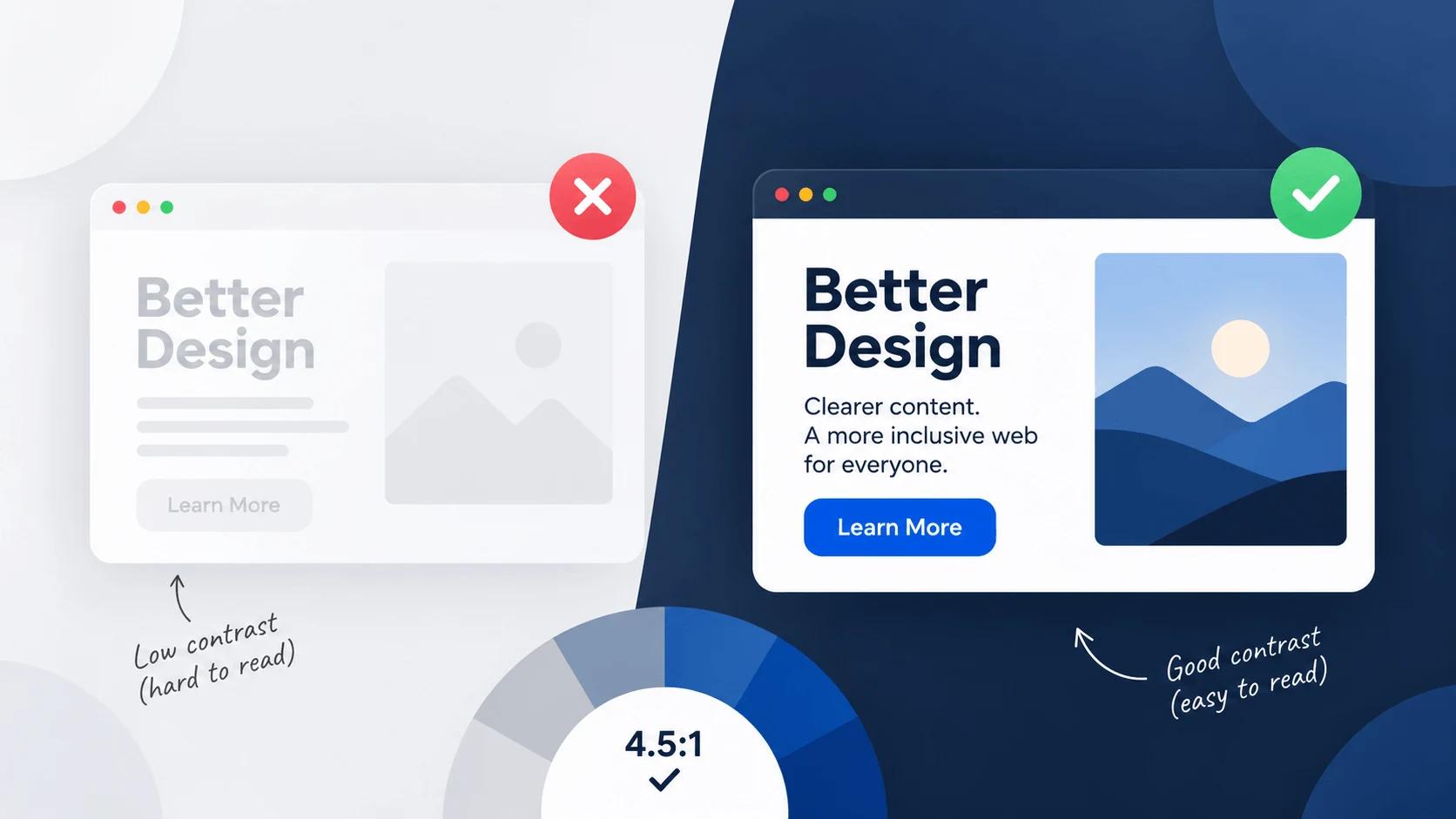
An accessible palette is not a different kind of palette — it is one where the foreground and background colors were chosen together and measured. WCAG 2.x asks for a contrast ratio of at least 4.5:1 for normal-size text and 3:1 for large text (18pt, or 14pt bold); AAA raises those to 7:1 and 4.5:1. Every palette here states its text and surface pair, so you can trace exactly which two colors produce the ratio, and each row shows all four verdicts at once.
Frequently asked questions
At least 4.5:1 between text and its background for body copy, and 3:1 for large text, icons and UI borders. Aim for 7:1 when the content is long or the audience is older.
Good to know
- 12 palettes, 12 clearing AA for normal text and 12 clearing AAA.
- Ratios are computed live from the hex values shown — nothing is hardcoded.
- Each palette supplies its own surface, so it works as a light or a dark theme.
Check your own colors
Measure any pair against WCAG, simulate color blindness, or build a palette from a single base color.
Guides for Contrast Checker
Longer reads for the questions that come up around contrast checker.