
Color Contrast for Web Design: A Beginner's Guide
Web Design10 min read
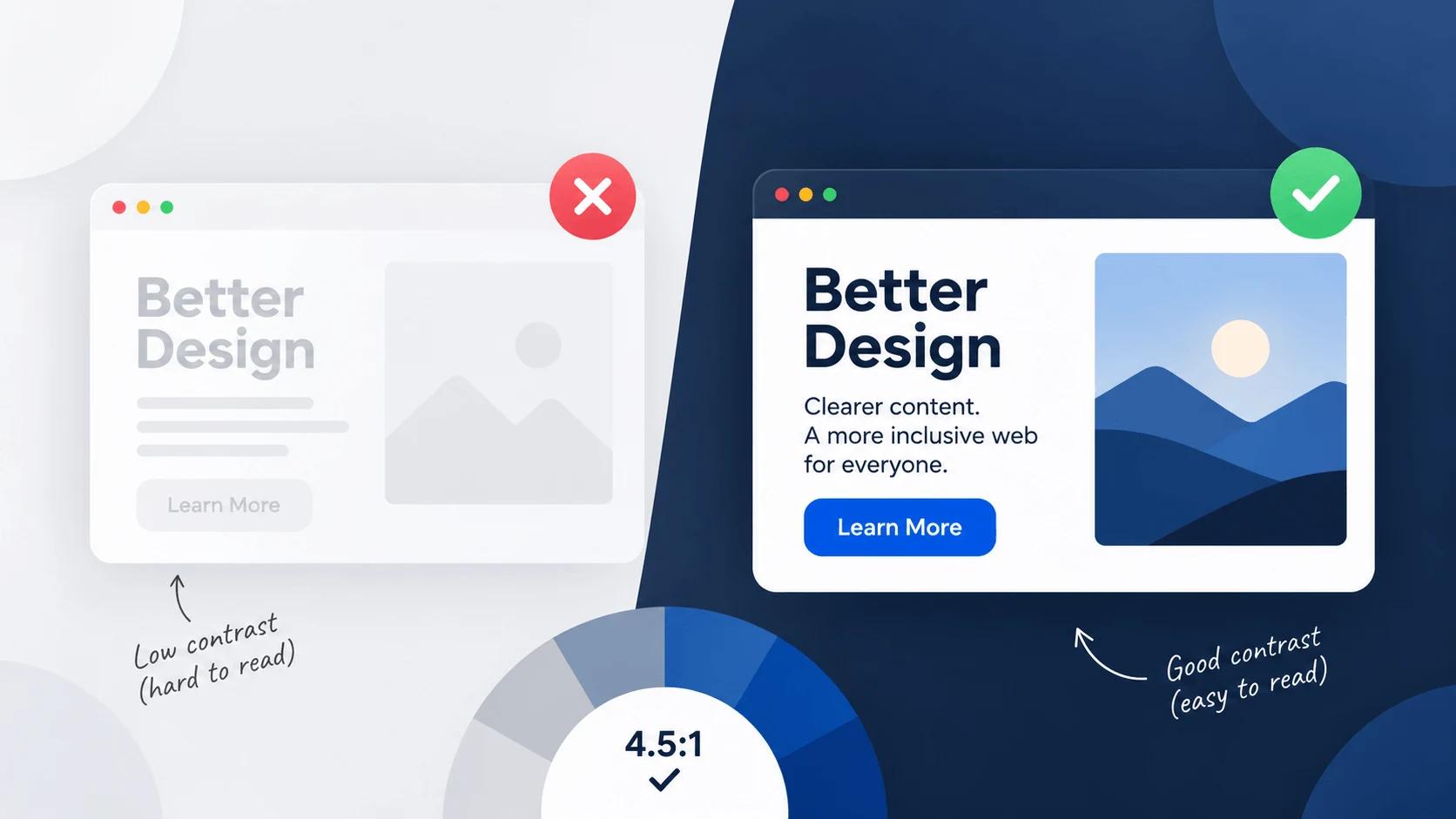
Here's a number worth sitting with for a second: more than 80% of homepages on the internet right now fail basic color contrast standards. Not obscure, hard-to-meet standards either — the baseline stuff. Pale gray text on white backgrounds. Thin, light-colored headlines on busy photos. The kind of thing that looks perfectly fine on a designer's laptop and then becomes genuinely unreadable for a huge chunk of real visitors.
Color contrast is one of those topics that sounds like a small detail until you realize how many people it actually affects, and how quickly it's turning from "nice to have" into an actual legal requirement in a lot of places. This guide walks through exactly what it is, the real numbers you need to know, and how to check your own work without any guesswork.
Key Takeaways
- Color contrast measures how easily text (or an icon) can be told apart from its background.
- Normal text needs a contrast ratio of at least 4.5:1 to meet the standard accessibility level (WCAG AA). Large text needs 3:1.
- The stricter AAA level asks for 7:1 on normal text and 4.5:1 on large text.
- This isn't just a best practice anymore — the EU's European Accessibility Act made WCAG 2.1 AA a legal requirement for many digital products as of June 2026.
- The most common contrast failure is light gray text on a white background — a color combination that looks "clean" but is genuinely hard to read for a lot of people.
- Never rely on color alone to communicate something important, like an error message or a chart category.
What Is Color Contrast, Exactly?
Color contrast is the measurable difference in brightness between two colors, usually text and whatever sits behind it. It's expressed as a ratio, like 4.5:1, which tells you how much darker or lighter one color is compared to the other.
The important word there is measurable. Contrast isn't something you eyeball and call "good enough" — it's calculated using a specific formula based on how bright each color actually is, and that calculation is exactly what accessibility standards are built around.
The Core Numbers: WCAG Contrast Ratios Explained
The Web Content Accessibility Guidelines, or WCAG, set the global standard here, and pretty much every accessibility rule you'll ever hear referenced traces back to it. There are three levels: A (the bare minimum), AA (the standard most sites aim for, and the one referenced in most laws), and AAA (the strictest, reserved for situations where accessibility really can't be compromised, like government or healthcare sites).
Here's what each level actually requires:
- Normal text, AA: at least 4.5:1
- Large text, AA (roughly 24px, or 18.66px bold, and up): at least 3:1
- Normal text, AAA: at least 7:1
- Large text, AAA: at least 4.5:1
- UI components and meaningful icons: at least 3:1
For reference, pure black text on a pure white background hits 21:1 — the highest ratio that's mathematically possible. Most real designs won't reach that extreme, and honestly, they don't need to. AA is the realistic, widely-accepted target for the vast majority of websites.
Why This Isn't Just a "Nice to Have" Anymore
For a long time, contrast was treated as a courtesy — a good habit, but not something anyone would actually enforce. That's changed, and it's changed fast.
In the United States, courts have repeatedly interpreted the Americans with Disabilities Act as applying to websites, and they consistently point to WCAG 2.1 AA as the benchmark when deciding whether a site is accessible enough. Lawsuits and settlements over inaccessible websites aren't rare anymore — they're common enough that plenty of businesses have had to fix their entire color system after the fact, which is a lot more expensive than getting it right the first time.
In the European Union, it's gone a step further. The European Accessibility Act made WCAG 2.1 AA compliance a legal requirement for many digital products and services, with a compliance deadline of June 28, 2026 — a date that, as of this writing, has already come and gone. If your website serves users in the EU, this isn't a future concern anymore. It's a current one.
Who Actually Benefits From Good Contrast
It's easy to think of contrast as something that only matters for people with a diagnosed vision condition, but the real list of people it affects is much longer than that.
- People with low vision or color blindness (roughly 1 in 12 men have some form of color blindness)
- Older adults, since the eye's ability to distinguish contrast naturally declines with age
- Anyone using their phone outside in bright sunlight, where washed-out screens make low-contrast text nearly invisible
- Anyone on a cracked screen, a cheap monitor, or a phone running in a dimmed, battery-saving mode
That last group is worth sitting with for a moment. Good contrast doesn't just help a specific category of user — it makes a site more readable for basically everyone, in basically every real-world condition a screen might be viewed in. That's a big part of why it matters so much more than a lot of people initially assume.
The Mistake Almost Every Designer Makes
If there's one specific failure that shows up more than any other, it's this: light gray text on a white background. Designers reach for a soft gray like #999999 or #aaaaaa all the time because it looks subtle and elegant on screen. The problem is that both of those colors fail WCAG AA on a white background — sometimes by a lot.
Here's the actual number worth remembering: on a pure white background, a gray needs to be roughly #767676 or darker to pass the 4.5:1 requirement for normal text. Anything lighter than that, and you're looking at a genuine accessibility failure, no matter how nice it looks in your design file.
How to Actually Test Your Colors
Here's the good news: you never have to calculate any of this by hand. Drop your text color and background color into our contrast checker, and it instantly tells you the exact ratio and whether it passes AA, AA Large, or AAA. It takes about ten seconds, and it removes all the guesswork.
If you're curious about the actual math happening behind the scenes, we walked through calculating a real contrast ratio by hand in our breakdown of Spotify's brand green — it's a good rabbit hole if you want to understand the "why," but for everyday design work, a tool doing the math for you is genuinely the right call.
A couple of other reliable options worth knowing about: most modern browsers (Chrome, Firefox, and Edge) now show a contrast ratio directly inside their built-in developer tools — right-click any text, choose "Inspect," and look at the color swatch in the styles panel. It's a fast way to double-check contrast on a live site without leaving the browser.
One important caveat: automated tools are great, but they're not perfect. They can struggle with text placed over gradients, text layered on top of photos, or text that gets rendered by JavaScript after the page loads. For anything unusual like that, it's worth doing a manual, human double-check rather than trusting an automated scan alone.
Dark Mode Has Its Own Rules
Here's something a lot of beginner guides skip entirely: contrast doesn't behave the same way once you flip to a dark theme.
Pure white text (#FFFFFF) on a very dark background like #121212 actually produces an extremely high contrast ratio — around 18:1, well past even the strictest AAA requirement. That sounds great on paper, but in practice, that much contrast in a dark environment can actually cause eye strain, especially at night. That's why a lot of well-built design systems intentionally use a slightly softened off-white, something like #E2E8F0, instead of pure white for dark-mode text. It still comfortably passes accessibility standards while being noticeably easier on the eyes.
There's a second trap here too: a color that passes contrast comfortably in light mode won't necessarily pass in dark mode. A blue link color that looks great and passes AA against a white background might fail completely once it's placed against a dark background instead. If your site supports both light and dark themes, you genuinely need to test both separately — passing one doesn't guarantee the other.
Don't Forget: Color Alone Isn't Enough
There's a related rule that's just as important as the ratio itself: never use color as the only way to communicate something meaningful. If a form field shows an error, don't just turn the border red — add an icon or a short text message too, since a colorblind user might not register the red at all. The same goes for charts and graphs: if two lines are only distinguishable by color, add different line styles or direct labels as well.
This is a simple rule, but it's the kind of thing that's easy to forget in the middle of a design, especially when the color difference feels obvious to you personally.
How to Fix a Failing Color Pair
If you run a color combination through a checker and it fails, the fix is usually simpler than people expect:
- Darken the text, or lighten the background, until the ratio clears the threshold you need.
- Keep the hue roughly the same while you adjust — you're changing brightness, not necessarily changing the color's identity entirely.
- Re-test after every change. Small adjustments can shift a ratio more than you'd expect.
- Check large text and normal text separately, since headlines and body copy often use different colors and sizes, and each has its own threshold.
Try It Yourself
The easiest way to build good contrast habits is to check as you go, not after the fact. Use our contrast checker any time you're picking a text-and-background pairing, and if you're building a palette from scratch, our color palette generator is a good way to explore combinations before committing to one. Want to fine-tune an exact shade until it clears a specific ratio? Our color picker lets you adjust lightness and see the resulting hex code in real time.
FAQs
What is a good contrast ratio for a website? For most websites, aim for at least 4.5:1 for normal text and 3:1 for large text — that's the WCAG AA standard, which is also the level most commonly referenced in accessibility laws.
Is WCAG AA a legal requirement? In the United States, courts have consistently referenced WCAG 2.1 AA in ADA-related website accessibility cases, even though there's no single explicit numeric law. In the European Union, the European Accessibility Act has made WCAG 2.1 AA a formal legal requirement for many digital products and services as of June 2026.
Why does gray text on white so often fail contrast checks? Because popular "soft" grays like #999999 and #aaaaaa simply aren't dark enough. On a white background, a gray generally needs to be around #767676 or darker to meet the AA standard for normal text.
Does dark mode need different contrast colors than light mode? Yes. Colors that pass comfortably in light mode can fail in dark mode, and vice versa. Each theme needs to be checked and adjusted on its own.
Can I rely on an automated contrast checker for my whole site? Automated tools are a great starting point, but they can miss issues involving gradients, background images, or text added by JavaScript. Use a tool for the bulk of your checking, then manually review anything unusual.
Wrap-Up
Color contrast is one of the rare areas of web design where doing the right thing and doing the smart thing are exactly the same move. It takes a few extra minutes per color decision, it makes your site genuinely easier to use for a huge range of real people, and increasingly, it keeps you on the right side of the law. Check your colors before you ship, not after — future you will be glad you did.
Tools for this guide
Related posts
Best Color Combinations for a Website (Real Examples)
7 real website color combinations with hex codes — deep blue and gray, navy and gold, digital lavender, and more — plus why each one works and who it fits.

The 60-30-10 Rule: A Simple Formula for Color in Design
The 60-30-10 color rule explained — how to split any palette into a dominant, secondary, and accent color, with real hex codes and CSS for web design.