Color Schemes
A color scheme is a set of colors built from one base hue with a fixed rule on the color wheel. Choose a base color below and all six classic schemes update at once, so you can compare the relationships side by side — then copy whichever values you need.
All six color schemes for #7c3aed
Every card is generated from the same base color, so only the harmony rule changes. Click any swatch to copy its hex code; in the worked examples below, each swatch opens its closest named color page.
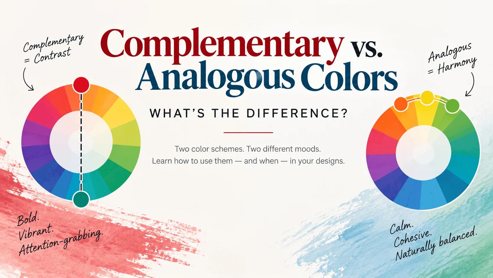
Complementary
Base + 180°Focal points, buttons and badges — one hue dominant, the other as an accent.
Analogous
Base ± 30°Backgrounds, long-form content and calm interfaces — add one outside accent for focus.
Triadic
Base + 120° / + 240°Logos, illustration and categorical charts — pick one hue to dominate.
Split-complementary
Base + 150° / + 210°Dashboards, data visualisation and product UI — confident but not aggressive.
Tetradic
Base + 90° / 180° / 270°Design systems and multi-series charts — needs neutrals to stay readable.
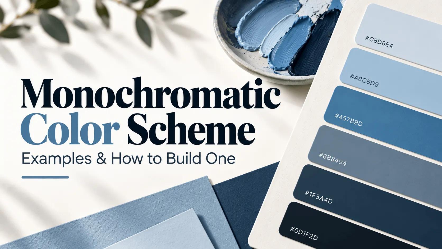
Monochromatic
One hue, five lightness stepsBrand ramps and Tailwind-style scales — hierarchy comes from lightness.
What is a color scheme?
A color scheme is a set of colors chosen so that they work together — usually derived from a single base hue with a fixed geometric rule on the color wheel. Those rules exist because hue positions are predictable: colors a certain number of degrees apart relate in a certain way, whether that is maximum contrast, quiet harmony or an even spread. Following a rule is what stops a palette from feeling accidental.
A scheme is not a finished palette. In practice you take the scheme’s hues, then add neutrals for surfaces and text, plus a few lightness steps so each hue can play more than one role. Contrast, not hue, is what decides whether the result is readable.
The six classic color scheme types
Each row is one rule from the wheel. The sections below show a worked example of every scheme, and the generator at the top of this page applies all six to whichever base color you pick.
| Scheme | How it is built | Feel | Best for |
|---|---|---|---|
| Complementary | Base + 180° | Bold, high contrast | Buttons, badges, focal points |
| Analogous | Base ± 30° | Calm, cohesive | Backgrounds, long-form pages |
| Triadic | Base + 120° / + 240° | Balanced, playful | Logos, illustration, categories |
| Split-complementary | Base + 150° / + 210° | Confident, low tension | Dashboards, data viz, product UI |
| Tetradic | Base + 90° / 180° / 270° | Rich, expressive | Design systems, chart series |
| Monochromatic | One hue, five lightness steps | Unified, restful | Brand ramps, dark mode |
Complementary color scheme
A complementary color scheme pairs two hues that sit directly opposite each other on the color wheel — 180° apart.
- 2 colors
- Bold, high contrast
- Buttons, badges, focal points
#db143c #14dbb4 — built from Crimson (#DC143C)
Because the two hues share no common color, the eye reads them as a deliberate contrast: each makes the other look more vivid, an effect called simultaneous contrast. That makes a complementary pair the fastest way to create a focal point — a red button on a green-tinted surface, an orange accent in a blue interface. The catch is vibration. Large areas of full-strength complements can feel harsh, so most production designs keep one hue dominant and the other small, or desaturate one side. Contrast is not guaranteed either: red and green are complements yet often share a luminance, so text on a complementary pair still has to pass a contrast check.
Analogous color scheme
An analogous color scheme uses three hues that sit next to each other on the color wheel — usually the base color plus the hues 30° either side.
- 3 colors
- Calm, cohesive
- Backgrounds, long-form pages
#b881ee #ee81ee #ee81b8 — built from Violet (#EE82EE)
Neighbouring hues share an undertone, so an analogous palette reads as a single family: cohesive, calm and easy on the eye. It is the natural choice for backgrounds, documentation and marketing sites that should feel considered rather than loud. The trade-off is contrast. Adjacent hues have similar lightness and saturation, so hue alone rarely produces a focal point — add one accent from outside the family, or lean on lightness with a pale tint against a deep shade of the same hue. Analogous schemes are also forgiving in dark mode, because a single hue family shifts cleanly onto a darker surface without breaking its relationships.
Triadic color scheme
A triadic color scheme takes three hues spaced evenly around the wheel — 120° apart from each other.
- 3 colors
- Balanced, playful
- Logos, illustration, categories
#51c878 #7851c8 #c87851 — built from Emerald (#50C878)
Even spacing gives a triadic palette natural balance: no single hue dominates and the eye can move between them without the tension of a complementary pair. Three colors also give you enough range for a primary, a secondary and an accent without reaching for neutrals, which is why triads show up in logos, illustration and playful marketing. The risk is over-saturation — three full-strength hues at equal weight look chaotic in an interface. Pick one as the dominant color, keep the other two for smaller areas, and let off-white or light gray carry the structure. For data work, a triad is the quickest way to build a categorical series where every item must be clearly distinguishable.
Split-complementary color scheme
A split-complementary color scheme uses the base color plus the two hues either side of its complement — 150° and 210°.
- 3 colors
- Confident, low tension
- Dashboards, data viz, product UI
#008080 #800040 #804000 — built from Teal (#008080)
It delivers most of the contrast of a complementary pair with much less tension. Instead of one opposite hue you get two neighbours of the opposite hue, which reads as confident rather than confrontational — the reason it is common in dashboards, data visualisation and product interfaces. In practice a split-complementary scheme behaves like a three-color system: the base hue carries the brand, and the two split hues separate primary from secondary information. Because those two hues sit close together they also create hierarchy on their own — use one more than the other. Check any text you place on the base hue, since the base is usually the lightest or darkest of the three.
Tetradic color scheme
A tetradic (rectangular) color scheme is four hues arranged as two complementary pairs — the base, its complement, and each of their 90° neighbours.
- 4 colors
- Rich, expressive
- Design systems, chart series
#0000ff #ff0080 #ffff00 #00ff80 — built from Blue (#0000FF)
Four colors give you the widest range of any classic scheme, which makes tetradic palettes ideal for systems rather than single screens: a product with several feature areas, a chart with four series, an illustration with multiple subjects. The problem is discipline. Four hues at equal weight cancel each other out, so area and contrast do the work — choose one dominant hue, give each remaining hue a distinct job, and let neutrals fill the space between them. A tetradic set also benefits from rounding: pull all four hues toward a shared temperature, all slightly warm or all slightly cool, so the palette feels chosen rather than assembled at random.
Monochromatic color scheme
A monochromatic color scheme uses a single hue at several lightness and saturation levels — from a near-white tint, through the base, to a deep shade.
- 5 colors
- Unified, restful
- Brand ramps, dark mode
#4d4100 #a38b00 #ffd900 #ffe75c #fff4b3 — built from Gold (#FFD700)
Because every color comes from the same hue, the palette cannot clash. That makes it the safest scheme to hand to developers and the easiest to extend: add steps, flip to dark mode, or map each step onto a role such as surface, border, accent and text without breaking harmony. It is how most design systems express a single brand color — a Tailwind 50–950 scale is a monochromatic ramp. The one thing a monochromatic scheme cannot do is signal difference by hue, so hierarchy has to come from lightness. Keep at least a 3:1 contrast ratio between neighbouring steps, and reserve the extremes for backgrounds and text.
How to choose a color scheme
Start from one color you already have — usually a brand color — and pick the scheme that matches how much contrast the design needs. Analogous and monochromatic schemes suit calm, content-heavy interfaces, because neighbouring and single-hue palettes hold their relationships as you add steps. Split-complementary suits product interfaces that need a confident accent without a fight. Complementary is for a single focal point, and tetradic is for systems with several equally important color roles.
Then decide how the colors share the space. The 60-30-10 rule is a good default: roughly 60% of the layout in a dominant neutral or base hue, 30% in a secondary color, and 10% in the accent that carries emphasis. Left to themselves, equally weighted hues fight each other — area is what creates hierarchy.
Finally, test the result instead of trusting it. Every text and background pair should reach a WCAG AA contrast ratio of 4.5:1 for body text, or 3:1 for large text and UI borders — check them with the contrast checker. A palette can be beautiful and still be unreadable, and contrast is the only thing that changes that. The palette guide walks through the same process end to end.
Color schemes in CSS
A scheme becomes useful once it is mapped onto roles rather than numbered colors. Define the hues you picked as custom properties, name them for the job they do, and the palette stops being decoration and starts being a system:
:root {
  --surface: #ffffff;
  --text: #1a1523;
  --accent: #7c3aed;      /* base hue */
  --accent-soft: #ede9fe; /* tint of the base */
  --accent-deep: #4c1d95; /* shade of the base */
}
For a single-hue scale, the Tailwind color generator exports a 50–950 ramp as CSS variables or a config block, and the palette generator exports any of these schemes as HEX, RGB, HSL, CSS variables or JSON. If the same hues need to blend into a background wash or a button fill, the gradient generator handles that too.
Every scheme on this page is generated from one base color with the same harmony rules used by the color wheel and the palette generator, so a color behaves identically whichever tool you open it in.
Frequently asked questions
Complementary (hues 180° apart), analogous (neighbouring hues), triadic (three hues 120° apart), split-complementary (the base plus the two hues either side of its complement), tetradic (four hues in two complementary pairs) and monochromatic (one hue at several lightness levels).
Good to know
- Switching the base color changes all six schemes together, so you can compare rules without losing your place.
- Schemes are HSL rotations of the base hue, which keeps the relationship between the colors intact at any lightness.
- Click any swatch in the generator to copy its hex code, or copy a whole scheme in one click.
- The color wheel visualises these same six rules, and the palette generator adds locks, extra colors and CSS or JSON export.
Explore Color Tools
Take a scheme further with the color wheel, the palette generator and the contrast checker.
Guides for Color Schemes
Longer reads for the questions that come up around color schemes.