
Comfort Colors Color Chart Guide for Perfect Shade Selection
Color Theory24 min read
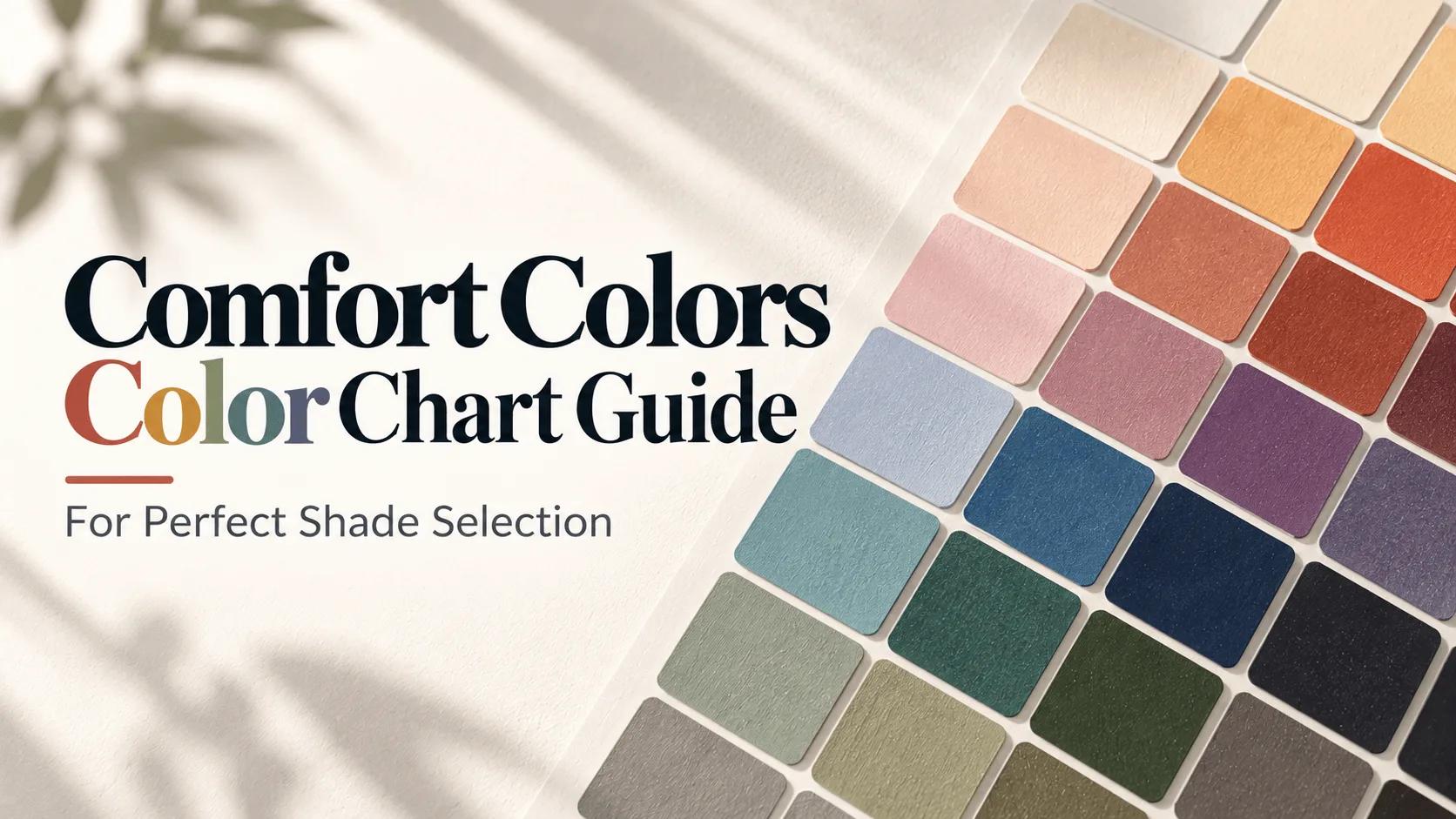
What if the “perfect” shirt color changes after printing, washing, or viewing it in natural light?
The comfort colors color chart compares 67 active colors offered on the Comfort Colors 1717 heavyweight T-shirt in 2026. New options, including Dusk, Neon Cantaloupe, and Rose Quartz, add fresh choices for custom apparel collections.
The garment-dyed 1717 uses 6.1-ounce ringspun cotton for a soft, matte finish. Its prewashed fabric limits normal wash shrinkage to about 1% to 2%. At GetCustom, sizes run from S through 4XL, giving teams and brands a broad fit range.
A comfort colors color selector can narrow choices, but it cannot replace a physical sample. Monitor settings, screen colors, and dye lots may change each shade’s appearance. Reviewing the actual garment before approval helps protect the final result.
Key Takeaways
- The Comfort Colors 1717 has 67 active colors in 2026.
- Dusk, Neon Cantaloupe, and Rose Quartz are notable current shades.
- Garment dyeing creates a soft, matte, worn-in appearance.
- Prewashing helps reduce typical wash shrinkage.
- Physical samples provide a more reliable color reference.
- The shirt supports plastisol, water-based, DTG, discharge, and embroidery decoration.
The comfort colors color chart: What Shoppers Should Know
Comfort Colors garments are sewn first and dyed after construction. This process lets dye reach seams, threads, cuffs, and other details. The result is a soft, worn-in look that may vary across each garment.
Shoppers can use the comfort colors color chart to compare shade families before ordering. The chart works best as a guide, not a promise of an exact match.
How garment dyeing affects color appearance
Most 1717 heavyweight T-shirt colors use pigment dye. Pigment particles rest near the cotton surface, creating a matte finish with a softly faded tone. Light colors such as Ivory, Butter, and Chalky Mint may receive a vintage wash for added softness.
Garment dyeing can make seams and edges look slightly different from the main fabric. This subtle variation gives Comfort Colors its relaxed, vintage character.
Why digital color references are only approximations
Hex values provide useful digital references, but they cannot show finished fabric with full accuracy. Monitor settings, lighting, cotton texture, and dye-lot variation can change how a shade appears.
For important projects, shoppers can compare a physical sample with the printed design. The comfort colors dye chart can support this review by showing how pigment dye and garment texture influence each color.
Current palette and seasonal availability
One 2026 reference lists 67 active colors for the 1717 style. Broader Comfort Colors product ranges include more than 80 colors across different garment styles. Core options include White, Ivory, Black, True Navy, Blanket Gray, and Terracotta.
Seasonal shades may remain available for shorter periods. Neon Pink, Chartreuse, and Watermelon can suit limited collections, while Banana was recently discontinued. Inventory can differ by style, size, and selling period, so shoppers should check availability before approving a color plan.
How the Comfort Colors Swatch Guide Makes Shade Selection Easier
A digital swatch guide lets shoppers review garment colors before they order. It groups shades by family, depth, and finish, so shoppers can compare close matches. It may include neutrals, pastels, earth tones, blues, greens, reds, berries, purples, neons, oranges, and yellows.
Compare colors by family and intensity
Color families help shoppers narrow a large list of options. Within each family, shoppers can review light, medium, and deep shades side by side. This method separates soft Seafoam from muted Chambray or bright Watermelon.
Digital tools may show Pantone, CMYK, RGB, and HEX references. These values help with design planning, but pigment-dyed garments may differ from screen colors and standard codes. Fabric finish, wash, and dye lot also affect the final look.
Use swatches to build a coordinated palette
Swatches make it easier to plan a balanced comfort colors color palette. Shoppers can pair shades for monochromatic, analogous, complementary, neutral, or color-blocked designs. A simple palette may combine one main color, one supporting shade, and one accent.
- Neutral shades create a clean base for logos and text.
- Analogous colors offer a soft, connected look.
- Complementary shades create stronger visual contrast.
Downloadable swatches and filter tools can show available styles by color. This helps teams compare design ideas with actual products before production.
Confirm the garment style before choosing a shade
Color availability can change by product style. The Comfort Colors C1717 heavyweight T-shirt comes in many shades, including Seafoam, Chambray, White, and Watermelon. Sweatshirts, shorts, pants, tanks, and youth garments may offer fewer choices.
Shoppers should check the selected style, size range, and current inventory before approving a comfort colors color palette. This step reduces substitutions and keeps different garments coordinated.
Comfort Colors Color Palette Organized by Shade Family
The comfort colors color palette includes classic neutrals, gentle pastels, rich earth tones, and vivid statement shades. Color families help shoppers compare mood, contrast, and styling needs before choosing a garment.
Neutrals and timeless essentials
Neutral shades fit everyday apparel, branded uniforms, and clean, minimalist designs. White, Ivory, Sandstone, Khaki, Black, Graphite, Grey, Pepper, Espresso, and Granite offer a reliable base for many projects.
White and Ivory create a bright, classic look. Black, Graphite, and Pepper give bold artwork stronger contrast. Sandstone, Khaki, Espresso, and Granite add warmth without overpowering printed graphics.
Pastels and soft tones
Pastel shades bring a light, relaxed feel to seasonal collections, event shirts, and lifestyle apparel. Blossom, Rose Quartz, Peachy, Butter, Chalky Mint, Chambray, Hydrangea, Ice Blue, Orchid, Periwinkle, Bright Salmon, and Island Reef fit this softer range.
These tones work well with white ink, fine line art, and simple typography. Rose Quartz and Blossom suit feminine designs, while Chambray, Ice Blue, and Periwinkle create a cool, calm effect.
Earth tones and warm neutrals
Earth tones give the comfort colors color palette a natural, vintage-inspired character. Terracotta, Burnt Orange, Mustard, Yam, Sage, Moss, Hemp, Light Green, Lagoon, and Dusk suit outdoor themes and heritage graphics.
Terracotta, Yam, and Burnt Orange add energy without appearing too bright. Sage, Moss, Hemp, and Dusk create a muted look for nature, craft, and fall-focused designs.
Blues, greens, reds, berries, and purples
Blue choices range from faded denim tones to deep, saturated shades. Blue Jean, China Blue, Denim, Flo Blue, Mystic Blue, Navy, and True Navy offer varied depth. Midnight, Sapphire, Royal Caribe, Washed Denim, and Blue Spruce add more depth.
Green options include Emerald, Island Green, Seafoam, Sage, Moss, Hemp, Light Green, and Blue Spruce. Red and berry shades include Red, Crimson, Wine, Brick, Paprika, Chili, Berry, Crunchberry, and Watermelon. They create a strong visual statement.
Grape, Violet, Orchid, and Periwinkle add purple-based color to the available range. Chart references may include Kiwi, Grass, Topaz Blue, Bay, Brown, Amethyst, and Chartreuse or Citrus. Because comfort colors garment color options can vary by product, check the garment style and current inventory before ordering.
Popular Comfort Colors Shades for Custom Apparel
Custom apparel buyers often choose familiar shades that print well and suit many audiences. The comfort colors color chart helps shoppers compare tone, depth, and vintage character before ordering.
Best-selling neutral and dark shades
Black, White, and gray remain reliable choices for custom shirts. They suit many designs and create strong print contrast. Pepper differs from standard charcoal through subtle value changes, while Graphite offers a modern alternative to black.
Sandstone remains a favorite for teams, retailers, and event apparel. Ivory, Khaki, Blanket Gray, True Navy, and Midnight offer versatile choices for clean, easy-to-market collections.
Popular vintage-inspired shades
Garment-dyed finishes give many Comfort Colors shirts a soft, broken-in look. Bay, Berry, Blue Jean, Blue Spruce, Brick, Chalky Mint, China Blue, Emerald, Grape, and Island Reef fit this vintage style.
Peachy, Light Green, Violet, Watermelon, Washed Denim, and Wine add color without losing the relaxed feel. These popular comfort colors shades suit campus wear, lifestyle brands, and casual event merchandise.
Colors that support high sell-through
Shoppers often favor a balanced assortment. A useful mix includes core neutrals, muted earth tones, and brighter shades such as Terracotta, Yam, Moss, Ice Blue, and Butter.
- Core sellers: Black, White, Pepper, Ivory, and Sandstone
- Earth tones: Khaki, Moss, Brick, Terracotta, and Yam
- Soft color: Peachy, Chalky Mint, Ice Blue, and Butter
- Deep accents: True Navy, Midnight, Berry, Wine, and Emerald
Reviewing shade depth and print contrast in the comfort colors color chart helps buyers create a practical lineup. This approach offers familiar staples while allowing seasonal color interest.
New and Trending Comfort Colors Shades for 2026
The 2026 palette brings softer contrast, warm color, and a refined vintage feel. These new shades give brands more choices for apparel, events, and seasonal collections. The latest comfort colors color trends pair well with simple graphics and clean typography.
Use these tones alone or layer Terracotta, Burnt Orange, Mustard, Wine, Ice Blue, Seafoam, Chalky Mint, Butter, Citrus, and Watermelon.
Dusk for modern neutral collections
Dusk is a cool gray-purple with an approximate hex value of #735B6A. It is darker than Graphite and warmer than Midnight. This balance gives Dusk a polished look without feeling too formal.
The shade suits minimalist streetwear, corporate merchandise, and tech company apparel. It can bring a calm, creative tone to wedding welcome bags and professional portraits. Dusk is one of the most flexible popular comfort colors shades for modern branding.
Neon Cantaloupe for energetic designs
Neon Cantaloupe is a warm creamsicle orange with an approximate hex value of #FFBBA4. Its garment-dyed finish softens the brightness found in a standard neon shade.
The color works well for summer collections, pride merchandise, and limited seasonal drops. It gives energetic brands a friendly visual style. White, cream, and soft brown prints help keep the design balanced.
Rose Quartz for bridal and feminine apparel
Rose Quartz is a dusty muted pink with an approximate hex value of #E2ACD7. It sits between millennial pink and sophisticated blush, making it easy to style across age groups.
Bridal parties, bachelorette weekends, and wedding favors can use Rose Quartz for a soft, coordinated look. The shade also fits sorority events and women’s fashion brands. In the wider comfort colors color trends, it offers a graceful choice with more depth than pale pink.
Comfort Colors Dye Chart: Understanding Garment-Dyed Finishes
The comfort colors dye chart helps shoppers read shade names with realistic expectations. Comfort Colors garments use cotton and are dyed after construction. This process shapes the finished piece’s color, texture, and soft feel.

Garment dyeing versus piece dyeing
Piece-dyed apparel uses fabric colored before cutting and sewing. Comfort Colors garments enter the dye bath after they are fully sewn. The dye reaches the body, seams, cuffs, and threads for a more complete finish.
Garment dyeing creates a soft, broken-in look. Small shade shifts may appear across seams or folded areas. A digital comfort colors color chart guides selection, but cannot show every finished detail.
Pigment dye and vintage wash effects
Pigment dye particles rest on the cotton surface instead of bonding like reactive dyes. This method creates a muted, matte finish with a relaxed vintage feel. Repeated washing can make the fabric softer and deepen its worn character.
Some light shades receive an extra vintage wash. This treatment can soften the color and add subtle dimension. Screen printers and apparel buyers should review a physical sample when shade accuracy matters.
Dye-lot variation and color consistency
Comfort Colors produces dye lots in separate runs. The same color name may change slightly between production batches. This variation is normal for garment dyeing, not a defect.
Comfort Colors does not publish a Pantone equivalent chart for these pigment-dyed garments. Pantone matching suggests precision that this finish cannot provide. For orders above 50 pieces in one color, a sample and dye-lot review can support better planning.
The comfort colors color chart remains useful for comparing color families and general intensity. A physical garment gives the clearest view of texture, wash effects, and production variation.
Comfort Colors Garment Color Options by Product Style
Comfort Colors garment color options can change by product style. The 1717 heavyweight T-shirt shows the brand’s broadest palette, while fleece, bottoms, tanks, and youth garments may offer fewer shades. Use a comfort colors color selector to match each color with the exact style, size range, and current inventory.
1717 heavyweight t-shirts
The 1717 heavyweight T-shirt uses 6.1-ounce ringspun cotton and serves as a key color-planning reference. A current listing reports 67 active colors, with sizes from S through 4XL. This wide range makes the shirt useful for school stores, retail collections, events, and custom brand launches.
Color names can vary across product pages. A physical sample shows the garment-dyed finish, texture, and shade depth better than a screen image.
Sweatshirts, long-sleeve shirts, and hoodies
These styles often offer a smaller palette than the 1717 shirt. The 1567 hoodie, for example, may appear in Seafoam.
The 1566 crewneck includes options such as Crimson and White. The C6014 long-sleeve heavyweight shirt features shades such as Island Green and White.
The 1745 T-shirt includes Citrine and Ocean, while the 1545CC Color Blast crewneck uses an Ocean treatment. These examples show why each product page needs a separate color check before artwork approval.
Shorts, pants, tanks, and youth styles
Shorts, pants, and tanks tend to have more focused color selections. Their shade lists may not match the 1717 palette. Youth products follow the same pattern.
The C9018 youth T-shirt provides a dedicated option for smaller sizes and younger customers.
Most adult garments use unisex sizing, with selected women’s styles available. The comfort colors color selector should verify the garment color, size range, and stock status before checkout. This step helps prevent shade changes when a preferred style is unavailable.
Choosing Colors for Printing, DTG, and Embroidery
Decoration method greatly affects how a Comfort Colors shade appears. Garment dye, fabric texture, and ink color can change the final result. The comfort colors swatch guide helps teams compare shades before choosing printing or embroidery.
These comfort colors garment color options support many styles, from clean DTG artwork to bold screen prints. Color testing helps when exact brand colors matter.
Light garments for DTG and detailed graphics
White, Ivory, Butter, Ice Blue, Chalky Mint, and Peachy work well for DTG. These light shades need little or no pretreatment in many production setups. They provide a clean white point and support a broad color range.
Light fabric helps small text, soft gradients, and fine line art stay clear. DTG also works on dark garments with pretreatment, but textured surfaces may soften small details.
Mid-tone garments and underbase requirements
Blanket Gray, Blue Jean, Seafoam, Khaki, and Terracotta create a balanced base for casual designs. White or light ink often needs a flash-cured underbase on these colors.
The underbase keeps the top ink bright and even. Screen printing on pigment-dyed fabric may need a soft hand underbase. Uneven cotton surfaces can absorb ink at different rates.
Dark garments for high-contrast decoration
Black, True Navy, Midnight, Pepper, Espresso, Berry, and Crimson need a full white underbase for light screen-print designs. This layer improves opacity and keeps artwork crisp against the fabric.
Screen printing often produces sharper results on very dark garments. The comfort colors garment color options create strong contrast with white, cream, gold, or other light inks.
Embroidery on heavyweight Comfort Colors fabric
The 6.1-ounce fabric supports embroidery backing without major distortion. It gives stitched logos a stable surface while preserving the garment's relaxed feel.
Terracotta, Moss, Khaki, and Sandstone work well for tonal embroidery. Thread one or two shades lighter or darker creates a refined look without overpowering the garment color. A physical sample from the comfort colors swatch guide can help match thread and fabric before production.
Best Comfort Colors Color Combinations for Every Project
Strong color pairings give custom apparel a clear visual direction. The best comfort colors color combinations should fit the project’s mood, audience, and decoration method. A balanced comfort colors color palette can make simple artwork look polished and planned.

Neutral and minimalist combinations
White, Ivory, Sandstone, Graphite, Pepper, Black, and Dusk create a clean, modern base. These shades suit corporate merchandise, professional branding, and minimalist apparel.
Monochromatic styling can use several values from one color family. For example, Dusk, Graphite, and Black create depth without a busy look. Ivory lettering on Pepper creates softer contrast than bright white.
Earth-tone and vintage combinations
Terracotta, Burnt Orange, Mustard, Yam, Moss, Hemp, Khaki, and Wine support vintage-inspired streetwear and lifestyle collections. These warm shades work well with cream or faded black graphics.
A comfort colors color palette built around Moss, Hemp, and Khaki feels relaxed and outdoorsy. Terracotta paired with Wine creates a richer look for fall designs. Muted ink colors preserve the worn, garment-dyed style.
Soft pastel combinations
Rose Quartz, Blossom, Peachy, Butter, Chalky Mint, Ice Blue, Chambray, Hydrangea, and Seafoam fit weddings, spring collections, Greek life merchandise, and feminine apparel.
Soft pastels benefit from gentle contrast. Chambray with Butter feels fresh, while Rose Quartz with Seafoam creates a calm, event-ready pairing. Dark gray or navy artwork can improve readability without overpowering the garment.
Bold and high-contrast combinations
Neon Cantaloupe, Neon Pink, Bright Orange, Watermelon, Royal Caribe, Emerald, and Crimson stand out against White, Ivory, or Black. These pairings suit event shirts, athletic designs, youth collections, and bold promotional apparel.
Complementary, analogous, and primary color relationships can guide color blocking. Jewel tones such as Grape, Violet, Berry, Sapphire, and Emerald create a deep, luxurious palette. The best comfort colors color combinations balance vivid garments with simple artwork, clear spacing, and strong contrast.
Comfort Colors Color Trends by Season and Use Case
Color choice shapes a garment’s feel, look, and sales. The best shade depends on the event, audience, season, and decoration method. The comfort colors color trends for 2026 include soft bridal, campus, business, and bright summer shades.
Wedding and bridal event colors
Bridal events often favor gentle shades with a clean, refined look. Rose Quartz leads the 2026 bridal palette. It pairs well with white lettering and simple artwork.
- Rose Quartz, Blossom, and Hydrangea create a soft romantic palette.
- Sandstone, Ivory, and White suit classic wedding themes.
- Sage and Chambray add muted color without feeling too bold.
These shades work well for bridal party shirts, welcome bags, and weekend event apparel. Minimal decoration keeps the garment color in focus.
Greek life and campus merchandise
Greek organizations often need colors that match established identity systems. Navy, True Navy, Sapphire, and Black provide strong bases for letters and crest designs.
Berry, Grape, Orchid, Terracotta, and Burnt Orange offer more expressive options. These popular comfort colors shades support chapter events, recruitment apparel, and game-day collections.
Corporate and small-business colors
Professional apparel benefits from colors that fit many settings. Graphite, Navy, Pepper, Sandstone, White, Sage, and Dusk offer a polished range for staff shirts and branded gifts.
Dusk brings a softer, modern feel to business apparel. Navy and Graphite create strong logo contrast. Sage and Sandstone suit wellness brands, outdoor companies, and lifestyle shops.
Summer, fall, and winter palettes
Summer collections can use bright, fresh shades. Neon Cantaloupe, Ice Blue, Seafoam, Chalky Mint, Butter, Citrus, Neon Pink, and Watermelon energize warm-weather designs.
Fall and winter palettes lean toward depth and warmth. Dusk, Wine, Burnt Orange, Terracotta, Midnight, Pepper, Espresso, and Hemp support rich seasonal graphics.
Earth tones and muted vintage shades have stayed strong in streetwear and lifestyle collections since 2023. These comfort colors color trends give seasonal releases a relaxed look with broad appeal.
How to Use a Comfort Colors Color Selector Before Ordering
A clear process keeps each project on budget and on brand. A comfort colors color selector narrows the palette before ordering. The best choice depends on the audience, garment style, print method, and expected use.
Define the Project’s Audience and Purpose
The project goal should guide the first color shortlist. Bridal apparel can start with Rose Quartz, Ivory, White, Sage, or Sandstone. These shades suit soft, refined designs and wedding events.
Corporate apparel can start with Graphite, Dusk, Navy, Pepper, or White. Streetwear may suit Terracotta, Mustard, Wine, Burnt Orange, Neon Cantaloupe, or Rose Quartz. A comfort colors swatch guide can match each shade to the intended mood.
Shortlist Shades Using Contrast and Undertones
Compare colors by family, value, saturation, and undertone. Muted shades may look calm, while saturated colors can make graphics feel more active. Warm and cool undertones can change nearby colors.
Expected print contrast matters before artwork approval, and light garments often show detailed graphics clearly. Dark garments may need a strong underbase for bright ink. Digital HEX values are planning references, not exact garment specifications.
Review Physical Samples and Production Details
A physical sample shows fabric color, wash, texture, and print placement more reliably. This step matters for color consistency, especially with orders above 50 pieces. The comfort colors swatch guide supports planning, but a real garment shows details screens cannot match.
Garment dye lots can create small shade changes between production runs. The buyer should review the proof, decoration area, ink colors, and selected garment before approval. These checks reduce surprises during fulfillment.
Confirm Inventory, Sizes, and Decoration Method
Each order should confirm the exact garment style, available colors, size range, dye lot, decoration method, proof, and current inventory. Screen printing at DTLA Print starts at 12 pieces, with standard turnaround of 10 to 14 business days. Rush service is listed at 3 to 5 business days.
DTG and embroidery can begin at one piece, making them suitable for samples or small runs. GetCustom reports same-day fulfillment, daily sales of up to 54 percent off, and free shipping on orders over $50. Buyers should review current terms and stock before placing a large order.
Conclusion
The comfort colors color chart helps shoppers compare more than basic shade names. Its garment-dyed finish creates a soft texture, muted saturation, and a lived-in look. In 2026, the 1717 palette includes 67 active colors.
It covers core neutrals, earth tones, pastels, blues, greens, berries, purples, neons, oranges, and yellows.
A comfort colors color palette supports many projects, including campus apparel, bridal events, business merchandise, and seasonal collections. New 2026 shades, including Dusk, Neon Cantaloupe, and Rose Quartz, add fresh choices for modern designs and themed releases.
Before ordering, use the comfort colors color selector with care. The final choice should match the garment style, intended audience, decoration method, and required print contrast. Physical samples help account for dye-lot changes and natural fabric variation.
Inventory, size ranges, and seasonal availability can affect the best option. Reviewing these details first helps shoppers choose a dependable shade and create consistent, intentional apparel that performs well in production.
FAQ
The Comfort Colors 1717 heavyweight T-shirt has 67 active colors in 2026. The palette includes Dusk, Neon Cantaloupe, Rose Quartz, core neutrals, soft pastels, earth tones, blues, and greens. It also includes berries, purples, neons, oranges, and yellows.
Tools for this guide
Related posts
Monochromatic Color Scheme: Examples & How to Build One
Learn what a monochromatic color scheme is, how tints, shades, and tones work, and how to build a cohesive palette with practical examples.
Neutral Colors: What They Are and the Complete Palette Guide
Neutral colors explained — the classic black, white, gray, and brown, plus "secret" neutrals like dusty blue and sage green. Full palette with hex codes.