
Monochromatic Color Scheme: Examples & How to Build One
Color Theory14 min read
Say the word "monochromatic" out loud and it doesn't exactly sound exciting. It sounds like a compromise — a design that couldn't commit to real color, or a room painted a single shade because nobody could agree on anything bolder. And yet look at the most expensive-looking hotel lobbies, the most acclaimed cinematography, and some of the cleanest tech branding out there, and you'll keep running into the exact same trick: one color, used with total confidence, from its palest tint to its darkest shade.
Monochromatic design isn't the safe choice. Done well, it's actually one of the harder color schemes to pull off, because you don't have five different hues to hide behind if something feels off. Here's exactly what it is, why it works, and how to build one that reads as sophisticated instead of flat.
Key Takeaways
- A monochromatic color scheme uses a single hue, varied through its tints (lighter), shades (darker), and tones (more muted).
- Technically, pure black and white aren't hues, so a strictly black-and-white design isn't considered truly monochromatic by most color theorists — though it's commonly treated that way in casual use.
- Monochromatic palettes are inherently cohesive, since every color shares the same base hue, but that same quality is exactly what makes them risk feeling flat if the lightness range isn't pushed far enough.
- The technique shows up everywhere from award-winning cinematography to minimalist tech branding to a current interior design trend called "color drenching."
- A well-built monochromatic palette almost always benefits from at least one point of real contrast — either a wide tonal range or a single small accent color.
What Is a Monochromatic Color Scheme?
A monochromatic color scheme is a palette built from a single hue, varied only through lightness and saturation rather than by introducing any other color. Instead of pairing blue with orange or building a palette out of several related hues, you take one color — say, blue — and stretch it across a full range: pale, almost-white versions of that blue, the pure hue itself, and deep, near-black versions of it.
The entire palette shares one parent color, which is exactly why monochromatic designs feel so naturally cohesive. There's nothing to clash, because there's technically nothing else in the room.
Wait — Is Black and White Actually "Monochromatic"?
This trips people up constantly, and it's worth clearing up early. Strictly speaking, black and white aren't hues at all — they're the absence and presence of all light, not a position on the color wheel. By that stricter definition, a genuinely black-and-white design isn't technically monochromatic, since there's no single colored hue being varied.
In everyday use, though, almost nobody applies that level of precision, and a black-and-white design is casually called "monochrome" constantly, including by plenty of professional designers. Both usages are fine to know — the strict color-theory version explains why a purist might correct you, and the casual, widely accepted version explains why you'll see "monochrome" used for black-and-white photography and film everywhere anyway.
There's a related, more precise term worth knowing here too: achromatic, meaning a palette built entirely from black, white, and grays with no hue involved at all. That's the technically correct label for a "true" black-and-white design. Monochromatic, strictly speaking, always involves at least one actual hue being varied — which is exactly why a single-blue palette and a black-and-white palette are two genuinely different things under formal color theory, even though casual conversation tends to lump them together under the same word.
How a Monochromatic Palette Is Actually Built
The mechanism behind a monochromatic palette is the exact same one we broke down in our guide on tint vs. shade vs. tone, just applied across a full palette instead of a single color comparison. You take one base hue and push it in three directions:
- Tints — the hue mixed with white, moving lighter
- Shades — the hue mixed with black, moving darker
- Tones — the hue mixed with gray, becoming more muted
A strong monochromatic palette usually pulls from all three, rather than sticking to just tints or just shades. That variety is what keeps the palette feeling dimensional instead of like one flat color repeated at different opacities.
A Simple Example: Building a Blue Monochromatic Palette
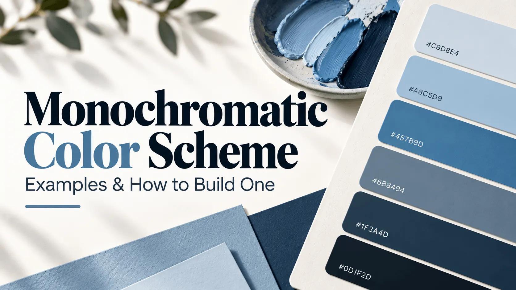
Here's a full six-step monochromatic ramp built from a single mid-tone blue, using the same base hue we worked through in our tint/shade/tone guide:
| Step | Hex Code | Role |
|---|---|---|
| Lightest Tint | #C8D8E4 | Backgrounds, large open areas |
| Light Tint | #A8C5D9 | Secondary surfaces, hover states |
| Base Hue | #457B9D | Primary brand color, key UI elements |
| Muted Tone | #6B8494 | Secondary text, subtle borders |
| Shade | #1F3A4D | Headlines, strong contrast elements |
| Darkest Shade | #12222E | Deep backgrounds, dark-mode surfaces |
Notice that every single value on this list is unmistakably "the same blue." Nobody looking at this table would think six different colors were involved — and that's the entire point. Want to build a ramp like this from any starting color? Our color picker lets you select a base hue, and our color mixer makes it easy to generate the tints, shades, and tones around it.
Choosing the Right Hue: What Each Monochromatic Color Communicates
Since a monochromatic palette lives and dies by a single hue, that one choice carries a lot more emotional weight than it would in a multi-color palette where the mood gets split across several colors. Here's a rough guide to what different monochromatic bases tend to communicate:
| Base Hue | Feels Like | Common Use Cases |
|---|---|---|
| Blue | Calm, trustworthy, professional | Tech products, finance, healthcare |
| Red | Bold, energetic, urgent | Entertainment, food, sales-driven brands |
| Green | Natural, growth-oriented, fresh | Wellness, sustainability, outdoor brands |
| Purple | Luxurious, creative, a little unconventional | Beauty, premium products, creative agencies |
| Gray | Neutral, sophisticated, understated | Architecture, editorial, minimalist portfolios |
| Orange/Brown | Warm, grounded, approachable | Artisan brands, hospitality, food and drink |
If you want the fuller breakdown of what each color tends to signal and why, our color meaning chart goes deeper into the psychology behind each one — worth a look before locking in a base hue for anything brand-related, since a monochromatic scheme leaves that single color with nowhere to hide.
Why Monochromatic Schemes Work So Well
There's a simple reason monochromatic palettes feel so put-together: there's structurally nothing for them to clash with. Every color relationship problem — two hues fighting for attention, an accent that doesn't quite match the background, a combination that reads as "almost right but a little off" — depends on having more than one hue in the mix in the first place. Remove that variable entirely, and you remove most of the ways a palette can go wrong.
This is also exactly why monochromatic schemes are so popular in branding. A single, consistent hue used across every touchpoint reads as controlled and intentional, which is a big part of why so many tech companies lean on this exact approach to project a clean, professional image, while fashion brands often reach for it to signal elegance and restraint instead of a flashier, over-decorated packaging.
Real-World Examples of Monochromatic Design
In Film and Cinematography
Few examples make the technique's power more obvious than director Zhang Yimou's films. His 2018 film The Shadow is shot entirely in full color, yet every location, costume, and set piece was deliberately designed around a black-and-white aesthetic, creating a genuinely striking monochromatic look without ever actually switching to black-and-white film. His earlier film Hero pushed the idea even further, assigning a different monochromatic color scheme to each chapter of the story, using the shift in palette itself to signal a change in perspective or emotional register as the film progressed. Neither film needed dialogue to tell you the mood had changed — the color did that work on its own.
In Branding
Plenty of recognizable brands lean almost entirely on a single hue stretched across its full tonal range rather than pairing multiple colors together. It's a deliberate signal of restraint and confidence — a way of saying a brand doesn't need five colors to be memorable, one used well is enough.
In Interior Design
A newer trend called "color drenching" has brought monochromatic thinking into home design in a big way — painting walls, trim, ceiling, and even furniture in variations of a single color to fully immerse a room in one tonal family. A more advanced version, sometimes called "double drenching," layers in two or three different hues from the same broad color family, like several distinct blues throughout one space, for a bolder version of the same underlying idea.
The Risk: When Monochromatic Becomes Boring
Here's the honest trade-off nobody skips mentioning for long: a monochromatic palette that doesn't push its tonal range far enough can end up feeling flat, sleepy, or unfinished rather than calm and sophisticated. If every element sits within a narrow band of similar lightness, there's nothing for the eye to latch onto, and the design can start to blur together instead of reading as intentional.
The fix isn't to abandon the approach — it's to commit to it more fully, not less.
How to Avoid the Flatness Problem
A few reliable techniques keep a monochromatic design feeling alive instead of muted into nothing:
- Push the lightness range further than feels comfortable. A timid monochromatic palette barely varies from its base color. A confident one runs from something nearly white all the way to something nearly black, creating real internal contrast without introducing a second hue.
- Use texture and pattern. Since color variation is off the table by design, texture picks up the slack — a matte surface next to a glossy one, or a patterned element against a flat one, adds visual interest a flat color palette alone can't provide.
- Add one small accent color, used sparingly. A single unexpected accent — reserved specifically for a call-to-action button, a logo detail, or one focal point — can make an otherwise monochromatic design pop without abandoning the overall approach. This is really just the 60-30-10 rule in a slightly different form: the monochromatic ramp handles the 90%, and one accent color handles the rest.
- Use white and black deliberately, even if they're not "true" hues. Purists may argue they don't technically count as part of the monochromatic family, but strategically placed white space or a near-black shade can create the sharp contrast a palette needs to avoid feeling muddy.
How to Build a Monochromatic Palette Step by Step
- Pick a base hue that fits the mood you're going for. Use the table above as a starting filter, or check our color meaning chart if you want a deeper read on what a specific hue tends to communicate before committing to it.
- Generate a full tonal range, pulling in tints, shades, and tones rather than sticking to just one direction. A palette that only goes lighter, or only goes darker, tends to feel unfinished compared to one that stretches in both directions from the base hue.
- Assign roles to each step — light tints for backgrounds and large open areas, the base hue for primary buttons or focal elements, deeper shades for text, headlines, and anything that needs to feel grounded.
- Test the extremes together, not just neighboring steps. Two adjacent tints might look nearly identical side by side, which is fine — but your lightest tint and your darkest shade need to create real, checkable contrast when they're the two colors actually doing the work of background and text.
- Decide whether you want an accent color, and if so, choose one deliberately using the color wheel rather than letting it sneak in from a random reference image or a component library's default. A single accent, used consistently, preserves the discipline that makes monochromatic work in the first place — two or three accents quietly turns the whole thing into a different color scheme entirely.
Monochromatic in Web and UI Design
This is where a genuinely important, practical warning belongs, since it's easy to overlook when everything technically "matches." A monochromatic UI can quietly fail basic accessibility standards if two adjacent steps in the ramp are placed as text and background without enough of a lightness gap between them. Two shades of the same blue can look pleasant sitting next to each other and still produce a contrast ratio nowhere near WCAG's requirements.
Setting this up cleanly in code usually means working in HSL rather than picking hex codes by eye, since HSL separates lightness into its own number:
:root {
  --mono-hue: 205; /* base blue hue */

  --mono-lightest: hsl(var(--mono-hue), 40%, 85%);
  --mono-base: hsl(var(--mono-hue), 40%, 45%);
  --mono-darkest: hsl(var(--mono-hue), 40%, 15%);
}

body {
  background-color: var(--mono-lightest);
  color: var(--mono-darkest);
}
Before shipping anything built this way, run your text-and-background pairing through our contrast checker rather than assuming that "it's all the same color family" automatically means it's readable. It doesn't.
Monochromatic vs. Analogous: Don't Confuse the Two
These two get mixed up constantly, so it's worth being precise. A monochromatic scheme uses one hue, varied through lightness and saturation. An analogous scheme uses several neighboring hues sitting next to each other on the color wheel — blue, blue-green, and green, for example, rather than just blue in different tints and shades. We covered that distinction, along with how it compares to complementary color pairs, in our guide on complementary vs. analogous colors. If a "monochromatic" palette starts to include a genuinely different hue rather than just a lighter or darker version of the same one, it's technically drifted into analogous territory instead.
Common Mistakes
- Not pushing the tonal range far enough, resulting in a palette that reads as flat rather than intentional.
- Assuming same-hue automatically means accessible, when two similar-lightness steps can still fail contrast requirements.
- Adding more than one accent color, which undermines the entire point of the restraint a monochromatic scheme is built on.
- Confusing monochromatic with analogous, and accidentally introducing a second hue while thinking you're still working within one color family.
Try It Yourself
Start with a single hue in our color picker, then build out its full tonal range using the color mixer. If you want to see how your base hue relates to genuinely different colors on the wheel, in case you decide a small accent is worth adding, our color wheel tool makes that easy to explore, and our color palette generator can pull the whole ramp together automatically.
Wrap-Up
A monochromatic color scheme isn't a lack of decision — it's one of the more disciplined choices in design, precisely because there's nowhere to hide if the execution is weak. There's no second hue to distract from a narrow tonal range, no accent color to paper over a flat, underdeveloped palette. Push the range, respect the contrast, choose your one hue with real intention, and it can carry an entire design further than five competing colors ever could.
FAQs
It's a palette built from one color, varied by making it lighter, darker, or more muted, rather than mixing in any other hue.
Tools for this guide
Related posts
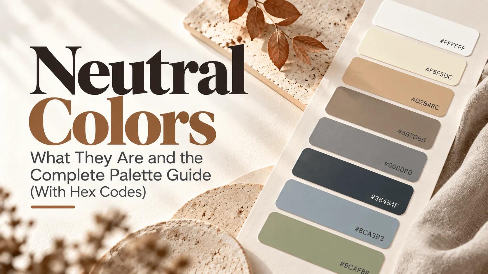
Neutral Colors: What They Are and the Complete Palette Guide
Neutral colors explained — the classic black, white, gray, and brown, plus "secret" neutrals like dusty blue and sage green. Full palette with hex codes.
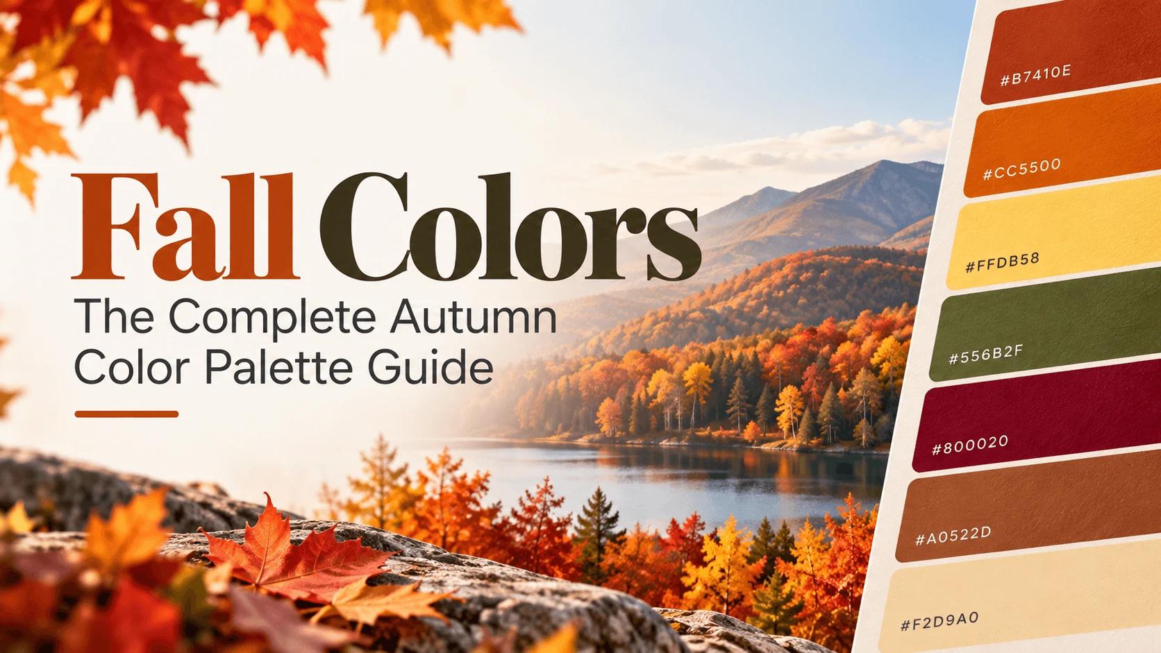
Fall Colors: The Complete Autumn Color Palette Guide
The complete fall color palette — rust, burgundy, mustard, olive, and more — with hex codes, ready-made combinations, and why these colors feel like autumn.