
Neutral Colors: What They Are and the Complete Palette Guide
Color Theory13 min read
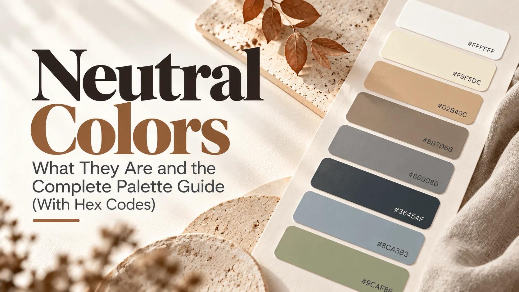
"Neutral" has a reputation problem. Say the word out loud and most people picture something boring by default — a beige wall, a gray cubicle, the safest possible choice made by someone too afraid to commit to an actual color. And yet walk into any genuinely well-designed space, look at any brand that reads as effortlessly premium, and you'll almost always find a neutral palette doing the real work underneath it. The bold color everyone notices is usually just the 10% sitting on top of a much larger, much quieter foundation.
Neutrals aren't the absence of a decision. They're one of the most deliberate tools in design, and they're a lot more varied than four colors on a paint chip. Here's the complete picture — what actually qualifies as a neutral, the full palette with hex codes, and how to use it without it reading as an afterthought.
Key Takeaways
- Neutral colors are low-saturation colors that don't compete visually with other colors — traditionally black, white, gray, and brown.
- The modern, more accurate definition is broader: any color muted enough can function as a neutral, including dusty blues and sage greens.
- Neutrals split into warm (yellow or red undertones) and cool (blue undertones), and mixing the two without intention is one of the most common design mistakes.
- Designers build palettes around a neutral foundation first, then layer bolder accent colors on top — it's the same underlying logic as the 60-30-10 rule.
- A neutral palette still needs contrast and at least a little variation, or it risks feeling flat instead of calm.
What Are Neutral Colors, Exactly?
Neutral colors are colors with little to no saturation — meaning they don't lean strongly toward any single, vivid hue. Traditionally, that means black, white, gray, and brown, since none of those colors carry the intensity of a red, blue, or yellow. They're the colors that recede into the background instead of demanding attention, which is exactly why they're so often used as a base rather than a focal point.
That's the simple version, and it's true as far as it goes. But it's also incomplete, and the more accurate definition is a little more interesting.
Wait — Isn't a Neutral Just Black, White, Gray, and Brown?
That's the common assumption, but it's not quite right. A neutral isn't defined by which hue it is. It's defined by how desaturated it is. Push nearly any color's saturation down far enough, and it starts behaving like a neutral, regardless of whether it technically started out as blue, green, or something else entirely.
This connects directly to something we covered in our guide on tint vs. shade vs. tone: a tone is created by mixing a hue with gray, which reduces its intensity without necessarily changing how light or dark it is. That's essentially the exact mechanism that turns an ordinary color into a neutral. A muted, grayed-out blue isn't really "blue" anymore in the way a bright, saturated blue is — it's closer to a soft, cool-leaning neutral that happens to have started life as blue.
The Complete Neutral Color Palette
Here's the full reference, spanning the classic four neutrals and the wider "secret neutral" family covered further down:
| Color Name | Hex Code | RGB | Undertone | Best For |
|---|---|---|---|---|
| Black | #000000 | 0, 0, 0 | True neutral | Text, high-contrast accents |
| White | #FFFFFF | 255, 255, 255 | True neutral | Backgrounds, negative space |
| Ivory | #FFFFF0 | 255, 255, 240 | Warm | Softer alternative to pure white |
| Off-White | #F5F5F5 | 245, 245, 245 | Cool-neutral | Clean digital backgrounds |
| Beige | #F5F5DC | 245, 245, 220 | Warm | Interiors, packaging, editorial |
| Cream | #FFFDD0 | 255, 253, 208 | Warm | Soft, cozy backgrounds |
| Tan | #D2B48C | 210, 180, 140 | Warm | Natural, earthy foundations |
| Camel | #C19A6B | 193, 154, 107 | Warm | Fashion, warm brand palettes |
| Khaki | #C3B091 | 195, 176, 145 | Warm | Casual, outdoor-leaning brands |
| Taupe | #8B7D6B | 139, 125, 107 | Warm-neutral | Sophisticated interiors |
| Greige | #CBC3BA | 203, 195, 186 | Warm-neutral | Modern minimalist design |
| Gray | #808080 | 128, 128, 128 | True neutral | UI, text, structural elements |
| Warm Gray | #93887A | 147, 136, 122 | Warm | Cozy, approachable neutrals |
| Slate Gray | #708090 | 112, 128, 144 | Cool | Modern, tech-leaning design |
| Charcoal | #36454F | 54, 69, 79 | Cool | Dark-mode text, backgrounds |
| Espresso Brown | #3C2A21 | 60, 42, 33 | Warm | Deep, grounding anchor color |
| Dusty Blue | #8CA3B3 | 140, 163, 179 | Cool | A "secret" neutral for calm palettes |
| Sage Green | #9CAF88 | 156, 175, 136 | Cool-neutral | A "secret" neutral for natural palettes |
Want to explore any of these further? Our color picker lets you fine-tune each one, and our color palette generator can build a full palette starting from any single neutral on this list.
Breaking It Down: Warm Neutrals vs. Cool Neutrals
Every neutral leans one direction or the other, even if it's subtle enough to miss at a glance. This comes down to undertone — a faint hint of another color sitting underneath the main one.
Warm neutrals carry a hint of yellow, orange, or red underneath. Beige, cream, tan, camel, and taupe all fall here. They tend to feel cozy, inviting, and grounded, which is why they show up so often in spaces and brands trying to feel approachable rather than sleek.
Cool neutrals carry a hint of blue or green underneath. Slate gray, charcoal, and cooler off-whites belong to this group. They tend to feel modern, crisp, and a little more serious, which makes them a natural fit for tech products and minimalist design.
We covered the deeper mechanics of why this split happens in our guide on warm vs. cool colors, and the exact same undertone logic applies here — it's just being applied to muted, low-saturation colors instead of bold, saturated ones. It's also the same undertone concept behind why beige pairs so naturally with other warm colors, which we broke down in our post on what colors go with beige.
One thing worth knowing: mixing warm and cool neutrals without any real intention is one of the fastest ways to make a palette feel slightly "off," even when nobody watching can immediately say why. A warm beige wall next to a cool slate-gray sofa can read as mismatched in a way that's hard to put into words, purely because their undertones are pulling in opposite directions.
The "Secret" Neutrals: When Blue and Green Aren't Really Colors Anymore
This is the part most basic neutral-color guides skip, and it's genuinely the most useful thing to understand if you want to build a more interesting palette than "beige and gray."
A pale, heavily muted blue — something like a soft, dusty slate blue rather than a bold sky blue — can function exactly like a neutral. It's calm, it recedes into the background, and it pairs easily with almost anything, the same way gray does. The same goes for a muted, grayed-out sage green: technically it's "green," but functionally, in a design, it behaves far more like a quiet neutral than like a bold, attention-grabbing color.
This matters because it opens up a lot more room than the traditional four-neutral list suggests. A palette built entirely from black, white, gray, and brown can feel a little predictable after a while. A palette that swaps in a dusty blue or sage green as one of its neutral tones still gets all the calm, versatile behavior of a true neutral, while feeling noticeably more distinct and considered.
A Quick History: Why Neutral Colors Feel So Timeless
Neutral colors have been the backbone of human-made spaces for about as long as humans have been building anything at all, and that's not really a coincidence. Clay, stone, straw, and wood — the actual materials available for most of history — are neutral by nature, and early architecture simply reflected whatever the earth provided. Whites, grays, and earthy browns weren't a stylistic choice so much as a practical one.
That deep, historical connection to natural materials is very likely part of why neutral palettes still read as grounded, authentic, and timeless today, even in a completely digital context where no actual clay or stone is involved. There's an inherited association at work, whether or not anyone designing a modern app consciously thinks about ancient brickwork while picking a background color.
Why Designers Build Around Neutrals First
Neutrals are almost always the starting point in a well-planned palette, not an afterthought added at the end. There's a practical reason for that: a neutral foundation gives you somewhere to safely layer bolder colors on top of, without the whole design competing for attention at once.
This is really the same logic behind the 60-30-10 rule — the dominant 60% of a design is almost always a neutral, precisely because a bold color at that much coverage becomes exhausting fast. Build the neutral base first, then decide which single color gets to be the star.
Neutral Colors in Branding and Web Design
This is where a lot of general "neutral colors" guides stop short, since most of them are written for interior design rather than screens. In branding and web design specifically, neutrals do a huge amount of the invisible structural work: backgrounds, body text, cards, borders, navigation bars. A brand or website with zero neutral foundation, using only bold saturated colors everywhere, tends to feel exhausting to look at for more than a few seconds.
There's no better real-world proof of this than Nike's brand identity, which we broke down in an earlier post. Nike's entire core palette is built on black and white — two of the purest neutrals that exist — with a single orange accent used sparingly. That restraint isn't a lack of ambition. It's precisely what gives every sub-brand, collaboration, and limited-edition colorway room to be loud without ever clashing with the core identity. A neutral foundation isn't the boring option; it's often the more disciplined one.
Here's a practical example, setting up a neutral-first palette as CSS variables:
:root {
  --neutral-background: #F5F5F5;
  --neutral-text: #36454F;
  --neutral-border: #CBC3BA;
  --accent-color: #B7410E;
}

body {
  background-color: var(--neutral-background);
  color: var(--neutral-text);
}

.card {
  border: 1px solid var(--neutral-border);
}
Notice there's only one non-neutral color in that entire snippet. That's intentional, and it's the same underlying pattern we walked through in our post on the best color combinations for a website — a calm, neutral base with exactly one color doing the talking tends to outperform a page trying to make five colors all matter equally.
Neutral Color Combinations That Always Work
Picking individual neutrals is one thing — pairing them well is where a palette actually comes together. Here are five combinations that consistently work, each with a base neutral, a supporting neutral, and a single accent:
| Combination | Base | Supporting Neutral | Accent | Feels Like |
|---|---|---|---|---|
| Modern Minimalist | White #FFFFFF | Slate Gray #708090 | Deep Blue #2563EB | A clean SaaS product or portfolio site |
| Warm & Cozy | Cream #FFFDD0 | Taupe #8B7D6B | Rust #B7410E | A boutique coffee brand or cozy interior |
| Scandinavian | Off-White #F5F5F5 | Greige #CBC3BA | Sage Green #9CAF88 | Calm, understated, nature-adjacent design |
| High Contrast | White #FFFFFF | Charcoal #36454F | Any bold accent | Editorial layouts, confident branding |
| Earthy & Grounded | Khaki #C3B091 | Espresso Brown #3C2A21 | Mustard #FFDB58 | Artisan, handmade, farmhouse-style brands |
Notice that every single row still follows the same structure: two neutrals doing most of the work, and exactly one color allowed to stand out. That's not a coincidence — it's the 60-30-10 principle again, just built almost entirely from muted tones instead of bold ones.
Choosing the Right Neutrals for Your Design Style
Different design styles lean on different corners of the neutral family, and picking the right one matters as much as picking the right accent color. A minimalist or tech-leaning design tends to favor cool neutrals — whites, grays, and charcoal — since they read as clean and precise. A cozy or artisan-style brand leans warm, reaching for cream, taupe, and khaki to feel handmade and approachable. A Scandinavian or "quiet luxury" aesthetic often blends the two, using warm-neutral bases with cooler, muted accents like sage green or dusty blue for contrast without ever feeling loud.
None of these are strict rules, but they're a genuinely useful starting filter. If you already know the overall feeling you're going for, you can narrow the palette above down to the three or four neutrals worth actually testing, instead of guessing across all eighteen.
Common Mistakes When Using Neutral Colors
- Treating "neutral" as an excuse to skip contrast entirely. A neutral palette still needs enough difference between your background and text colors to stay readable. Run any neutral text-and-background pairing through our contrast checker before assuming a soft, muted combination is automatically safe — plenty of light neutrals fail basic accessibility standards.
- Mixing warm and cool neutrals without intention. As covered above, a warm beige next to a cool slate gray can clash in a subtle, hard-to-diagnose way. Pick a lane, warm or cool, and stay mostly consistent within it.
- Relying only on pure black and pure white. Both can feel harsh, especially on a screen. A softened off-black or off-white almost always reads as more considered and easier on the eyes.
- Going so neutral there's genuinely nothing to look at. A palette built entirely from similar-value neutrals with zero contrast or accent can end up flat and forgettable rather than calm and sophisticated. Neutral doesn't mean flavorless — it means restrained, and restraint still needs at least one point of interest.
How to Build Your Own Neutral Palette
Start by deciding whether you want a warm or cool foundation, since that single decision shapes everything else. From there, our color mixer is the fastest way to actually create a custom neutral — blend a small amount of gray into any hue, including a blue or green, to see exactly how much saturation it takes to turn a bold color into a quiet one. Once you've settled on a direction, our color wheel tool can help you pick a single accent color that genuinely complements your neutral base rather than clashing with it.
Wrap-Up
Neutral colors aren't the safe, boring default they're often mistaken for — they're the deliberate, load-bearing foundation underneath almost every design that actually works. Once you understand that "neutral" is really about saturation rather than a fixed list of four colors, you've got a much bigger, more interesting palette to work with than beige and gray alone.
FAQs
Black, white, gray, and brown make up the traditional core group, though the modern definition extends further to include any sufficiently desaturated color.
Tools for this guide
Related posts
Monochromatic Color Scheme: Examples & How to Build One
Learn what a monochromatic color scheme is, how tints, shades, and tones work, and how to build a cohesive palette with practical examples.
Fall Colors: The Complete Autumn Color Palette Guide
The complete fall color palette — rust, burgundy, mustard, olive, and more — with hex codes, ready-made combinations, and why these colors feel like autumn.