
Instagram Gradient: Recreate the Exact Colors in CSS
6 min read
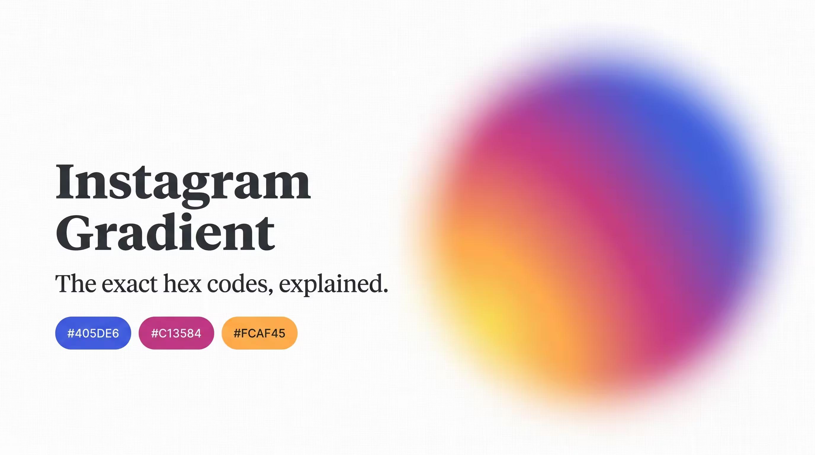
You've probably tried this before. You open a code editor, type background: linear-gradient(purple, orange), and hit save expecting Instagram's logo to appear on your screen. Instead, you get something that looks... close, but not quite right. A little muddy. A little off.
Here's the good news: the exact colors behind that gradient aren't a secret. They're documented, they're specific, and once you know them, you can recreate that look almost perfectly. Let's get into it.
Quick Answer: The Instagram Gradient CSS Code
If you just want something you can copy and paste right now, here's a simple version that captures the look:
.instagram-gradient {
  background: linear-gradient(45deg, #405DE6, #5851DB, #833AB4, #C13584, #E1306C, #FD1D1D, #F56040, #F77737, #FCAF45, #FFDC80);
}
That's the full ten-color version. Want something a bit lighter to work with? Here's a simplified five-color version that still reads clearly as "Instagram":
.instagram-gradient-simple {
  background: linear-gradient(45deg, #405DE6, #833AB4, #C13584, #FD1D1D, #FCAF45);
}
Now let's talk about why there are actually two different gradients people mean when they say "Instagram gradient," because mixing them up is where most tutorials go wrong.
Wait — There Are Two Different Instagram Gradients?
Yes, and this trips up almost everyone. There's:
- The official brand gradient — the ten colors Meta itself documents for Instagram's brand identity, used across marketing and design materials. This is a smooth, wide gradient running from blue through purple, pink, red, orange, and yellow.
- The app icon gradient — the specific look of the little rounded-square camera icon on your phone. It's a tighter, more concentrated gradient that glows from one corner, almost like a spotlight.
They use overlapping colors, but they're built differently, and if you're trying to recreate the actual icon, the ten-color brand gradient alone won't get you there. You need a different technique. More on that in a minute.
A Little History: Why Does Instagram Even Have a Gradient?
Back in 2016, Instagram's logo was a plain, brown, old-fashioned camera icon. Then the company swapped it out for the colorful gradient icon we know today, and honestly, a lot of people hated it at first. Give it a few years, though, and it became one of the most recognized, most copied design choices of the decade.
The gradient itself was inspired by sunsets — that exact moment when a sunset shifts from cool blue at the top down into warm orange and pink near the horizon. It was also a deliberate move away from the cold blues that basically every other social media app was using at the time. Instagram wanted to feel warmer, more creative, and a little more alive. A gradient did that better than any single flat color could.
The Official Instagram Brand Colors
Here's the full ten-color list, in the order the gradient actually flows:
- Blue —
#405DE6 - Blue-Purple —
#5851DB - Purple —
#833AB4 - Purple-Pink —
#C13584 - Pink-Red —
#E1306C - Bright Red —
#FD1D1D - Red-Orange —
#F56040 - Orange —
#F77737 - Orange-Yellow —
#FCAF45 - Yellow —
#FFDC80
If you only need one or two of these for a smaller project, you can grab any individual code from that list and drop it straight into your stylesheet — no need to use all ten every time.
Recreating the Actual App Icon
If what you're really after is that glowing, corner-lit look from the actual Instagram app icon (not just the general brand colors), you need a radial gradient instead of a straight line of color. This is the version that's become a bit of a classic among developers, precisely because it nails the look:
.instagram-icon {
  width: 150px;
  height: 150px;
  border-radius: 35px;
  background: radial-gradient(
    circle at 30% 107%,
    #fdf497 0%,
    #fdf497 5%,
    #fd5949 45%,
    #d6249f 60%,
    #285aeb 90%
  );
}
Here's what's actually happening in that code, in plain terms: circle at 30% 107% tells the browser where the "light" is coming from — in this case, a spot just below and to the left of the shape. Everything radiates outward from there, starting bright yellow and fading through orange, pink, and finally deep blue at the edges. That's exactly the glow you see in the real icon.
Which Version Should You Actually Use?
It depends on what you're building:
- Making a button, banner, or background? Use the simple linear-gradient version. It's easier to control and looks great across a wide shape.
- Recreating the actual app icon or a rounded logo-style badge? Use the radial-gradient version. It's built specifically to mimic that glowing, off-center look.
One thing worth checking either way: if you're planning to put text directly on top of a gradient this colorful, don't just eyeball whether it's readable. Gradients shift in brightness across their length, so text that looks fine on one end might be nearly invisible on the other. Run your text and background combination through our contrast checker before you ship it.
How to Build Your Own Version From Scratch
Don't want to use Instagram's exact colors, just something in the same warm, sunset-inspired spirit? Our gradient generator lets you drag your own color stops around and see the result update instantly, so you can build something similar without copying it directly.
If you're working from RGB values instead of hex, or need to convert between formats for a design tool, our RGB to Hex and Hex to RGB converters handle that instantly. And if you want to see how any two of these colors blend together directly, rather than sitting side by side in a gradient, try our color mixer.
A Quick Word on Using Brand Colors
Using these exact hex codes for a personal project, a school assignment, or to understand how the gradient works is completely normal — that's exactly the kind of thing designers and developers do all the time to learn. Just be thoughtful if you're using it commercially in a way that could make people think your project is officially connected to Instagram. The colors themselves are just numbers, but the specific combination is closely tied to a real brand.
Quick Answers
What are the exact hex codes for the Instagram gradient? The full brand gradient runs through ten colors starting at #405DE6 (blue) and ending at #FFDC80 (yellow). The app icon specifically uses a radial gradient built from #fdf497, #fd5949, #d6249f, and #285aeb.
Why does my recreated gradient look different from the real one? Most likely you're using a plain linear-gradient when the icon actually needs a radial-gradient, or you're using fewer color stops than the original, which flattens out the transition between colors.
Can I use fewer than ten colors and still have it look right? Yes. A five-color version keeps the same overall feel while being much easier to work with in your code.
Wrap-Up
Instagram's gradient looks effortless, but it's actually a very specific, well-documented set of colors doing a very specific job — and now you've got the real numbers behind it instead of guessing. Want the codes without scrolling back through this article? Bookmark our Instagram brand colors page for quick access any time.