
Netflix Red: The Exact Hex Code Behind the Logo
Brand Colors14 min read
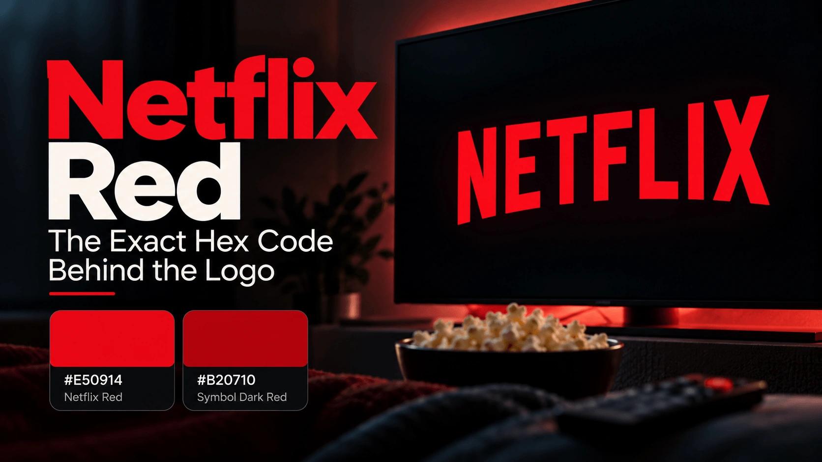
The lights are off, the room is quiet, and a single red word fades onto a black screen. You don't need the sound to know what's about to happen next. That specific shade of red has been trained into most of our brains for the better part of two decades, and it's doing that job before you've even processed a single letter of the logo.
Here's the exact hex code behind it, the surprisingly deliberate reasoning that shaped it, and a detail most "brand color" roundups get wrong entirely: Netflix doesn't actually use just one red.
Key Takeaways
- Netflix's primary brand color, officially called Netflix Red, is
#E50914. - There's a second, darker red — Symbol Dark Red,
#B20710— used specifically to build the gradient effect inside the "N" icon. - Netflix's red has gone through five distinct logo versions since 1997, and the current flat red wordmark has only been around since 2014.
- The shade was deliberately chosen to look sharp and cinematic across digital screens, from phones to TVs, especially in dim, low-light viewing conditions.
- Netflix's own brand guidelines require a minimum 3:1 contrast ratio for their logo — and running the numbers shows white text pairs with their red noticeably better than black does.
The Official Netflix Color Palette
Netflix's entire visual identity runs on a tight, deliberate set of colors:
| Color Name | Hex Code | RGB | CMYK | Pantone |
|---|---|---|---|---|
| Netflix Red | #E50914 | 229, 9, 20 | 0, 96, 93, 2 | 1795 C |
| Symbol Dark Red | #B20710 | 178, 7, 16 | — | — |
| Black | #000000 | 0, 0, 0 | — | — |
| White | #FFFFFF | 255, 255, 255 | — | — |
Four colors, and that's genuinely the entire palette. No secondary blues, no accent greens — just a bold red, pure black, pure white, and one darker red reserved for a very specific job.
Wait — There Are Two Different Reds?
Yes, and this is exactly the kind of detail a flat "here's the hex code" list tends to miss. Netflix's wordmark, the full "NETFLIX" text logo, uses the brighter Netflix Red (#E50914) on its own. But the standalone "N" symbol — the compact icon you see on your phone's home screen — isn't actually one flat color at all. According to Netflix's own brand guidelines, the N is built from a blend of Netflix Red and the darker Symbol Dark Red (#B20710), creating a folded-ribbon effect with visible depth and shading rather than a flat red shape.
That distinction matters if you're trying to recreate either one accurately. A flat #E50914 square will match the wordmark perfectly, but it won't capture the actual look of the icon, which relies on that two-tone gradient to read as dimensional rather than flat.
A Brief History: Five Logos in Under 30 Years
The red, glowing wordmark feels timeless now, but Netflix has actually cycled through quite a few looks to get here. The original 1997 logo used a purple film reel design, closer to a generic video-rental aesthetic than anything resembling today's brand — Netflix was still mailing DVDs at the time, and the logo reflected that era honestly. A short-lived yellow oval version followed in 2000, lasting barely any time at all before being replaced.
Then came a glossy, three-dimensional red logo with heavy drop shadows and a reflective sheen, the kind of design language that dominated a lot of early-2000s web branding. It ran from 2001 all the way to 2014 — the version a lot of longtime subscribers probably picture first when they think "old Netflix." As flat, minimalist design took over the broader tech industry, Netflix followed suit, stripping away the gloss and shadow for the simplified, flat red wordmark still in use today, introduced in 2014.
Finally, in 2016, Netflix added the standalone "N" icon specifically because the full wordmark was too wide to work cleanly on small mobile screens and social media avatars — a problem plenty of text-based logos have run into as more browsing shifted to phones. That standalone N has arguably become more recognizable day-to-day than the full wordmark itself, precisely because it shows up constantly as an app icon rather than only appearing once, briefly, before a show starts.
So the red itself has been remarkably consistent for a long stretch of that history, even while the actual logo shape and treatment changed repeatedly around it.
Why This Specific Red? The Psychology and the Practical Reasoning
There's a genuine, well-documented reason red dominates entertainment and media branding, and it's not just tradition. Red is one of the few colors with a measurable physiological effect — it's been linked to increased heart rate and heightened arousal, which is exactly the kind of reaction a streaming platform wants right before you hit play. It signals excitement, urgency, and anticipation, all useful emotions for a brand competing for your attention against dozens of other apps on the same home screen.
But there's also a more practical, less emotional reason behind the specific shade Netflix landed on. This particular red was chosen to render sharply and consistently across a huge range of digital displays, from a small phone screen to a living room TV, and it holds up especially well against dark backgrounds and in low-light viewing environments. That's not a coincidence — it's the same basic logic behind why movie theaters are dark in the first place. A vivid color against black creates a kind of theatrical, spotlighted quality that a lighter background simply can't replicate, and Netflix's whole interface, mostly black with red accents, is built around that same principle.
Why Red, When Almost Every Competitor Chose Blue?
Look across the rest of the streaming landscape and a pattern jumps out fast: Disney+ leans on blue, Amazon Prime Video leans on blue, and even HBO Max has largely stuck to a restrained black-and-white identity rather than reaching for a bold, saturated color at all. Red, by comparison, is genuinely rare in this specific category, which is exactly what makes Netflix's choice work so well.
Blue is the safe, expected choice for almost any tech or media platform — it signals trust and calm, and it's a low-risk pick precisely because so many other brands have already proven it works. Red does something different. It's a higher-risk, higher-reward choice: more polarizing, more energetic, and considerably harder to look away from in a crowded app grid full of blue icons. Netflix picked the one color in its category that guarantees it never blends into the background, and that decision has aged remarkably well as the number of competing streaming apps has exploded over the past decade.
How Netflix's Red Shows Up Across the Platform
The color isn't just sitting quietly in a logo file somewhere — it does real, functional work throughout the actual product. The signature loading animation uses it as a pulsing accent against black. Notification badges and "New Episodes" indicators lean on it to draw the eye immediately. Even small UI details, like the highlight around a selected profile or the progress bar underneath a paused episode, borrow the same red rather than introducing a second accent color. That consistency is part of why the brand feels so cohesive across a genuinely huge range of screens and contexts — a phone app, a game console interface, and a smart TV home screen all end up feeling unmistakably like the same product, largely because that one red never changes.
How Netflix Red Compares to Other Famous Reds
Red is one of the most fought-over colors in branding, and it's genuinely interesting to see how differently major brands have tuned the exact same base hue for their own purposes:
| Brand | Hex Code | Character |
|---|---|---|
| Netflix | #E50914 | Darker and more cinematic, built to glow against a dark screen |
| Coca-Cola | #F40009 | Warmer and slightly earthy, closer to terracotta than pure red |
| Target | #CC0000 | Colder and purely saturated, built for retail visibility at a distance |
| YouTube | #FF0000 | The most "digitally native" of the group — vivid on screens, but flatter and less warm |
Coca-Cola's red actually has a wonderfully strange origin story: the shade traces back to a 19th-century printing limitation its earliest bottlers had no control over, not a deliberate branding decision at all. It became iconic almost by accident and then got protected fiercely for well over a century afterward. Netflix's red, by contrast, was a fully deliberate, modern choice, engineered from the start for screens rather than print or packaging — which is exactly why it reads as noticeably darker and richer than a flat, digital-default red like YouTube's.
The Wordmark vs. the "N" Icon: Official Usage Rules
Netflix's brand guidelines are unusually specific about how these colors can and can't be used. The wordmark is meant to appear in Netflix Red whenever possible, with black or white allowed only in rare, production-limited situations — think single-color engraving or embossing — and only if legibility isn't compromised. The N icon specifically isn't supposed to be reproduced in flat black, grayscale, or any alternate color outside of approved restricted-use cases, precisely because that red-to-dark-red blend is considered part of the mark's identity, not just a stylistic flourish.
There's also a concrete accessibility requirement baked directly into the guidelines: a minimum 3:1 contrast ratio wherever the logo appears. That number isn't arbitrary — it's the exact same threshold WCAG uses for large text and for meaningful UI components, which means Netflix's own internal brand standards are already aligned with established accessibility guidelines, whether or not that was the primary motivation. Clear space rules are equally specific: the wordmark needs breathing room equal to at least the width of the letter "T" in "Netflix" on all sides, while the N icon needs space equal to at least half its own width. And worth knowing if you're ever tempted to borrow these exact codes for something commercial: Netflix holds well over 200 active trademark filings with the USPTO, so these colors are protected considerably more tightly than an average brand's palette.
The color doesn't operate alone, either — Netflix pairs it with a custom in-house typeface called Netflix Sans, used consistently across the wordmark, the app interface, and marketing materials. It's a small detail, but it matters: a bold, saturated color paired with a bespoke, tightly controlled typeface is part of what makes the overall brand feel deliberate and expensive rather than like a color choice bolted onto a generic font.
How to Use These Colors in Your Own Work
If you want to experiment with a similar palette, set both reds up as CSS variables, and you can even recreate the icon's signature gradient effect using a simple linear gradient between the two:
:root {
  --netflix-red: #E50914;
  --netflix-dark-red: #B20710;
  --netflix-black: #000000;
}

.icon-gradient {
  background: linear-gradient(135deg, var(--netflix-red), var(--netflix-dark-red));
}

.button-primary {
  background-color: var(--netflix-red);
  color: #FFFFFF;
}
Need to move between color formats for a specific project? Our RGB to Hex and Hex to RGB converters handle the conversion instantly.
A Contrast Check: Does Netflix Red Actually Work as a Background?
Since Netflix's own guidelines specifically call out a minimum 3:1 contrast requirement, it's worth actually running the numbers rather than assuming. White text on #E50914 produces a contrast ratio of roughly 4.8:1 — comfortably clearing not just the 3:1 minimum, but the stricter 4.5:1 threshold required for normal body text under WCAG AA.
Black text tells a different story. Against that same red, black comes out to roughly 4.4:1 — enough to pass for large text and UI components, but just short of the 4.5:1 bar for normal text. That's not a huge gap, but it's a real one, and it lines up exactly with what Netflix actually does in practice: white text is the default choice across their red UI elements, not black.
There's a second scenario worth checking too, since it's arguably the most iconic use of this color of all: the red wordmark sitting directly on a solid black splash screen. Run that pairing through the same math, and it lands at almost exactly the same ratio as the black-text example above — roughly 4.4:1. Technically, that sits just under the strict small-text AA threshold. In practice, it's a total non-issue, because that logo is always displayed as large, bold lettering, which only needs to clear a 3:1 ratio — a bar it passes with real room to spare. It's a good reminder that the "correct" contrast target depends entirely on context: the exact same two colors can be a borderline choice for a paragraph of body text and a completely safe choice for a large logo, at the very same ratio.
If you're using a bold, saturated color like this in your own project, don't assume a pairing works just because it looks fine at a glance — run it through our contrast checker first, the same way we did here.
Building Your Own Streaming-Style Palette
If Netflix's overall approach appeals to you beyond just the exact hex code, the underlying formula is worth borrowing directly: a dominant near-black background, a single bold accent color used consistently everywhere it needs to grab attention, and white reserved for text and contrast. That's really just the 60-30-10 rule applied to a dark interface — black carrying the large majority of the screen, white handling readability, and one saturated accent color doing all of the emotional heavy lifting in a small, consistent dose.
It's the same underlying pattern we've seen show up again and again across very different brands — Nike does it with orange against black and white, Spotify does it with electric green against near-black. Netflix just proves it works with red too, and arguably proves it better than almost anyone else, given how many other platforms have tried to copy the "dark UI plus one loud accent" formula since.
Try It Yourself
Curious how this exact red interacts with other colors, or want to build a palette inspired by the same "dark base, one bold accent" formula? Our color picker lets you fine-tune the shade directly, our color mixer can show you what happens when you blend Netflix Red with black to approximate that Symbol Dark Red gradient yourself, and our color palette generator can build out a full palette starting from either red on this page.
Wrap-Up
Netflix Red looks simple on the surface — one bold color, endlessly repeated — but there's a lot more precision underneath it than a single hex code suggests. Two distinct reds working together, five logo generations getting there, a deliberate contrarian bet against an entire industry's preference for blue, and a shade engineered less for print or packaging and more for the specific glow of a screen in a dark room. Next time that word fades in before the "ta-dum," you'll know there's actual color science and genuine brand strategy sitting behind it, not just a good guess made once and never revisited.
FAQs
#E50914 is Netflix's primary brand red, used for the wordmark and most UI elements. A second, darker red, #B20710, is used specifically within the "N" icon.
Tools for this guide
Related posts
Instagram Gradient: Recreate the Exact Colors in CSS
The real hex codes behind Instagram's gradient — both the official brand palette and the radial gradient used in the app icon — with ready-to-copy CSS.
Nike's Brand Colors: Hex, RGB & Design Breakdown
Nike's real color codes — black (#000000), an off-black variant, and its orange accent (#FF6600) — and the deliberate strategy behind having no signature color.