
Nike's Brand Colors: Hex, RGB & Design Breakdown
Brand Colors8 min read
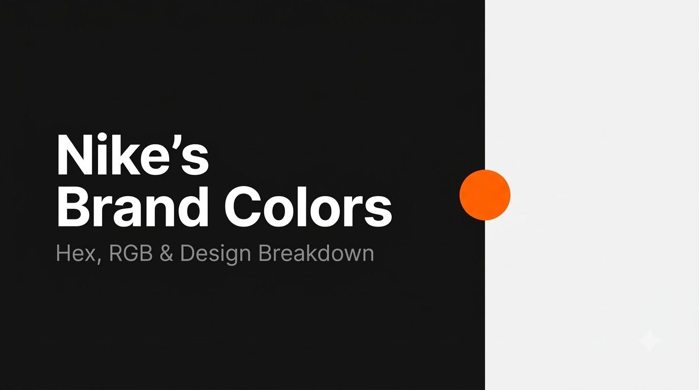
Every brand color post we've written so far has centered on one unmistakable color. Starbucks has its green. Spotify has its electric green. You see the color before you even register the logo. Nike breaks that pattern completely, and once you understand why, it actually tells you a lot more about smart brand design than another "here's the hex code" post ever could.
Nike doesn't have a signature color. It has a signature absence of color — and that's not an accident, it's a strategy. Let's break down the real codes, the thinking behind them, and how you can apply the same logic to your own work.
Key Takeaways
- Nike's core brand identity is built on black and white, not a single signature hue.
- The primary black is
#000000, though a softer near-black (#111111) shows up often in digital design. - Orange (roughly
#FF6600, close to Pantone 1655 C) is Nike's most common accent color, but it's never been locked in as a rigid brand standard. - Staying neutral is deliberate — it lets Nike's sub-brands and collaborations use bold, loud colors without ever clashing with the core identity.
- Black communicates power, sophistication, and timelessness, which lines up exactly with the image Nike has built for decades.
The Official Nike Color Palette
- Black —
#000000· RGB (0, 0, 0) - Off-Black (digital variant) —
#111111· RGB (17, 17, 17) - White —
#FFFFFF· RGB (255, 255, 255) - Nike Orange (accent) —
#FF6600· RGB (255, 102, 0) · closest to Pantone 1655 C - Light Gray (supporting neutral) —
#F5F5F5· RGB (245, 245, 245)
Quick honesty check: a few sources list Nike's orange slightly differently, some using #FA5400 instead of #FF6600. That's not really a contradiction — it's a sign that, unlike a brand such as Coca-Cola with one legally locked-in red, Nike treats orange as a flexible accent rather than a fixed standard. Which brings us to the real story here.
Wait — Nike Doesn't Have a "Nike Color"?
Nope. And that's genuinely unusual for a brand this size.
Most massive, globally recognized brands anchor themselves to one specific color the second you think of them. Coca-Cola is red. Starbucks is green. Nike, despite being one of the most recognizable logos on the planet, has never done that. Its entire identity runs on black and white — a deliberately colorless foundation.
Here's why that's actually a smart move, not a missed opportunity: staying neutral gives every other part of the Nike universe room to be as loud as it wants. When Jordan Brand needs a specific team red, it can use it, because it's sitting against a neutral black background that doesn't fight with it. When a limited-edition sneaker collab wants a wild neon pink or electric blue, the Swoosh doesn't need to change. The core brand absorbs whatever color shows up around it instead of competing with it.
Designers sometimes call this "chromatic freedom over chromatic ownership." Instead of owning one color the way Tiffany owns its specific blue, Nike owns the freedom to use any color, whenever it wants, without ever diluting the brand. It's a completely different strategy from Starbucks or Spotify, and honestly, it might be the harder one to pull off — staying recognizable without a signature color takes serious design discipline.
Why Two Different Blacks? (#000000 vs. #111111)
This is a small detail that ends up mattering a lot once you're actually building something. Pure black, #000000, looks great in theory, but on a bright screen it can feel harsh — almost like it's vibrating next to white text or bright images. That's why a lot of digital brands, Nike included, quietly swap in a slightly softened near-black like #111111 for things like backgrounds, navigation bars, and app interfaces.
It's such a small difference that most people would never spot it side by side. But your eyes feel the difference even when you can't name it. If you're designing something screen-based, it's worth testing both and seeing which one feels right for your specific use case, rather than assuming pure black is automatically correct.
The Psychology of an All-Black (and White) Brand
Color psychology research keeps landing on the same handful of associations for black: power, authority, sophistication, and timelessness. It's the color of a tuxedo, a luxury car, a blackout curtain — things that feel serious and permanent rather than trendy or temporary.
That's precisely the personality Nike has spent decades building. Compare that to competitors who lean hard into a specific hue — a trefoil in forest green, a formstrip in bold red — and you can see the difference in approach. Those brands say "remember our color." Nike says "remember our shape, our attitude, and let the color be whatever it needs to be that season."
Neither approach is better than the other. They're just different bets on what makes a brand memorable, and Nike's bet has clearly paid off — the Swoosh is recognizable in silhouette alone, with zero color required.
Nike Orange: The Closest Thing to a Signature Accent
If Nike has anything resembling a secondary brand color, it's this orange — you'll spot it in the header of Nike's own website and scattered across certain product lines and campaigns. It's warm, energetic, and impossible to ignore, which makes it a natural choice for anything that needs to grab attention against all that black and white.
But it's worth repeating: this orange has never been treated as untouchable the way a true signature color would be. It shows up when it's useful and disappears when it's not, which is really just the black-and-white strategy playing out one level down.
How to Use These Colors in Your Own Work
If you're building something with a similar restrained, high-contrast feel, set these up as CSS variables so you can switch between the two blacks depending on context:
:root {
  --nike-black: #000000;
  --nike-off-black: #111111;
  --nike-orange: #FF6600;
  --nike-white: #FFFFFF;
}

.button-primary {
  background-color: var(--nike-off-black);
  color: var(--nike-white);
}

.button-accent {
  background-color: var(--nike-orange);
  color: var(--nike-black);
}
Need to convert between formats while you're working? Our RGB to Hex and Hex to RGB converters handle it instantly.
A Quick Contrast Lesson, Courtesy of Nike
Here's a nice bonus lesson hiding in this palette. Black and white together create the single highest contrast ratio that exists in color — roughly 21:1, the absolute maximum on the WCAG accessibility scale. Every other color combination we've covered in past posts has involved checking whether the contrast actually holds up. Black on white doesn't just pass; it's the benchmark everything else gets measured against.
That's worth knowing next time you're picking colors for body text specifically: when in doubt, a near-black on a near-white background is about as safe and readable as it gets. You can confirm the exact ratio for any pairing you're using with our contrast checker.
Colors That Pair Well With Nike's Neutral Base
This is the fun part about a black-and-white foundation: it pairs with genuinely everything. Since there's no signature hue to clash with, you can build a full palette around black and white and then drop in almost any accent color you want, the same way Nike does with orange, or bold reds and blues across its product lines.
Try dropping black or white into our color palette generator to see auto-generated accent options, or use our color mixer to soften pure black into a custom off-black shade of your own.
Try It Yourself
If you want to explore this palette hands-on, start with our color picker to fine-tune your own version of "off-black," or experiment with different accent colors against a black-and-white base using the palette generator linked above. Sometimes the best way to understand why a strategy works is to try building something with the same constraints yourself.
FAQs
What is Nike's exact hex code for black?
The standard value is pure black, #000000, though a softer near-black, #111111, is often used in digital interfaces for a less harsh look on screens.
Does Nike have an official orange color?
Nike frequently uses an orange close to #FF6600 (Pantone 1655 C), but unlike a true signature color, it isn't rigidly standardized the way Coca-Cola's red or Starbucks' green are.
Why doesn't Nike use a signature color like other brands?
It's a deliberate strategy. Staying neutral in black and white lets Nike's sub-brands, product lines, and collaborations use any color they want without ever clashing with the core identity.
What Pantone color is closest to Nike's orange?
Pantone 1655 C is the closest documented match.
Is black-and-white a good color strategy for a smaller brand?
It can be, but it takes discipline. Without a signature color to lean on, a brand needs a genuinely strong shape, name, or personality to stay memorable — which is exactly what Nike's Swoosh and "Just Do It" branding provide.
Wrap-Up
Nike proves something that goes against most brand-color advice: you don't always need a signature color to be unforgettable. Sometimes the smartest move is staying out of color's way entirely, and letting everything else — the shape, the attitude, the products themselves — do the talking. Black and white were never a lack of a decision. They were the decision.
Tools for this guide
Related posts
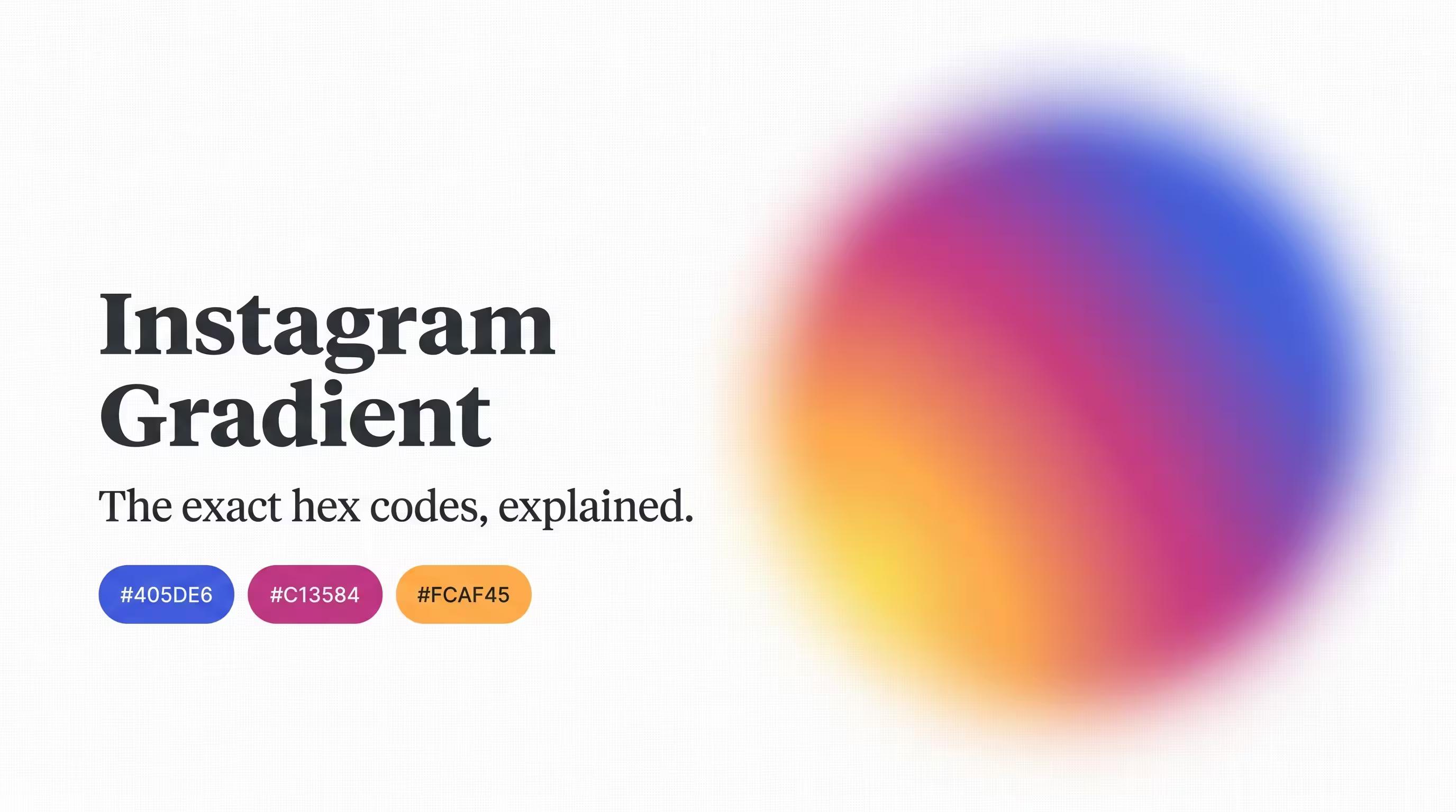
Instagram Gradient: Recreate the Exact Colors in CSS
The real hex codes behind Instagram's gradient — both the official brand palette and the radial gradient used in the app icon — with ready-to-copy CSS.
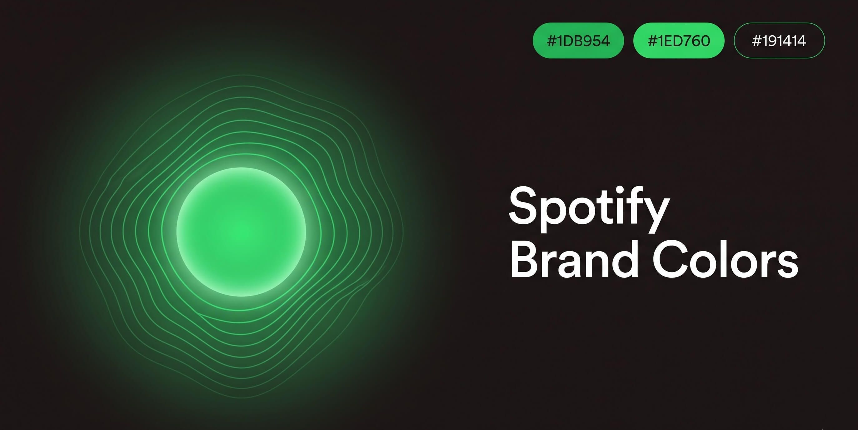
Spotify Green: The Exact Hex Code and How to Use It
Spotify green is #1DB954 — but the logo uses a different shade. The exact hex, RGB, and contrast data, plus how to use it without breaking accessibility.