
Tint vs. Shade vs. Tone: What's the Actual Difference?
Color Theory11 min read
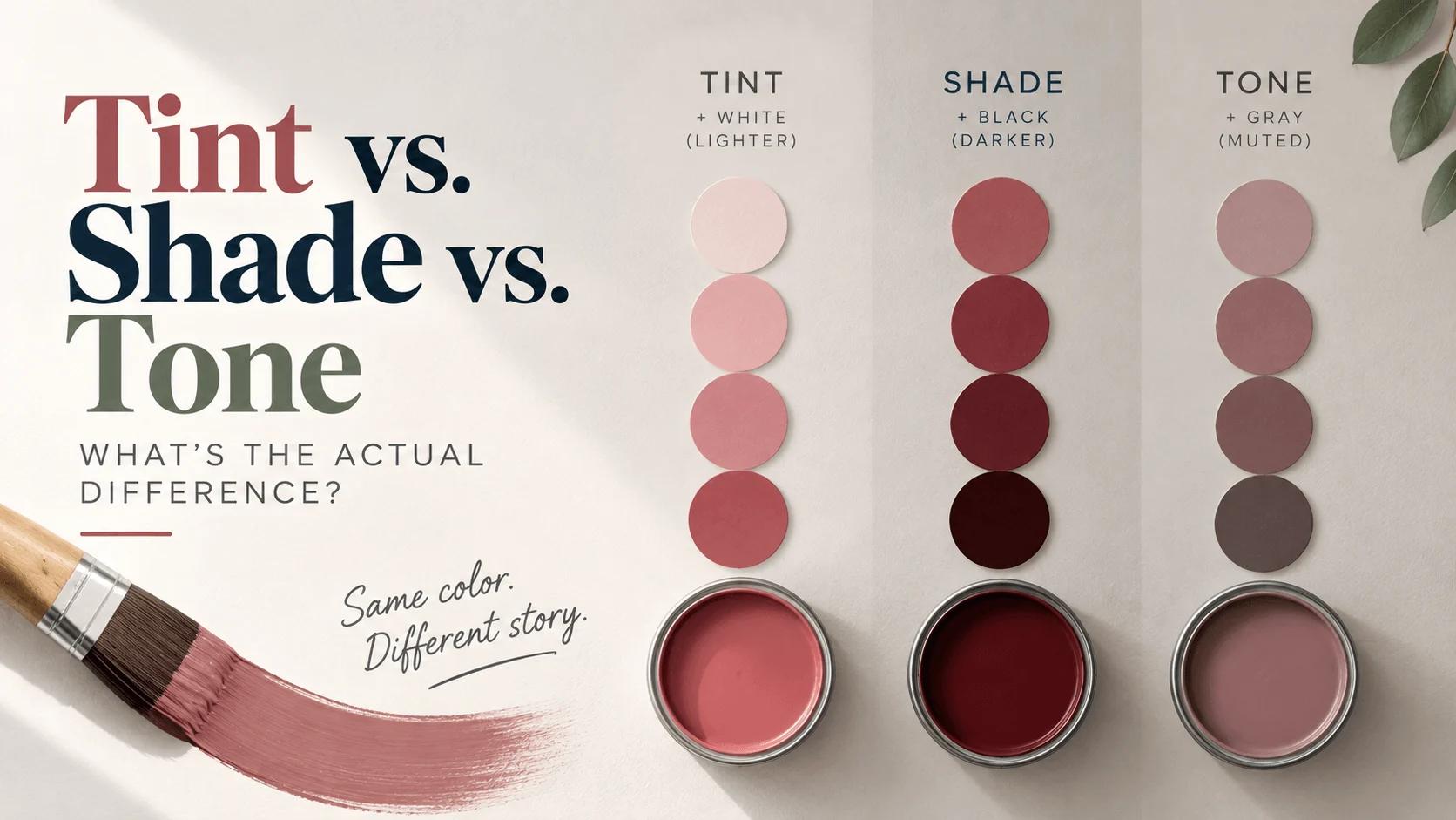
Walk down a paint store aisle and you'll see it everywhere: "Dusty Rose Shade," "Soft Blue Tint," "Muted Sage Tone." Half the time, the labels don't even match what the words technically mean. Most people, including plenty of designers, use tint, shade, and tone completely interchangeably, as if they're just three different ways of saying "a version of this color."
They're not. Each one describes a specific, different thing you can do to a color, and once you actually understand the difference, you'll have a lot more control over how a design looks and feels — not just which color you're using, but which version of it.
Key Takeaways
- A tint is a color mixed with white, which makes it lighter.
- A shade is a color mixed with black, which makes it darker.
- A tone is a color mixed with gray, which makes it more muted, without necessarily making it lighter or darker.
- All three start from the same base color, called a hue, and only the neutral you mix in changes.
- Tints tend to feel soft and airy, shades feel deep and dramatic, and tones feel sophisticated and understated.
What Is a "Hue," and Why Does It Matter Here?
Before any of this makes sense, you need one more term: hue. A hue is a pure, unmixed color straight off the color wheel — red, blue, yellow, and everything in between, with no white, black, or gray added at all. It's the starting point.
Tints, shades, and tones aren't separate colors. They're all just that same starting hue, modified in one specific direction. Take red as your hue, and every pink, every maroon, and every dusty brick-red you can imagine is really just red with something else mixed in. What changes is which neutral you added, and how much of it.
Tint: Adding White
A tint is a hue with white mixed in. The result is always lighter and softer than where you started, and the more white you add, the paler it gets. Take a pure red, add white gradually, and you'll move through a whole range of pinks, eventually landing somewhere close to a barely-there blush.
Think of it the way milk changes coffee. The coffee doesn't stop being coffee — it just gets lighter and gentler the more milk you pour in. Tint works the same way with color: the hue is still fundamentally there, just diluted.
Tints tend to feel light, delicate, and calm. That's why they show up constantly in pastel color palettes, spring and baby-related branding, and anywhere a design wants to feel gentle rather than intense. In digital design specifically, tints are the workhorse of light-theme interfaces — think alert banners, card backgrounds, tag labels, and hover states, where you want a hint of color without it overwhelming whatever content sits on top of it.
Shade: Adding Black
A shade is the opposite move: a hue with black mixed in, which makes it darker and richer. Take that same pure red, add black instead of white, and you'll move through deepening reds until you land somewhere around a dark maroon or near-black burgundy.
Shades feel deep, moody, and a little dramatic. They're what give a color a sense of weight and seriousness — a navy is really just blue pushed toward black, and a forest green is really just green pushed the same direction. In UI and app design, shades dominate dark-mode interfaces: dark navigation bars, footer backgrounds, and the deeper, pressed-down version of a button's color when someone clicks it. A well-chosen shade can make a dark interface feel warm and intentional instead of just defaulting to flat gray.
Tone: Adding Gray
This is the one almost everyone gets wrong, mostly because it doesn't behave the way tints and shades do. A tone is a hue with gray mixed in, and gray itself is just a neutral, even mix of black and white with no color of its own. The result isn't necessarily lighter or darker than where you started — it's simply less colorful. Less saturated. Quieter.
Take that same red one more time, mix in gray, and instead of moving toward pink or maroon, you'll land somewhere like a dusty brick or a muted terracotta — still recognizably red, just far less intense and a little more grown-up. The same thing happens to green: mix in gray, and you land somewhere close to sage.
Toned colors tend to read as sophisticated, earthy, and refined, rather than loud or playful. That's exactly why they show up so often in luxury branding, editorial design, and high-end packaging — a muted, toned-down palette signals restraint, and restraint reads as expensive.
Quick Visual Comparison
- Tint — hue + white → lighter, softer, pastel-leaning
- Shade — hue + black → darker, deeper, more dramatic
- Tone — hue + gray → muted, desaturated, more sophisticated
- What stays the same across all three: the underlying hue itself never changes, only how much white, black, or gray gets mixed in
Why People Mix These Terms Up
Honestly, it's not entirely your fault if you've used these words interchangeably. Paint companies are some of the worst offenders — plenty of commercial paint names slap the word "shade" on what's technically a tint, or call something a "tone" when it's really closer to a shade, because the marketing name just needs to sound appealing, not be technically accurate. Language drifts, especially in casual conversation, and "shade" in particular has become an informal catch-all for "any variation of a color" in everyday speech, even among people who work with color professionally.
That's fine for casual conversation. But once you're actually building a palette, especially for something like a brand identity or a UI design system, the precise version of these words gives you a much clearer way to communicate exactly what you want — and a much more intentional way to build it.
The Bonus Terms: Value, Saturation, and a Weird Little Fact
While we're clearing up terminology, two related words are worth knowing. Value refers to how light or dark a color is — this is the axis that tints and shades move along. Saturation (sometimes called chroma) refers to how colorful or intense a color is — this is the axis that tones move along, since adding gray reduces intensity without necessarily changing lightness much.
Here's a genuinely strange fact for the curious: mixing white, black, or gray into a hue doesn't just change its lightness and intensity — it can very slightly shift how your eye perceives the hue itself. Colors don't always stay perceptually "pure" as you tint, shade, or tone them, even though the math behind the mix stays consistent. It's a subtle effect you'll probably never consciously notice, but it's part of why color work sometimes feels more like an art than a formula, even with all these precise definitions in place.
How to Build Tints, Shades, and Tones With Real Tools
You don't need to mix digital paint by hand to do any of this. In most color tools, tints and shades come from adjusting a color's lightness value, while tones come from adjusting its saturation downward. Our color mixer lets you blend any hue with white, black, or gray directly and see the exact resulting hex code, which is a much faster way to explore this than doing the math yourself.
If you're working in code, the same idea translates directly into CSS using HSL values, since HSL separates hue, saturation, and lightness into three distinct numbers:
:root {
  --base-hue: 0; /* red */

  --tint: hsl(var(--base-hue), 70%, 85%);  /* high lightness = tint */
  --shade: hsl(var(--base-hue), 70%, 20%); /* low lightness = shade */
  --tone: hsl(var(--base-hue), 25%, 50%);  /* low saturation = tone */
}
Notice the pattern: the tint and shade both keep saturation the same and only move lightness up or down, while the tone keeps lightness roughly steady and pulls saturation way down instead. That's the technical version of everything explained above, expressed in three numbers instead of words.
One Color, Three Directions: A Worked Example
Theory is easier to hold onto with an actual example in front of you, so let's take one color and push it all three ways.
Start with a mid-tone blue: #457B9D.
- Tinted (mixed toward white):
#A8C5D9— a soft, airy sky blue. Great for a light background or a gentle hover state. - Shaded (mixed toward black):
#1F3A4D— a deep, almost navy blue. Great for a dark-mode background or a footer. - Toned (mixed toward gray):
#6B8494— a muted, dusty blue-gray. Great for secondary text or an understated accent.
Notice that all three are unmistakably still "blue." Nobody would look at any of them and think you'd switched colors entirely. What changed is the feeling each one carries — the tint feels light and calm, the shade feels serious and grounded, and the tone feels quiet and a little more sophisticated than either. These exact values are illustrative — the precise result depends on how much white, black, or gray you mix in, so plug your own base color into our color mixer if you want to dial in an exact match.
Common Mistakes to Avoid
A couple of things trip people up once they start actually applying this:
- Shading with pure black. Mixing in 100% black can flatten a color and make it look muddy or lifeless rather than rich. A lot of experienced designers get a better result by darkening toward a related, darker hue instead of pure black — for instance, pushing blue toward a deep indigo rather than straight black.
- Tinting with too much white, too fast. Add white too aggressively and a color can wash out into something barely recognizable, losing whatever personality made you pick it in the first place. Small, incremental steps usually preserve more of the original character.
- Assuming a tone is automatically "boring." Toned colors are quieter by design, not weaker. In the right context — packaging, editorial layouts, premium branding — a well-chosen tone reads as more confident than a bright, saturated hue ever could.
Where You'll See Each One in Real Design
Tints show up constantly in soft, approachable branding — think wellness apps, baby products, and anything aiming for a light, springtime feeling. Shades dominate anything wanting to feel premium, dramatic, or focused, which is a big part of why so many dark-mode interfaces and luxury logos lean on deep, near-black versions of a color instead of the pure hue. Tones show up in more understated, editorial spaces — muted, earthy branding, high-end packaging, and interior design palettes that favor a calm, grown-up feeling over anything bright or attention-grabbing.
If you want to see this ratio-based thinking applied to a full palette rather than just one color, our post on the 60-30-10 rule is a natural next step — it's really about deciding how much space each of your colors, tints, shades, and tones included, should actually take up in a design.
How to Build Your Own Tint, Shade, and Tone Palette
Start with a single hue using our color picker, then explore lighter and darker variations of it with the color mixer. Once you've found a direction you like, our color palette generator can help you build out a fuller set of tints, shades, and tones around that same base hue, so your whole palette feels connected rather than like a collection of unrelated colors.
FAQs
What's the actual difference between a tint and a shade? A tint is a color mixed with white, making it lighter. A shade is a color mixed with black, making it darker. They move in opposite directions from the same starting hue.
Is a tone lighter or darker than the original color? Neither, necessarily. A tone is a color mixed with gray, which mainly reduces how saturated or intense it looks, rather than shifting it clearly lighter or darker.
Which is used more in dark mode design, shade or tone? Shades are far more common in dark-mode interfaces, since they're specifically built by adding black, which naturally suits darker backgrounds and deeper, more dramatic color use.
Do tints, shades, and tones all keep the same hue? Yes. That's the whole foundation of the concept — the underlying hue never changes. Only the amount of white, black, or gray mixed into it does.
Is "shade" just a general word for any color variation? In casual, everyday conversation, yes, people use it that way constantly. In color theory specifically, though, "shade" has one precise meaning: a hue mixed with black.
Wrap-Up
Tint, shade, and tone aren't interchangeable synonyms — they're three different tools that do three different jobs, all starting from the exact same color. Once you can tell them apart on sight, picking a palette stops being about vaguely "finding a nice version" of a color and starts being a deliberate decision: lighter and softer, darker and richer, or muted and more sophisticated. Same hue, three completely different moods.
Tools for this guide
Related posts
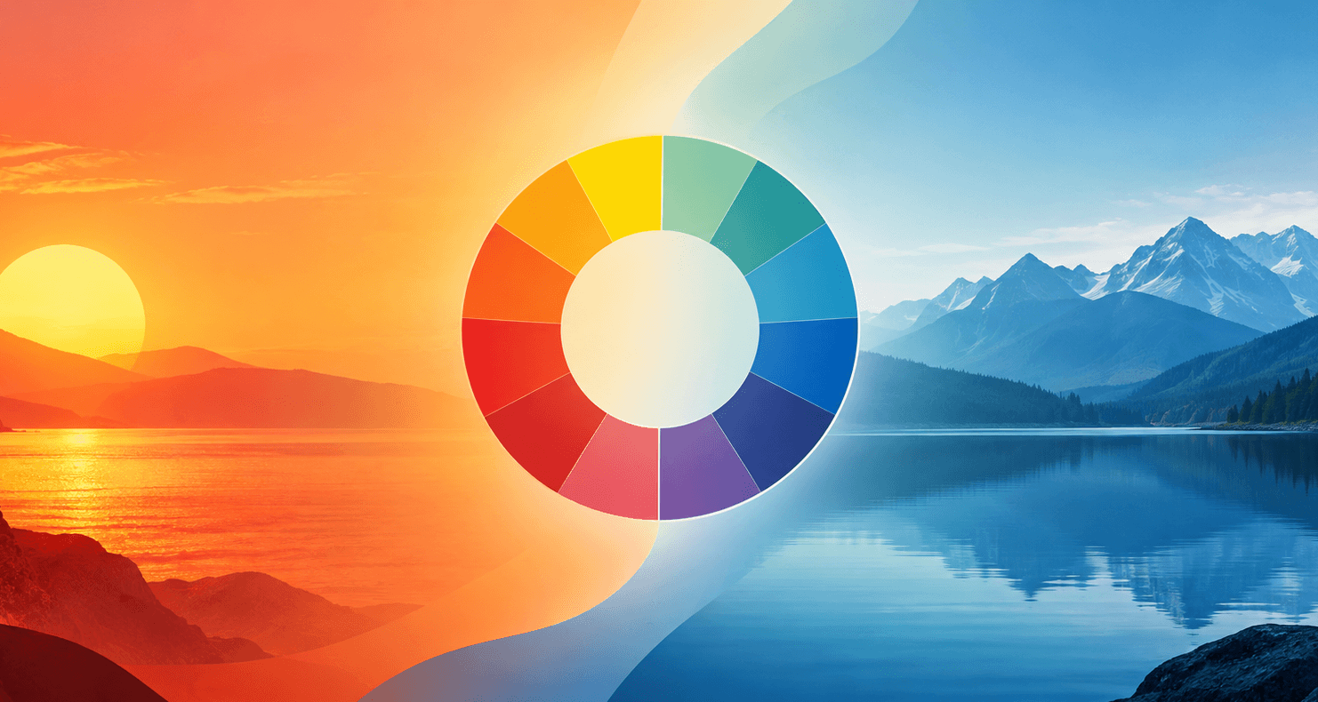
Warm Colors vs. Cool Colors: What's the Difference?
Warm colors (red, orange, yellow) vs. cool colors (blue, green, purple) — what actually makes a color warm or cool, why it's relative, and how to use it in design.
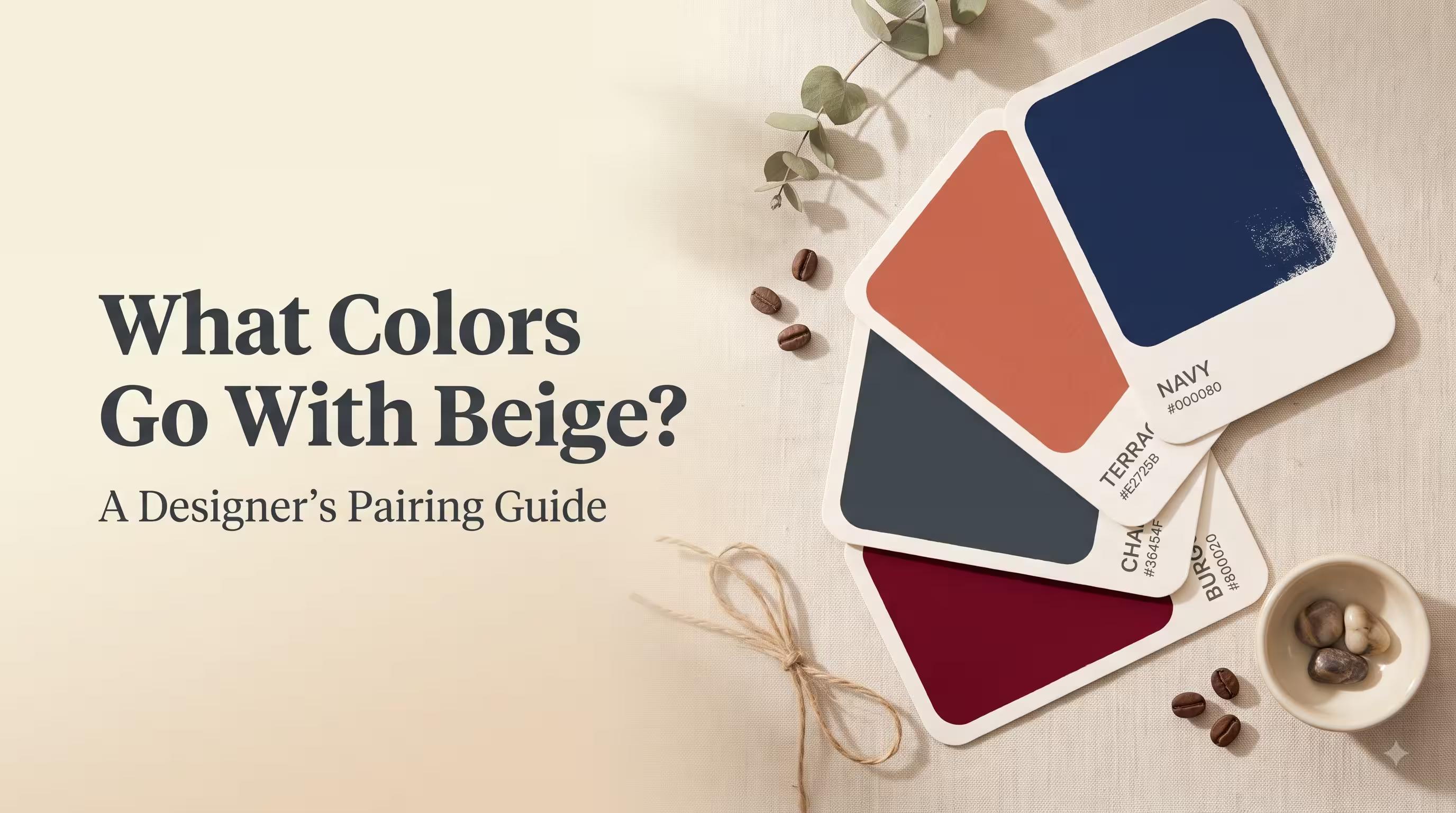
What Colors Go With Beige? A Designer's Pairing Guide
The best colors to pair with beige — navy, terracotta, charcoal, burgundy and more — with hex codes, real use cases, and tips for testing combos yourself.