
Warm Colors vs. Cool Colors: What's the Difference?
Color Theory8 min read
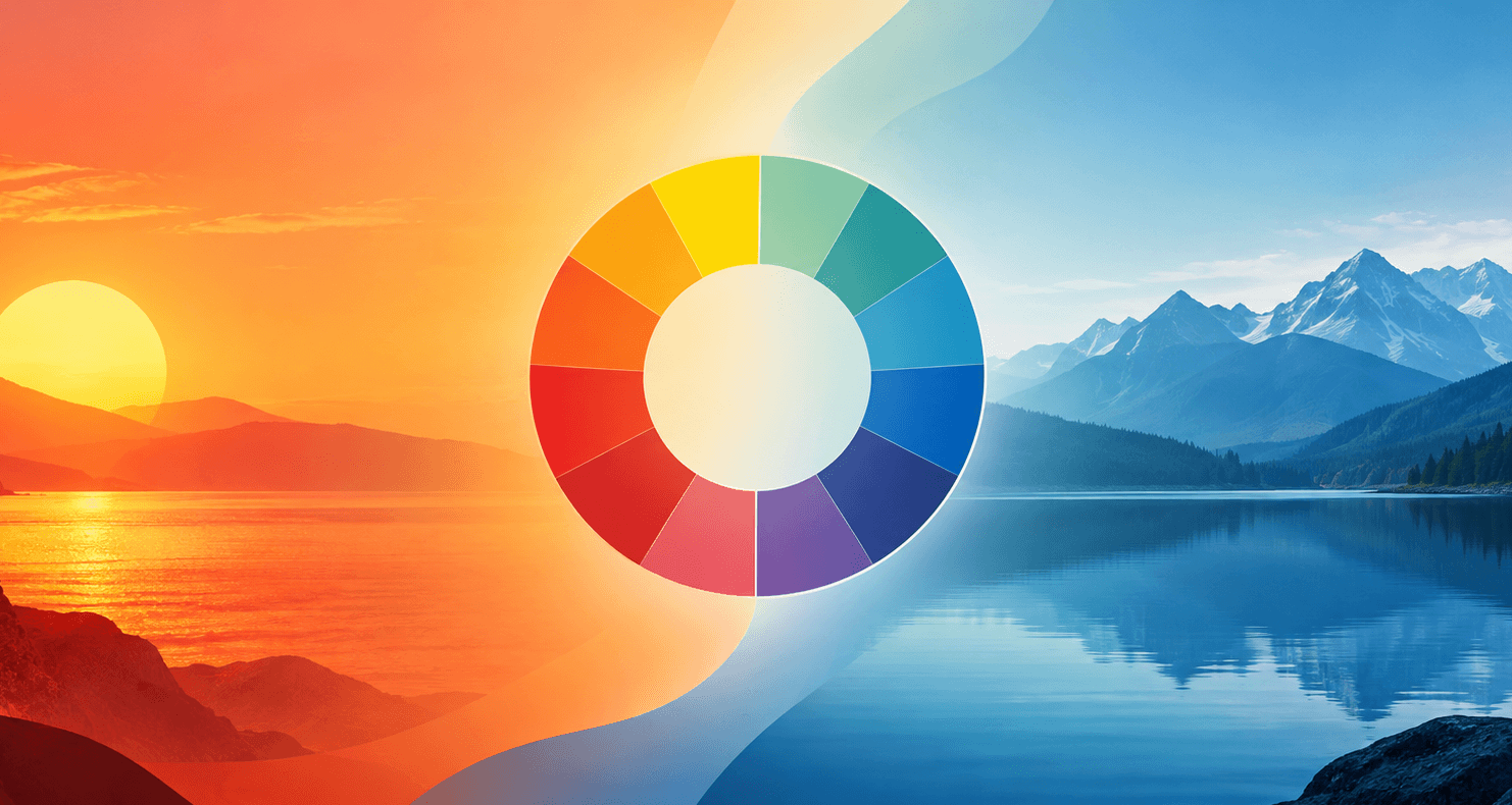
Look at a photo of a sunset and then a photo of the ocean. You don't need anyone to tell you which one feels warmer. Your brain just knows. That instant reaction — one color family feeling hot, energetic, and close, the other feeling calm, quiet, and distant — is one of the most basic, powerful tools in all of design. And yet most people couldn't actually explain why it happens, or how to use it on purpose.
That's what this guide is for. By the end, you'll know exactly what makes a color warm or cool, why the answer is a little more complicated than "red good, blue bad," and how to actually use that knowledge in real design work, not just paint swatches.
Key Takeaways
- Warm colors are red, orange, and yellow. Cool colors are blue, green, and purple.
- Warm colors feel closer, more energetic, and grab attention faster. Cool colors feel calmer, more distant, and easier to sit with for a long time.
- Color temperature is relative, not fixed — a single color can look warm next to one color and cool next to another.
- Neutrals like beige, gray, brown, and white aren't temperature-neutral. They almost always lean slightly warm or slightly cool depending on their undertone.
- In design and branding, warm colors are best for grabbing attention (buttons, alerts, calls to action), while cool colors are better for building trust and keeping people calm (backgrounds, finance apps, healthcare).
Quick Answer: Warm vs. Cool Colors at a Glance
Warm colors:
- Red —
#E63946 - Orange —
#F4A261 - Yellow —
#FFD60A
Cool colors:
- Blue —
#457B9D - Green —
#2A9D8F - Purple —
#6A4C93
That's the short version. Now let's get into why it actually works this way.
What Makes a Color "Warm" or "Cool," Really?
Here's the interesting part: warm and cool colors don't actually have a different temperature. Red isn't hotter than blue in any measurable, physical way. The whole idea comes from association, not physics.
Reds, oranges, and yellows remind us of fire, sunlight, and heat. Blues, greens, and purples remind us of water, sky, shade, and ice. Our brains latched onto those associations a long time ago, and now we feel them almost instantly, without even thinking about it. It's less a rule of science and more a rule of human memory and instinct — which, honestly, makes it even more powerful for design, because it's tapping into something everyone already feels the same way.
Here's the Twist: Warm and Cool Are Relative, Not Fixed
This is the part most quick explanations skip, and it's genuinely the most useful thing to understand. A color isn't warm or cool all by itself. It's warm or cool compared to another color.
Take yellow. A golden, slightly orange-leaning yellow feels warm. A lemon, slightly green-leaning yellow feels noticeably cooler, even though it's still, technically, yellow. The same thing happens with blue — a teal that leans toward green feels warmer than a periwinkle that leans toward purple. Even grays and browns do this: a gray with a hint of yellow or red in it (sometimes called "greige," a mashup of gray and beige) reads as warm, while a gray with a hint of blue reads as cool.
So when someone asks "is this color warm or cool?" — the honest answer is: compared to what? Once you start comparing colors side by side instead of judging them in isolation, you'll start seeing warmth and coolness everywhere, even inside colors you thought were simple.
Warm Colors: What They Are and What They Do
The core warm family is red, orange, and yellow, along with everything that sits between them on the color wheel — think red-orange, orange-yellow, and so on.
Warm colors tend to do a few specific things:
- They feel like they're moving toward you, which is why designers use them for anything that needs to grab attention fast
- They create a sense of energy, urgency, and excitement
- They feel close and personal rather than distant
That's exactly why so many "Buy Now," "Sign Up," and "Limited Time" buttons on websites are orange or red. It's not a coincidence or a trend — it's the same instinct that makes a campfire feel inviting from across a dark field.
Cool Colors: What They Are and What They Do
The core cool family is blue, green, and purple, along with everything in between — blue-green, blue-violet, and so on.
Cool colors tend to do the opposite of warm ones:
- They feel like they're settling back, away from the viewer, which is why they work so well as backgrounds
- They create a sense of calm, stability, and trust
- They're easier to look at for long stretches of time without feeling overwhelming
This is exactly why so many banking apps, healthcare websites, and meditation apps lean heavily on blue and green. They're not trying to grab you by the collar — they're trying to make you feel safe enough to stick around.
What About Neutrals? (Beige, Gray, White, Black)
Here's a common misconception: people assume neutrals like beige, gray, white, and black have no temperature at all. In reality, almost every neutral leans slightly warm or slightly cool once you look closely, because of something called an undertone — a faint hint of another color hiding underneath the main one.
A beige with a yellow undertone feels warm. A beige with a gray or pink undertone feels cooler. The same goes for gray, brown, and even white — paint stores are full of options like "warm white" and "cool white" for exactly this reason. We actually broke this down in detail in our guide on what colors go with beige, including how that warm undertone is the reason beige pairs so easily with other warm colors like terracotta and burgundy.
The only truly temperature-neutral colors are pure, mathematically perfect black and white — and in real-world design, you'll rarely see either used in that exact, unmixed form.
Why This Actually Matters for Design (Not Just Paint Colors)
Most articles about warm and cool colors are written for people picking paint for a living room. That's useful, but it undersells what this concept can actually do in digital design, branding, and marketing.
Here's the practical version:
- Use warm colors when you want action. Buttons, alerts, sale banners, anything you want a visitor to notice and click on almost immediately.
- Use cool colors when you want trust and calm. Backgrounds, navigation, anything that needs to stay comfortable to look at for a long time.
- Mix both, deliberately. A cool background with one warm accent color (like a blue website with an orange "Sign Up" button) is one of the most effective, most commonly used design patterns out there, precisely because the warm color has nothing to compete with — it's the only warm thing on the page, so it's impossible to miss.
This is the same underlying logic we broke down in our post on the best color combinations for a website — a calm base plus one attention-grabbing accent is a formula that shows up again and again because it works.
How to Spot Warm vs. Cool at a Glance
The fastest way to train your eye is to compare colors side by side instead of judging them alone. Pull up a color wheel, place two similar shades next to each other, and ask which one leans more toward red/orange/yellow (warmer) versus blue/purple (cooler). Our color wheel tool is a great place to actually practice this — you can spin through hues and watch the temperature shift in real time, which honestly makes the concept click a lot faster than reading about it. If you want the fuller walkthrough on using it, check out our guide on how to use a color wheel.
Try It Yourself
The best way to really understand warm and cool colors is to play with them directly. Start with our color picker to grab a color and see its exact values, then use the color palette generator to build a palette and notice how the warm and cool colors in it behave differently. Want to see what happens when you blend a warm and a cool color together? Our color mixer shows you the result instantly — it's a genuinely fun way to see this whole concept in action instead of just reading about it.
FAQs
Is green a warm or cool color? Green is generally considered a cool color, since it sits close to blue on the color wheel. That said, some greens (like olive or chartreuse) lean warmer because they contain more yellow.
Is purple warm or cool? Purple is usually grouped with cool colors, but it's one of the more flexible ones — a red-leaning purple can feel noticeably warmer than a blue-leaning purple.
Can a color be both warm and cool? Not at the same time, but the same color name can have both warm and cool versions. A "warm yellow" and a "cool yellow" are both still yellow, just leaning in different directions depending on what other color is mixed in.
Do warm and cool colors actually have different temperatures? No, not physically. The effect is based on association and perception, not any real difference in heat. Your brain treats them differently because of what they remind you of, not because they're actually warmer or cooler.
Which colors are considered temperature-neutral? True black and true white are the only colors without any warm or cool lean. Nearly every other neutral, including beige, gray, and brown, has a subtle undertone that pushes it one way or the other.
Wrap-Up
Warm and cool isn't just a fun fact about color — it's one of the most reliable tools you have for guiding how people feel the instant they look at something you've made. Once you start noticing it, you can't really unsee it: the buttons designed to grab you, the backgrounds designed to calm you, the undertones hiding inside colors you thought were simple. Start paying attention, and you'll start designing with a lot more intention.
Tools for this guide
Related posts
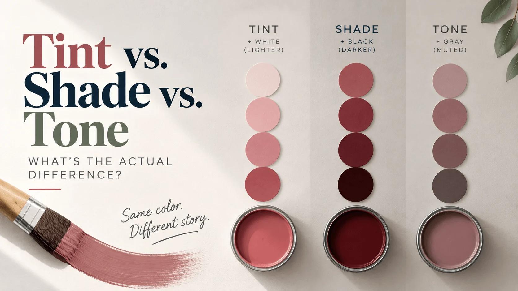
Tint vs. Shade vs. Tone: What's the Actual Difference?
Tint (+white), shade (+black), and tone (+gray) explained clearly — with a real hex example, CSS code, and where each one actually belongs in design.
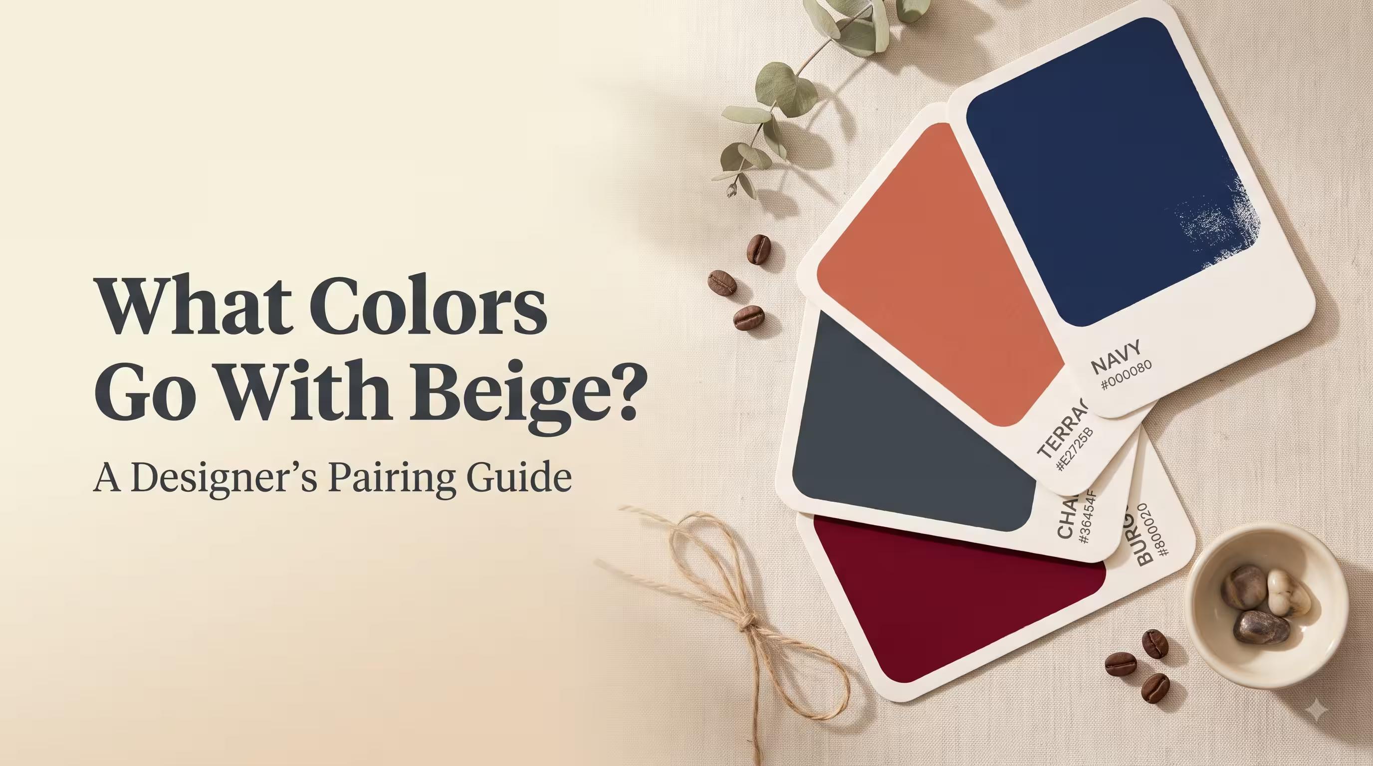
What Colors Go With Beige? A Designer's Pairing Guide
The best colors to pair with beige — navy, terracotta, charcoal, burgundy and more — with hex codes, real use cases, and tips for testing combos yourself.