
The 60-30-10 Rule: A Simple Formula for Color in Design
Color Theory10 min read
Have you ever looked at two designs using almost the exact same colors and felt like one looked professional while the other looked like a mess? It happens more than people realize, and it's almost never about which colors were picked. It's about how much of each color was used.
That's the entire idea behind the 60-30-10 rule, one of the simplest, most widely used formulas in design. It doesn't tell you which colors to choose. It tells you how to divide them so your design actually has a sense of order instead of feeling like five colors fighting for the same amount of attention. Once you understand it, you'll start noticing it everywhere, from well-designed homes to the app on your phone.
Key Takeaways
- The 60-30-10 rule splits a design into three roles: a dominant color (60%), a secondary color (30%), and an accent color (10%).
- It's a ratio, not a specific palette — it works with almost any color combination as long as the proportions stay roughly balanced.
- The rule originated in interior design but applies just as well to websites, apps, branding, and any visual design.
- The accent color's power comes from scarcity — it works because it's rare, not despite it.
- It's a helpful guideline, not a strict law. Real designs bend it constantly, and that's completely normal.
What Is the 60-30-10 Rule?
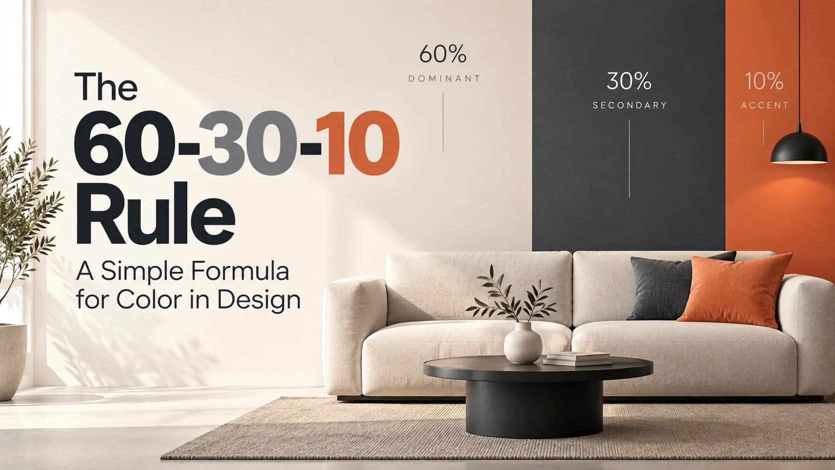
The 60-30-10 rule is a color proportion guideline that divides a design into three weighted roles: a dominant color covering roughly 60% of the visible space, a secondary color covering about 30%, and an accent color reserved for the remaining 10%. It doesn't specify which actual colors to use — it specifies how much of each one should appear, which is exactly what makes it so flexible.
Think of it like a stage. The dominant color is the backdrop, quietly setting the overall tone. The secondary color is the supporting cast, adding structure and depth without stealing focus. The accent color is the one moment everyone's eye gets pulled toward — small, sharp, and impossible to miss precisely because there's so little of it.
Where Did the 60-30-10 Rule Come From?
Honestly, there's no single, universally agreed-upon origin story here, and most sources that claim otherwise are guessing. What we do know is that it's been a staple of interior design for decades, used by decorators to keep a room from feeling chaotic when working with multiple colors, fabrics, and finishes at once. Over time, the same underlying logic got adopted by graphic designers, brand strategists, and eventually web and UI designers, because the core problem it solves — too many competing colors with no clear hierarchy — shows up in every visual medium, not just rooms.
Breaking Down Each Percentage
The 60%: Your Dominant Color
This is your foundation. In a room, it's the walls and the largest furniture. On a website, it's usually your background and the largest surfaces on the page. The dominant color sets the overall mood before a viewer even registers any of the details, which is exactly why it's almost always something calm and neutral rather than something loud — a bold color at 60% coverage gets exhausting fast.
The 30%: Your Secondary Color
This is where you start building structure and contrast. In a room, it might be curtains, rugs, or a sofa. In a digital design, it typically shows up in cards, navigation bars, section backgrounds, and supporting UI elements. The secondary color should relate to the dominant one, either through the color wheel or simply by feeling like it belongs in the same family, while still being distinct enough to create visible separation between sections.
The 10%: Your Accent Color
This is the smallest slice, and it's doing the most work. The accent color is reserved for whatever you most want someone to notice — a call-to-action button, a highlighted price, a single striking decor piece in a room. Here's the part that trips people up: the accent color's impact comes directly from how little of it there is. Use it everywhere, and it stops being an accent at all — it just becomes another color competing for attention. Its scarcity is the entire source of its power.
Why This Ratio Actually Works
Most cluttered, "off" designs break this exact proportion without anyone quite noticing why. Someone scatters five or six colors across a page in roughly equal amounts, and even though every individual color might be perfectly nice, the whole thing feels noisy and directionless, because nothing is clearly more important than anything else.
The 60-30-10 rule fixes that by creating a deliberate visual hierarchy. Your eye rests on the dominant color first, since it's everywhere. Then it scans the secondary color, picking up the structure of the design. Finally, it gets pulled toward the accent color, which stands out precisely because it's rare. That's not a coincidence or a design trend — it's a predictable pattern of how human attention naturally moves across an unfamiliar image.
The 60-30-10 Rule in Interior Design
This is where the rule is most famous, and it's worth understanding even if your main interest is digital design, since it explains the logic in its most literal, physical form. In a living room, the dominant 60% typically covers the walls and largest furniture pieces. The 30% secondary color might show up in curtains, an area rug, or a set of accent chairs. The final 10% is reserved for smaller touches — throw pillows, artwork, a single bold lamp — the details that give a space personality without overwhelming it.
The 60-30-10 Rule in Web and UI Design
This is where things get genuinely useful for most readers of this site, and it's an area a lot of general design guides skip over entirely.
In a website or app, the roles translate almost directly:
- 60% (Dominant): Your main background and largest surfaces — usually a soft neutral like off-white or light gray
- 30% (Secondary): Cards, navigation bars, section dividers, supporting text — often a mid-tone neutral like charcoal or slate
- 10% (Accent): Buttons, links, and anything you want someone to click — a bold, high-contrast color that has nothing else competing with it
Here's a concrete example using real hex codes:
:root {
  --color-dominant: #F9FAFB;  /* 60% - background */
  --color-secondary: #36454F; /* 30% - cards, nav, text */
  --color-accent: #F4A261;    /* 10% - buttons, links */
}

body {
  background-color: var(--color-dominant);
  color: var(--color-secondary);
}

.button-primary {
  background-color: var(--color-accent);
}
Notice how this is really the same underlying pattern we walked through in our post on the best color combinations for a website — a calm base, a supporting neutral, and exactly one attention-grabbing color. That wasn't a coincidence. It's the 60-30-10 rule showing up under a different name.
The 60-30-10 Rule in Branding
You can see this same ratio at work in a lot of brand identities, even when the brand itself never labeled it that way. Think back to our breakdown of Nike's brand colors — white and black dominate almost everything, while orange shows up sparingly as an accent, exactly where it's needed most. Or Starbucks, where white and neutral tones do most of the heavy lifting, with that specific green reserved for the moments that need to stand out. Strong, memorable brands rarely use their boldest color everywhere. They use it exactly where it counts, and let something quieter carry the rest.
How to Pick Your Three Colors
Start with your dominant color first, since everything else needs to work around it. A neutral, whether warm or cool, is almost always the safest and most flexible choice here. From there, pick a secondary color that feels related — either a deeper or lighter shade in the same family, or a color that sits nearby on the color wheel. Finally, choose your accent color by looking for real contrast, either a complementary hue from across the wheel or simply a much bolder, more saturated version of something already in your palette.
Our color wheel tool is the fastest way to actually see these relationships instead of guessing at them — pick a starting hue and watch which colors naturally complement it before you commit to anything.
Common Mistakes When Using the 60-30-10 Rule
- Treating it as an exact science. Nobody is measuring pixels to hit precisely 60.0%. It's a proportion to aim for, not a rule to obsess over.
- Overusing the accent color. The second an accent color starts showing up everywhere, it loses the scarcity that made it effective in the first place.
- Ignoring contrast between the dominant and secondary colors. Two colors can technically follow the ratio and still be hard to read against each other. Always double-check text readability with a contrast checker rather than assuming it's fine.
- Picking three colors with no real relationship. The ratio alone won't save a palette where the colors genuinely clash. Use the color wheel to make sure your choices actually belong together — our guide on complementary vs. analogous colors is a good place to start if you're unsure how your colors relate.
When to Break the Rule
Like most design guidelines, this one is meant to be a starting point, not a cage. Some of the best minimalist designs use only two colors, skipping the third entirely. Others need a fourth neutral, like pure black or white, layered on top of the three main roles just to handle text and borders cleanly. The ratio itself can shift too — a dashboard full of data might need more than 10% devoted to functional colors like error states or status indicators. The goal was never to hit an exact number. It was always to create a clear sense of what matters most in your design, and sometimes that takes a slightly different shape than 60-30-10 exactly.
Try It Yourself
The easiest way to get a feel for this ratio is to build a palette and actually look at it applied to something. Start with our color palette generator to explore dominant, secondary, and accent combinations, then use our color mixer if you want to soften or adjust any of the three before committing. And before you finalize anything, run your dominant-and-secondary text pairing through our contrast checker to make sure it's actually readable, not just visually balanced on paper.
FAQs
What is the 60-30-10 rule in color theory? It's a design guideline that divides a color palette into three roles by proportion: a dominant color covering about 60% of a design, a secondary color covering about 30%, and an accent color covering the remaining 10%.
Does the 60-30-10 rule apply to web design, or just interior design? Both. While it's most famous in interior design, the exact same logic applies to websites, apps, and branding — the dominant color becomes your background, the secondary becomes your supporting UI, and the accent becomes your call-to-action color.
What colors should I use for the 60% dominant color? A neutral is almost always the safest choice, whether warm (off-white, beige) or cool (light gray, soft blue-gray). Using a very bold color as your dominant shade tends to feel overwhelming across that much space.
Can I use more than three colors with the 60-30-10 rule? Yes, especially in more complex interfaces. Many real designs add a neutral like pure white or black for backgrounds and text on top of the three main roles. The rule is a helpful starting structure, not a hard limit.
Is the 60-30-10 rule a strict rule, or just a guideline? It's a guideline. Nobody measures a design down to the exact percentage — it's meant to create a clear sense of visual hierarchy, and small deviations from the exact ratio are completely normal.
Wrap-Up
The 60-30-10 rule survives across interior design, branding, and web design for a simple reason: it solves the same problem every single time, which is that too many competing colors leave a viewer with no idea where to look first. Pick a calm foundation, add a supporting structure, and reserve your boldest color for the one thing that actually deserves the attention. It's a small formula, but it's doing a lot of quiet work behind almost every design that feels effortlessly put together.
Tools for this guide
Related posts
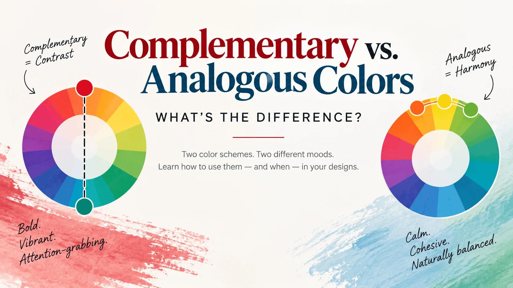
Complementary vs. Analogous Colors: What's the Difference?
Complementary colors sit opposite each other on the wheel for bold contrast; analogous colors sit next to each other for harmony. Real examples and when to use each.
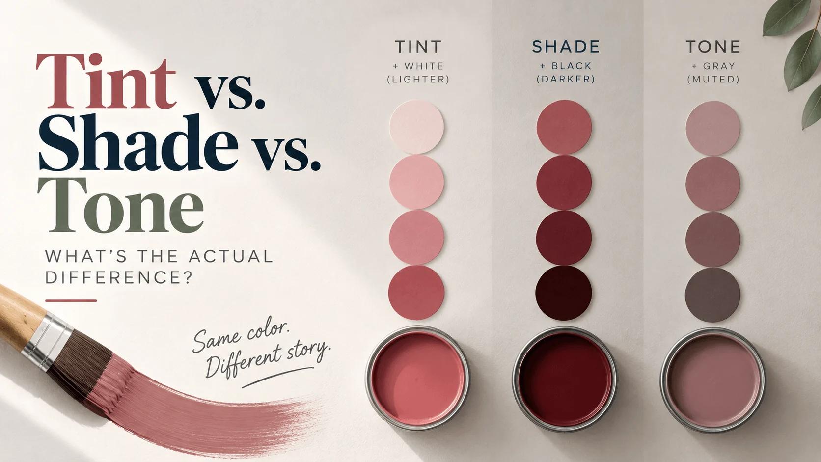
Tint vs. Shade vs. Tone: What's the Actual Difference?
Tint (+white), shade (+black), and tone (+gray) explained clearly — with a real hex example, CSS code, and where each one actually belongs in design.