
Best Color Combinations for a Website (Real Examples)
6 min read
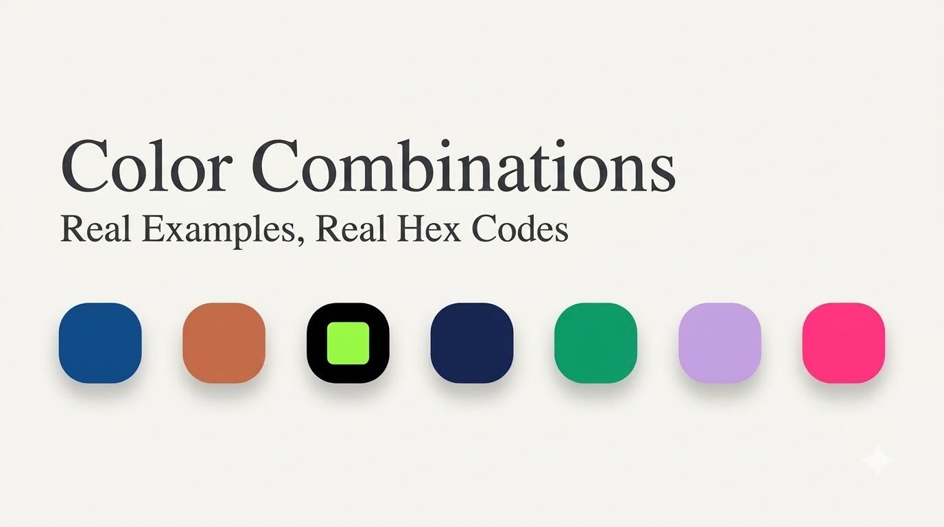
Here's a fun fact to start with: Pantone just named "Cloud Dancer" — a soft, quiet white — as its Color of the Year for 2026. Not a bold red. Not an electric blue. A calm, barely-there white. That single choice tells you a lot about where website design is headed right now: less noise, more intention.
But "calm" doesn't mean boring, and picking website colors definitely doesn't mean grabbing whatever looks nice in the moment. The best color combinations follow patterns, and once you see those patterns, you'll notice them everywhere. Let's break down the ones that actually work, with real hex codes you can use today.
Quick Answer: 7 Website Color Combos That Work
- Deep blue + light neutral gray — trustworthy, modern, great for tech and SaaS
- Warm off-white + charcoal + one accent — calm, easy to read, great for blogs and content
- Black + white + neon accent — bold, energetic, great for gaming and music
- Navy + gold — premium, confident, great for luxury brands
- Emerald green + cream — natural, grounded, great for eco and wellness
- Digital lavender + soft white — calming, modern, great for health and wellness apps
- Hot pink + safety orange on black or white — loud and fun, great for entertainment and youth brands
Now let's go through each one properly.
1. Deep Blue + Light Neutral Gray
The colors: #2563EB (blue), #F9FAFB (background), #111827 (text)
This is, statistically, one of the most-used color combinations on the entire internet right now. Deep blue reads as trustworthy and professional without feeling cold, and pairing it with soft grays instead of stark white keeps the whole page from feeling harsh. This is the "safe and smart" choice — it's why you'll see it all over banking apps, software tools, and business websites.
Best for: SaaS products, fintech, B2B tools, anything that needs to feel reliable.
2. Warm Off-White + Charcoal + One Accent Color
The colors: A soft warm white (close to Pantone's Cloud Dancer), #36454F (charcoal) for text, plus one accent like #E2725B (terracotta) or #10B981 (emerald)
Pure white backgrounds are slowly falling out of favor, and it's not just a style choice — a slightly warm, "unbleached" white is genuinely easier on the eyes, especially on pages with a lot of text. Pair it with dark charcoal instead of pure black for your text, then add exactly one accent color for buttons and highlights. That's it. One base, one accent, done.
Best for: Blogs, editorial sites, content-heavy pages, personal brands.
3. Black + White + Neon Accent
The colors: #0D0D0D (near-black), #FFFFFF (white), #39FF14 (neon green) or another electric accent
This is the loud cousin of the combo above. A dark background with a single, glowing accent color creates instant energy, which is exactly why so many gaming, music, and streaming platforms lean on it. It's the same basic idea we broke down in our post on Spotify's brand green — a vivid color practically glows when it's placed against near-black.
Best for: Gaming sites, music platforms, tech startups that want to feel energetic rather than corporate.
4. Navy + Gold
The colors: Navy (#000080) and Gold (#FFD700)
Some combinations never really go out of style, and navy with gold is one of them. Navy brings depth and seriousness, gold adds just enough shine to feel a little special, and together they read as premium without saying a single word. Use gold sparingly, though — a little goes a long way before it starts looking gaudy instead of elegant.
Best for: Luxury brands, law firms, financial services, anything trying to feel established and high-end.
5. Emerald Green + Cream
The colors: Emerald (#10B981) and Cream
Green and cream together feel natural without tipping into "generic nature brand" territory, mostly because emerald is a much more saturated, confident green than the muted sage tones everyone else uses. It signals growth and sustainability while still looking modern and clean.
Best for: Eco-friendly brands, wellness companies, plant-based products, sustainability-focused organizations.
6. Digital Lavender + Soft White
The colors: Lavender (#E6E6FA) and a soft off-white
This is one of the newer combinations gaining ground, and it makes sense why. Lavender sits right between blue's calmness and pink's warmth, which makes it feel gentle and welcoming rather than tied to any one strong emotion. It's become a popular choice specifically for health, wellness, and mental-health-focused websites that want to feel soothing rather than clinical.
Best for: Health apps, therapy and wellness platforms, calming productivity tools.
7. Hot Pink + Safety Orange on Black or White
The colors: Hot Pink (#FF69B4) and safety orange (#FF5F15)
Sometimes you don't want calm — you want attention. This pairing is loud on purpose, borrowing from a bit of Y2K nostalgia and "dopamine design," where bright, playful colors are used specifically to make a site feel fun and alive. It only works, though, if the rest of the layout stays simple. Two loud colors need a quiet background to actually shine.
Best for: Entertainment, fashion, youth-focused brands, anything that wants to feel exciting rather than trustworthy.
The One Rule That Applies to All of These: Contrast Comes First
Here's something that isn't just a style preference anymore — it's becoming a real requirement. As accessibility rules get stricter, low-contrast gray text (you know the kind, the faint gray that's hard to read) is quickly going out of fashion, and in some places it's becoming a legal issue, not just a design one.
Whatever combination you land on, don't just eyeball whether the text is readable. Run it through our contrast checker first. It takes a few seconds, and it's the difference between a site that looks good in a screenshot and one that actually works for real visitors, including people with low vision.
Try These Combinations Yourself
Reading about a color combination is one thing — seeing it applied to an actual layout is another. Drop any of these hex codes into our color palette generator to build out a full palette around it, or use our color mixer to see what happens when you blend two of these colors together instead of placing them side by side. If you're starting completely from scratch, our color picker is the easiest place to find your own starting point.
Quick Answers
What's the safest color combination for a business website? Deep blue with light neutral gray. It's the most widely used combination for a reason — it reads as trustworthy across almost every industry.
How many colors should a website actually use? Most well-designed sites stick to one main background color, one text color, and one accent color. Adding more than that usually makes a site feel busy rather than polished.
Is it okay to use a trendy color combination, or should I stick with something classic? Both work — it depends on your brand. A trend like digital lavender or hot pink can make a newer brand feel current, while something like navy and gold signals stability and tradition. Neither is "wrong," they just say different things.
Wrap-Up
The best website color combinations aren't random — they're built on the same handful of ideas: one calm base color, one color that does the talking, and enough contrast that everything stays easy to read. Pick a combo from this list, test it with real text on top of it, and you'll already be ahead of most sites out there.