
Fall Colors: The Complete Autumn Color Palette Guide
Color Theory13 min read
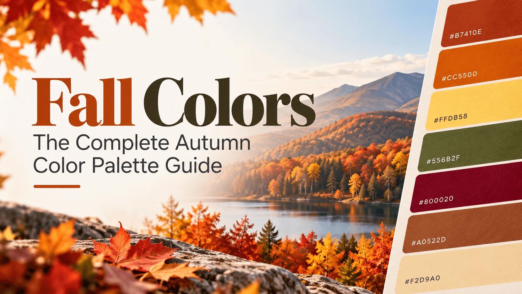
There's a specific moment every year when the light changes, the air turns crisp, and somewhere a coffee shop starts advertising pumpkin spice again. Before any of that fully registers, your brain has already done something interesting: it's pictured a color. Not one color, actually — a whole palette. Deep orange. Burnt red. Warm brown. Mustard yellow. Nobody has to teach you what "fall colors" look like. You already know, on sight, without thinking about it.
That instinct is exactly what this guide turns into something usable. Below is the complete fall color palette, real hex and RGB codes included, why these specific colors feel so unmistakably autumnal, and how to actually use them in branding, decor, and digital design without the whole thing turning muddy.
Key Takeaways
- Fall colors are warm, slightly muted hues inspired by changing leaves and the harvest season — think rust, burnt orange, mustard, burgundy, olive, and warm brown.
- The "muted" part matters as much as the "warm" part. A neon orange doesn't read as autumnal; a slightly dulled, dusty orange does.
- "Fall colors" also has a completely different meaning in personal color analysis (used for skin tone and styling) — this guide covers the design and decor meaning, not that one.
- A good fall palette usually follows a simple structure: one dominant warm hue, one deeper anchor color, and a light neutral to keep everything from feeling heavy.
- These colors work just as well in web and digital design as they do in fashion and home decor, as long as you check contrast before using them for text.
What Are Fall Colors, Exactly?
Fall colors are a family of warm, earthy hues inspired by the natural changes that happen during autumn — the turning of leaves, the last warm light of the season, and the harvest itself. The core group includes rust, burnt orange, mustard yellow, deep burgundy, olive green, and warm brown, almost always in a slightly muted, dusty version rather than a bright, saturated one.
That last detail is the part people miss most often. A pure, neon orange doesn't feel like fall. A dulled, slightly brownish orange, the kind you'd actually see on a maple leaf in October, does. Saturation and warmth are doing equally important jobs here.
Wait — Does "Fall Colors" Mean Something Else Too?
It's worth clearing this up before going further, because it trips up a lot of searches. In the world of personal color analysis — the system used by stylists to figure out which colors suit someone's skin tone, hair, and eyes — "Autumn" is also the name of an entire personal color season, with its own subtypes like Warm Autumn, Soft Autumn, and Deep Autumn. That's a real, well-established framework, but it's about which colors flatter a specific person's coloring, not about seasonal design or decor.
This guide is about the other meaning: the visual, seasonal color palette associated with the autumn months themselves, the kind you'd use for a website, a brand, a room, or a wedding. If you landed here looking for the personal styling version instead, that's a genuinely different topic with its own set of rules.
The Complete Fall Color Palette
Here's the full reference list, with real hex and RGB values for each shade:
| Color Name | Hex Code | RGB | Best Used For |
|---|---|---|---|
| Rust | #B7410E | 183, 65, 14 | The single most iconic fall color; branding, decor accents |
| Burnt Orange | #CC5500 | 204, 85, 0 | Warm dominant color for palettes and backgrounds |
| Pumpkin | #FF7518 | 255, 117, 24 | Brighter, more playful accent than rust or burnt orange |
| Mustard Yellow | #FFDB58 | 255, 219, 88 | Warm highlight color, pairs well with olive and brown |
| Goldenrod | #DAA520 | 218, 165, 32 | A deeper, richer alternative to mustard |
| Olive Green | #556B2F | 85, 107, 47 | Grounding, earthy secondary color |
| Forest Green | #228B22 | 34, 139, 34 | A cooler contrast that still fits an autumn palette |
| Burgundy | #800020 | 128, 0, 32 | Rich, moody anchor color for deeper palettes |
| Maroon | #800000 | 128, 0, 0 | Similar role to burgundy, slightly more brown-leaning |
| Firebrick | #B22222 | 178, 34, 34 | A warmer, brighter red for accents |
| Sienna | #A0522D | 160, 82, 45 | Warm reddish-brown, great supporting neutral |
| Saddle Brown | #8B4513 | 139, 69, 19 | Deep, classic brown for text or backgrounds |
| Chocolate | #D2691E | 210, 105, 30 | A warmer, more orange-leaning brown |
| Camel | #C19A6B | 193, 154, 107 | Soft neutral, works well as a light background |
| Copper | #B87333 | 184, 115, 51 | Metallic-adjacent accent, great for highlights |
| Cream | #F2D9A0 | 242, 217, 160 | Essential light neutral to balance darker tones |
Want to grab any of these directly? Our color picker lets you fine-tune each one further, and our color palette generator can build a full palette starting from any single color on this list.
Why These Specific Colors Feel Like "Fall"
There's a real, biological reason these colors show up together every year, and it's worth knowing since it's the whole reason this palette exists in the first place. Leaves are green through spring and summer because of chlorophyll, the pigment plants use to absorb sunlight. As daylight shortens in autumn, trees stop producing chlorophyll, and it breaks down and fades. Once it's gone, it stops masking pigments that were quietly there all along — carotenoids, the same yellow and orange pigments found in carrots and pumpkins. That's where mustard, gold, and burnt orange come from directly.
Red is a slightly different story. Unlike the yellows and oranges, red pigments (called anthocyanins) aren't sitting there year-round waiting to be revealed — they're actively produced in the fall, often more intensely after a stretch of bright, sunny days followed by cool nights. That's part of why some autumns produce more vivid reds than others; it's not just aesthetic randomness, it's genuine seasonal chemistry.
So when a fall palette leans on orange, gold, and deep red together, it isn't just "these colors happen to look nice." It's a fairly literal snapshot of what's actually happening inside a leaf as the season changes.
Breaking Down the Palette by Family
Reds and Burgundies
Burgundy and maroon are the deep, moody anchors of most fall palettes. They read as rich and a little dramatic without tipping into anything aggressive, which is why they show up so often in autumn weddings and premium branding. Firebrick, a brighter, warmer red, works well as an accent when a palette needs a little more energy without losing the season's overall warmth.
Oranges and Rust
Rust is arguably the single most recognizable fall color that exists — it's specific enough to feel unmistakably autumnal, but flexible enough to pair with almost every other color on this list. Burnt orange and pumpkin sit close by, with pumpkin being the brighter, slightly more playful version of the two, better suited to accents than large background areas.
Yellows and Golds
Mustard and goldenrod carry a lot of the palette's warmth without the intensity of a full orange or red. They're especially good as a secondary color rather than a dominant one, since a large area of bright yellow can start to feel more like a caution sign than an autumn afternoon.
Greens
This is the family people forget belongs in a fall palette at all, but olive and forest green are genuinely core autumn colors, not just a summer leftover. They mirror pine trees and fading foliage rather than fresh spring growth, and a slightly dulled, warm-leaning green pairs beautifully with rust and brown without fighting for attention.
Browns and Neutrals
Sienna, saddle brown, chocolate, and camel do the quiet, essential work of grounding a palette. Without at least one warm brown or neutral, a fall palette risks feeling like a pile of competing bright colors instead of a cohesive whole. Cream plays a similar but opposite role — it's the light breathing room that keeps a deep, warm palette from feeling heavy or claustrophobic.
Fall Color Combinations That Always Work
Picking individual colors is one thing — putting three of them together well is where most palettes actually succeed or fail. Here are five combinations that reliably work, each built around a dominant, a secondary, and an accent color:
| Combination | Dominant | Secondary | Accent | Feels Like |
|---|---|---|---|---|
| Classic Harvest | Cream #F2D9A0 | Rust #B7410E | Olive #556B2F | A farmers market on a crisp morning |
| Cozy Evening | Camel #C19A6B | Burgundy #800020 | Copper #B87333 | A fireplace and a wool blanket |
| Bold Autumn | Burnt Orange #CC5500 | Chocolate #D2691E | Forest Green #228B22 | A maple tree at peak color |
| Moody Jewel Tones | Sienna #A0522D | Maroon #800000 | Mustard #FFDB58 | An elegant fall wedding |
| Soft & Muted | Cream #F2D9A0 | Saddle Brown #8B4513 | Firebrick #B22222 | A quiet, understated design system |
Notice the pattern repeating across every row: a light or mid-tone neutral doing most of the work, one deeper color adding structure, and a single warmer or brighter accent doing the rest. That's the 60-30-10 principle again, just applied five different ways with five different moods.
How Many Colors Should You Actually Use?
For a single project, three to five colors is genuinely plenty, and this is where the same structure we've covered before comes back into play: the 60-30-10 rule. Pick one warm dominant color (rust, burnt orange, or mustard) for roughly 60% of your design, a deeper anchor color (burgundy, brown, or olive) for about 30%, and a single accent for the remaining 10% — often a metallic-adjacent tone like copper, or a small pop of a brighter color like pumpkin.
Skip a light neutral like cream entirely, and even a technically well-chosen fall palette can start to feel muddy or oppressive. It's a small addition that does a disproportionate amount of work.
Fall Colors in Branding and Design
It's no accident that so many coffee shops, farmers markets, and artisan or "handmade" brands lean on this exact palette. Warm browns and rust signal authenticity and craft in a way that a cool, corporate blue simply doesn't. If you want to understand why that specific emotional association exists, our color meaning chart breaks down what warm, earthy tones tend to communicate on their own, separate from any seasonal context.
It's also worth remembering that fall colors are, fundamentally, a specific corner of the broader warm color family — if you want the full picture of why warm colors behave the way they do, our guide on warm vs. cool colors covers that foundation in more depth.
Fall Colors in Home Decor
The same logic scales down to a single room just as easily as it scales up to a brand identity. A dominant warm neutral like camel or cream on the walls, a deeper anchor like olive or burgundy in larger furniture pieces, and rust or copper reserved for smaller accents — a throw pillow, a vase, a single piece of art — creates the same cozy, layered feeling without requiring every surface in the room to compete for attention.
Fall Colors for Websites and Digital Design
This is where a lot of general "fall colors" articles stop short, and it's worth going further, since these colors work just as well on a screen as they do on a leaf or a living room wall. Setting up a seasonal palette as CSS variables makes it easy to apply consistently across a site, and just as easy to swap out again once the season changes:
:root {
  --fall-dominant: #F2D9A0;   /* cream - 60% */
  --fall-secondary: #8B4513;  /* saddle brown - 30% */
  --fall-accent: #B7410E;     /* rust - 10% */
}

body {
  background-color: var(--fall-dominant);
  color: var(--fall-secondary);
}

.button-seasonal {
  background-color: var(--fall-accent);
  color: #FFFFFF;
}
Before shipping anything using deep, warm tones like burgundy or saddle brown as a background with light text on top, run the combination through our contrast checker — some of these colors are dark enough to pass easily, but it's worth confirming rather than assuming. If you want to build a smooth, blended seasonal gradient instead of flat color blocks, our gradient generator can turn any two or three colors from this list into a soft autumn-toned background.
Common Mistakes When Using Fall Colors
- Reaching for fully saturated versions instead of muted ones. A bright, neon orange reads as a highlighter, not a maple leaf. Dial the saturation down for anything meant to feel authentically autumnal.
- Skipping the neutral entirely. Without at least one light color like cream or a dark grounding neutral like a deep brown, a fall palette can quickly feel like too much warmth with nowhere for the eye to rest.
- Using too many warm colors at equal weight. Five different warm tones with no clear dominant color tends to look busy rather than rich. Let one color lead, per the 60-30-10 structure above.
- Forgetting that green belongs here too. A lot of people build a fall palette entirely out of reds, oranges, and browns and skip green completely, when a well-chosen olive or forest green often adds exactly the depth a palette is missing.
How to Build Your Own Fall Palette
Start with one dominant color from the list above using our color picker, then explore muted, toned-down variations using the color mixer — blending a small amount of gray or brown into a bright color is exactly how you get from a highlighter orange to a proper burnt orange. If you're deciding how your chosen colors relate to each other on the color wheel, our color wheel tool makes that easy to see at a glance rather than guessing.
Wrap-Up
Fall colors aren't just a seasonal aesthetic preference — they're a fairly direct visual record of what's actually happening in nature as the season turns, translated into a palette anyone can use. Keep it warm, keep it slightly muted, give it room to breathe with a light neutral, and you'll end up with something that feels genuinely autumnal rather than just vaguely orange.
FAQs
Rust, burnt orange, mustard yellow, burgundy, olive green, and warm brown make up the core fall palette, usually in a slightly muted rather than fully saturated form.
Tools for this guide
Related posts
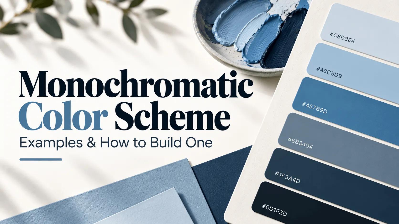
Monochromatic Color Scheme: Examples & How to Build One
Learn what a monochromatic color scheme is, how tints, shades, and tones work, and how to build a cohesive palette with practical examples.
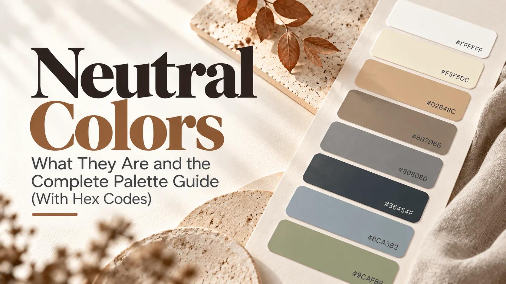
Neutral Colors: What They Are and the Complete Palette Guide
Neutral colors explained — the classic black, white, gray, and brown, plus "secret" neutrals like dusty blue and sage green. Full palette with hex codes.